A picture may be worth a thousand words, but an effective postcard design is worth a thousand prospects.
The design of your postcard is almost as important in eliciting a response as getting a good list — it runs a very close second. Much as in deciding on a list, there are definite rules you should follow when designing a postcard.
Based on what I said earlier about the quantity of mail determining your income, you could literally slap together a postcard on your own printer, send it out consistently, and still make money. However, there is more to direct mail marketing than the bare minimum, and eventually low quality will start to affect your campaign. Since you are reading this book, I take it that you want to know how you can utilize direct mail to really grow your company. And that requires far from the bare minimum.
Postcard Design Utilizing the 13 Elements
Do you want your direct mail postcard to end up in the trash with the rest of the unread mail?
These are the 12 (or 13 for some businesses) elements your design absolutely must have to maximize your return:
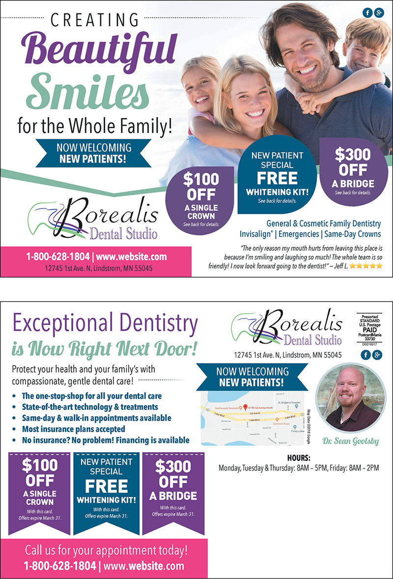
- A clear, bold headline
On the postcard there should be one central message. The best way to achieve that is with a bold, clear headline that isn’t cluttered up with other text. The headline should allow the recipient to immediately know what you’re selling. The key word being “immediately.”
- A graphic that supports the message
The graphic should be easy to understand and add to the message the headline is conveying. For instance, if you are trying to get people to list their home, you would want to show a home with a SOLD sign clearly visible out front. That graphic reinforces the message more than a plain picture of a home.
- Color that pops
Make the headline and other text stick out by using a color that stands out from the background color. When you look at the card, ask yourself, “What do I see first?” If it isn’t the headline, you might want to tweak the colors or increase the size of the headline.
- A subhead that leads into text
If you have a couple paragraphs of text with no lead in on the back of your postcard, there’s nothing to entice people to read the copy. A subhead will give prospects a place to start reading. If you have only a hundred words or so, you may be able to get away with it, but if the text gets any longer the average reader will need some guideposts along the way.
- Benefits, benefits, benefits
One of the biggest errors people make in advertising is stating features, rather than benefits. For example, never assume recipients know what benefit can be derived from a lower interest rate on their mortgage. Instead, let them know their monthly payments will go down.
- The offer
An offer is always a good idea and should represent a specific reason to call NOW, such as “Limited supply” or “Interest rates are climbing,” or “Save $50 before the end of the month.”
- Your company name and logo
Although this needs to be on the mailer, it shouldn’t overshadow the offer. Customers care most about what you can do for them — not who you are or how great you say you are.
- Call to action
Tell prospects exactly what you want them to do. “Call today for more information” or “See us online” are two of the most common desired actions. What happens when they see you online could be the subject for another book — this is very important. Another great way to get people to see your offer and call to action is to position them near each other and in a color that doesn’t match the rest of the design. That way, their eye will be involuntarily dragged to your offer and call to action (CTA).
- Contact information
Provide your phone number and web address directly following the call to action. Whatever you ask prospects to do, give them the means to do it — right away. Don’t make them search for it.
- Return address
A return address ensures you’ll get returned mail from the post office and communicates you’re an established professional. People feel better knowing the company they’re dealing with has an actual location.
- A 5-star review
Don’t give the recipient the added step of searching for reviews online. Provide one on your card. Even if you are brand new, you can get someone you serviced to say something great about you and put 5 stars next to that quote. If you have a huge number of 5-star reviews online, brag about it on your card!
- QR code
A QR code (short for Quick Response) makes it easy for people to jump right from your postcard to your website with minimal effort. They only have to scan the QR code with their smartphone camera, and a link to your website or landing page pops right up. QR codes can also be used in your CTA with verbiage like, “Scan me!” Just make sure that the web page you’re driving your postcard traffic to is set up for success — meaning it has a form people can fill out to redeem an offer with a high perceived value, thereby capturing that lead for you.
- CONDITIONAL — A map of your location.
Are you a local or regional business that people visit with or without an appointment? Add a map to the back of the card with the little red upside-down teardrop and the nearest major roads so people know where you are at a glance.
* Also — make sure you don’t use specialized terminology that only other professionals in your industry will understand. I’ve seen this mistake A LOT. If a recipient reads something that is completely foreign to them, they WILL NOT ACT.
The Ultimate Postcard Success Test
Answer the following questions honestly, and then tally your score. Anything less than a perfect 13 means your postcard (and investment) is at risk!
- Does your postcard have a crystal clear headline?
- Is there an eye-catching graphic that supports the message of the headline?
- Does the color scheme make the postcard “pop?”
- Is there a sub-headline on the back of the postcard that continues the message from the front of the card?
- Does the copy focus on the benefits of your offer (rather than the features)?
- Is there a compelling offer (special benefit, discount, etc.) to spur the recipient to action?
- Is your company name and logo featured on the postcard?
- Is there a call to action that spells out exactly what the recipient needs to do to respond and is the eye dragged there involuntarily?
- Is there a 5-star review that includes a 4-star graphic?
- Is your contact information on the postcard?
- If (and only if) you’re local and support foot traffic, did you include a map with your location highlighted and your largest crossroads clearly outlined?
- Does your design include a QR code linking to a web page that’s set up to capture the identity of recipients?
- Is there a return address (ideally not a P.O. Box) on the postcard?
Understanding Your Score
0-6
Eek! You are missing CRUCIAL elements in your postcard. It is unlikely you will have success with the postcard as-is.
7-9
You have a chance. You have enough elements to give you a shot at success, but your best bet is to tweak your design so that all 13 of the elements are included.
10-13
Nailed it! You are good to go. Mail those puppies and watch the prospects roll in.
Postcard Marketing in an Online World
By Joy Gendusa, Founder/CEO PostcardMania