7 Ways to Convert More Website Visitors into Customers
Updated on November 16, 2021
The importance of your website can’t be overstated. In most industries, it’s likely your most important sales tool.
Website conversion – that is, getting a visitor to complete a certain action – is tricky, considering the endless amount of variables that could sway someone that visits your website to convert. Based on PostcardMania data, nearly 95% of all visitors don’t convert.
Nobody can really know for sure why people don’t engage; it could be as simple as the colors you choose or as complicated as the load time of your website. The visitor could just be in a bad mood that day!
However, data shows that there are definitely certain website attributes that significantly boost conversion rates. To help out my small business readers, I’ve broken down the biggest website conversion variables into two main groups – website design and lead capture devices.
Website Design Elements that Establish Professionalism
In order for a visitor to even think about converting, your website needs to earn their trust. Before a visitor even reads any of your website copy, within the first 10 seconds they’ve made a judgment about your website, and ultimately your business.
1. Website Mood & Relevant Photos
For one, what kind of mood does your homepage set? The first indicator of a quality website is the color scheme and formatting it uses.
I usually recommend a color scheme that POPS – use bright colors that stand out, like this tax service template’s website:
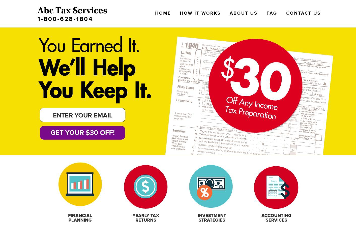
This bright yellow and red scheme really gives off a confident, professional, and established feel for their business. The formatting is simple and easy to follow.
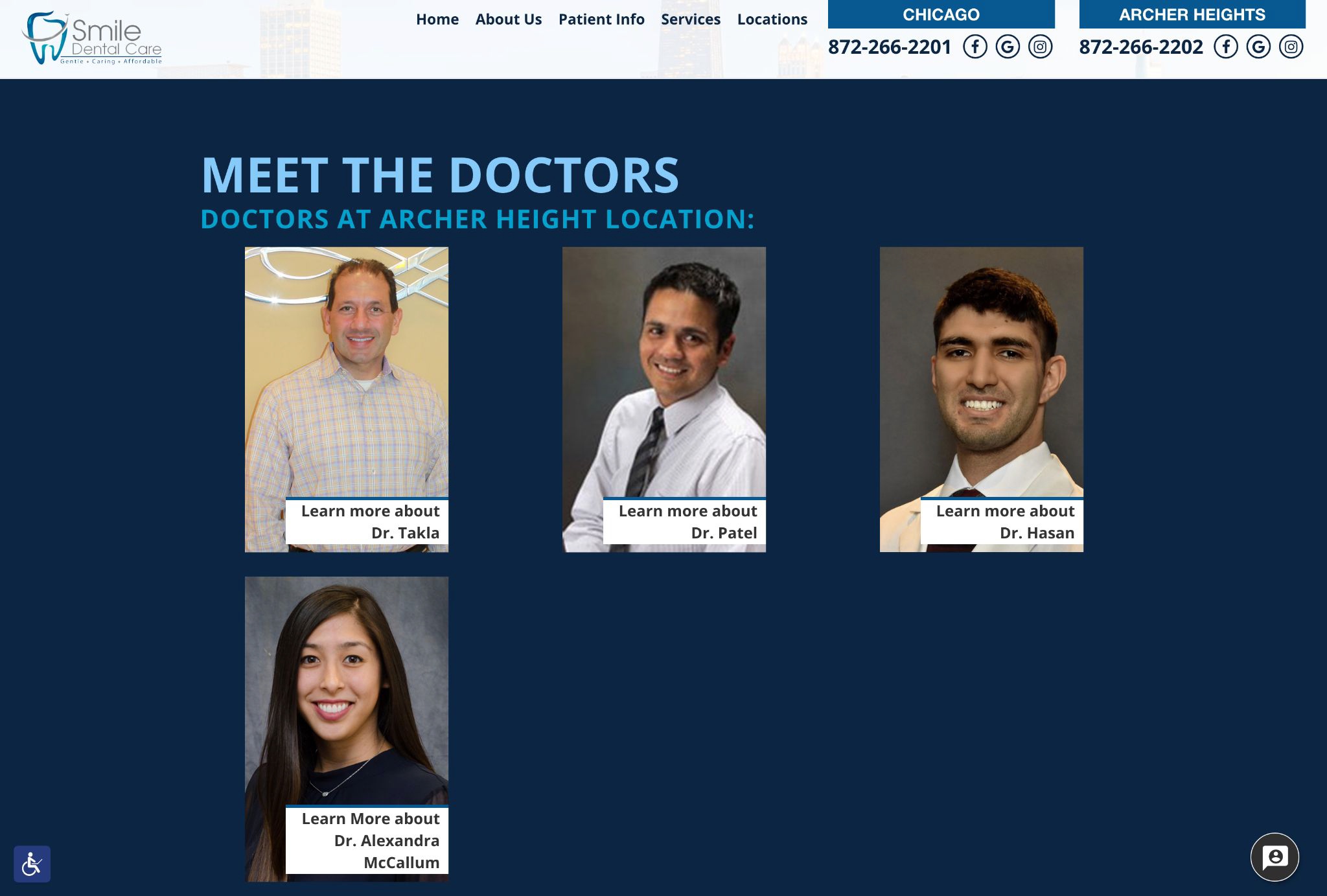
However, depending on your industry, you may want to opt for a more cool color scheme. For example, there are a lot of people out there that dislike going to the dentist. Many of my dental clients want their website to look more like this:
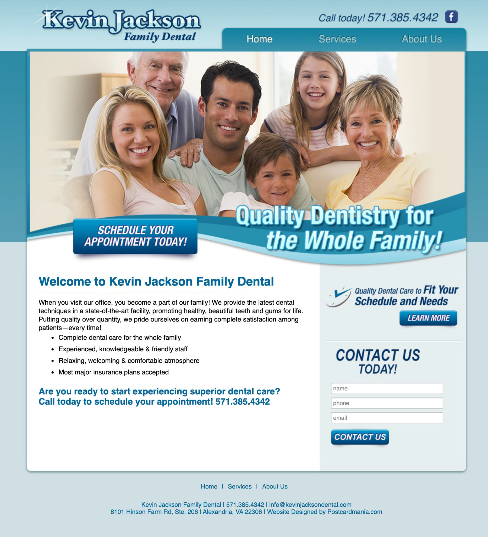
This color scheme gives off a more clean, family-oriented, and friendly vibe. Other industries that people may be more hesitant to use, like exterminators or funeral homes, would be smart to follow this strategy.
It’s also beneficial for conversions to include photos, especially those that can present impressive before and after shots:
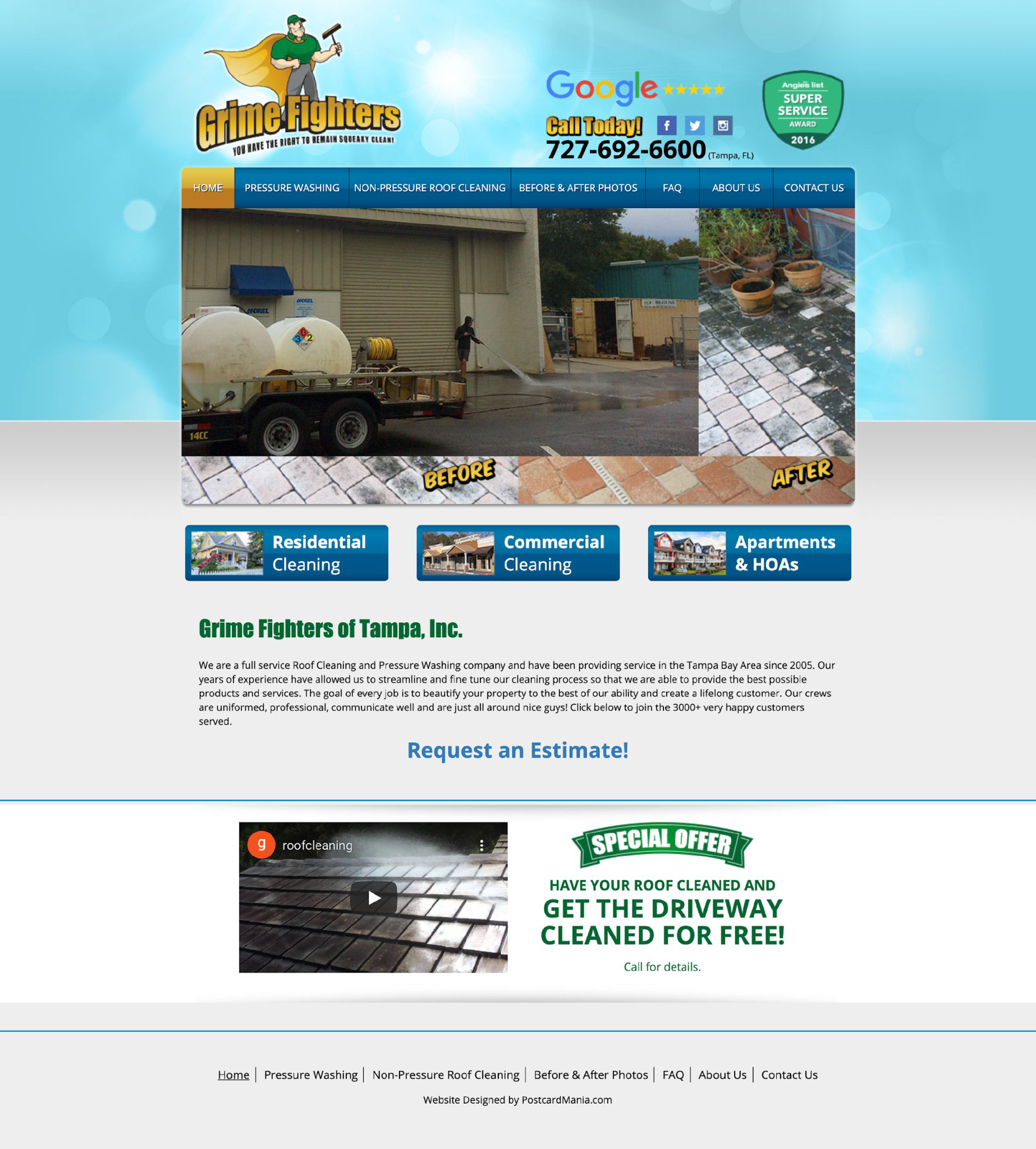
These images show that Grime Fighters can deliver the results that they promise, helping to prevent any buyer’s remorse. This photo is also a credibility indicator, which I’ll talk more about below.
I always recommend including REAL photos of you and your staff. This gives your business a human face and gives off a better feeling of trust, making visitors more likely to convert.
2. Clear and Concise Copy & Simple Navigation
Immediately upon landing on your website, a visitor should immediately know why they’re there. Your copy should address the curiosity that brought them to your website.
Your home page should answer questions like:
- What are you offering?
- Why should they care about your offer?
- Would they benefit from your service or products? If so, how?
I always tell clients to keep their website copy as clear and concise as possible. There’s no need to involve long, intimidating paragraphs within the homepage. That’s not to say that you shouldn’t have any in-depth copy at all – just let them navigate to it if they want to learn more.
And speaking of navigation, keep it simple and straightforward. Website visitors should be able to move around your website with ease. This makes their experience more pleasurable, which correlates with a higher conversion rate.
I recommend having as few navigation tabs as possible. If you have no choice but to have many tabs, consider a menu icon. They’re an easy way to clean up your homepage.
Also, make sure your Call to Action (CTA) button stands out. It should take a website visitor no time at all to locate the button. I always advise having it be a separate color from the rest of your page so eyes are drawn to it.
Lastly, a major part of easy navigation comes from your website’s programming; a quick load time is essential. A slow load time can majorly hurt your conversion rate. Website conversion rates drop by an average of 4.42% with each additional second of load time (between seconds 0-5).
3. Credibility Indicators Creating Social Proof
Once your website design is optimized for conversions, it’s time to find places to include credibility indicators, such as the before and after photos I mentioned above.
Every time a new customer visits your website, you’re fighting an uphill battle to earn their trust. You’ve already lost them if your website design is ugly, runs poorly, or is difficult to navigate.
But a quality design alone will not bring in conversions and sales. You need to show your audience that your products or services are worth their time and money.
This is called social proof, which in a marketing context is evidence that other people have been pleased with a company’s product or service they purchased. Kissmetrics found that social proof and credibility indicators can lead to a 144.1% improvement in lead conversion. This evidence can take many different forms.
One of the easier credibility indicators to include is what your previous customers say themselves! Display your best client testimonials and reviews for every website visitor to see. You can have a carousel on your homepage, or dedicate an entire webpage to it if you have enough quality reviews!
Another simple credibility indicator to implement in your website is awards that your company has won or publications that you’ve been featured in. While these don’t build social proof per se, they give your business industry authority.
After all, which company would you go with – one that promises award-winning service, or one that has actually won awards?
If you’re willing to put in some work, there are several in-depth credibility indicators that sway even the most stubborn visitors.
For example, if you have an especially positive review, reach out to that client to see if they would be willing to share more in a case study. Case studies provide all of the nitty-gritty details about an experience with a product or service, including:
- The situation that led to them buying the product or service
- Their experience with the actual service or product
- The end-results obtained
- Any additional notes, such as:
- Level of professionalism shown by employees
- The quality of customer service
- Any statistics the product/service created, if applicable
If you have a complex product, a video explanation can help simplify any difficult processes. Visitors are 64% more likely to convert after watching a video on your website.
A blog is another way to build authority on topics within your industry, which also builds credibility. If you’re stuck on what to write about, you can Google your industry along with “near me” and scroll down to the “People also ask” box on Google, where questions will be displayed.
These are just the website elements I picked out that significantly help boost conversions – you can find the 10 must-have elements of a great website here.
If you don’t want to take the time to do it yourself, PostcardMania offers an affordable website design service that includes everything needed for a revenue-driving online presence!
Lead Capture Devices
Lead capturing devices are arguably one of the most important elements in your website when it comes to sales-related website conversions.
I’m here to help you avoid costly trial-and-error so that your lead capture devices immediately start bringing in leads, based on data-driven research!
4. Contact Capture Forms
One of the more popular lead-capturing devices for websites is contact capture forms, which offer the visitor something of value (like a coupon or newsletter subscription) for their contact information.
There are several important elements to pay attention to when building contact capture forms.
For one, and this goes for any lead capture device you choose, have the Call To Action button stand out against the rest of the page. Make sure you use the best label for the button – consider phrases that depict EXACTLY what’s going to happen, such as “Request Information”, “Get Started”, or similar descriptive words.
Keep the layout simple and familiar. For example, a contact capture form should ask for the most basic contact information that people are comfortable with sharing. PostcardMania has found that the less you ask for, the more likely the chances of conversion!
The only piece of contact information we ask for is a visitor’s email. Unbounce.com found asking for a phone number creates an average dip in conversions of 5%.
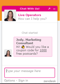
Once you gather the most essential contact information, you can try to capture more information with a more detailed form and a better offer, like this:
46% of people that gave their email ended up filling out this second form – but by asking for just their email address, we’ve collected nearly double the actual leads!
Also, ensure that your contact capture form is optimized for mobile – 57% of all website visits were mobile in 2020, meaning you’re missing over half of your opportunities for contact capture.
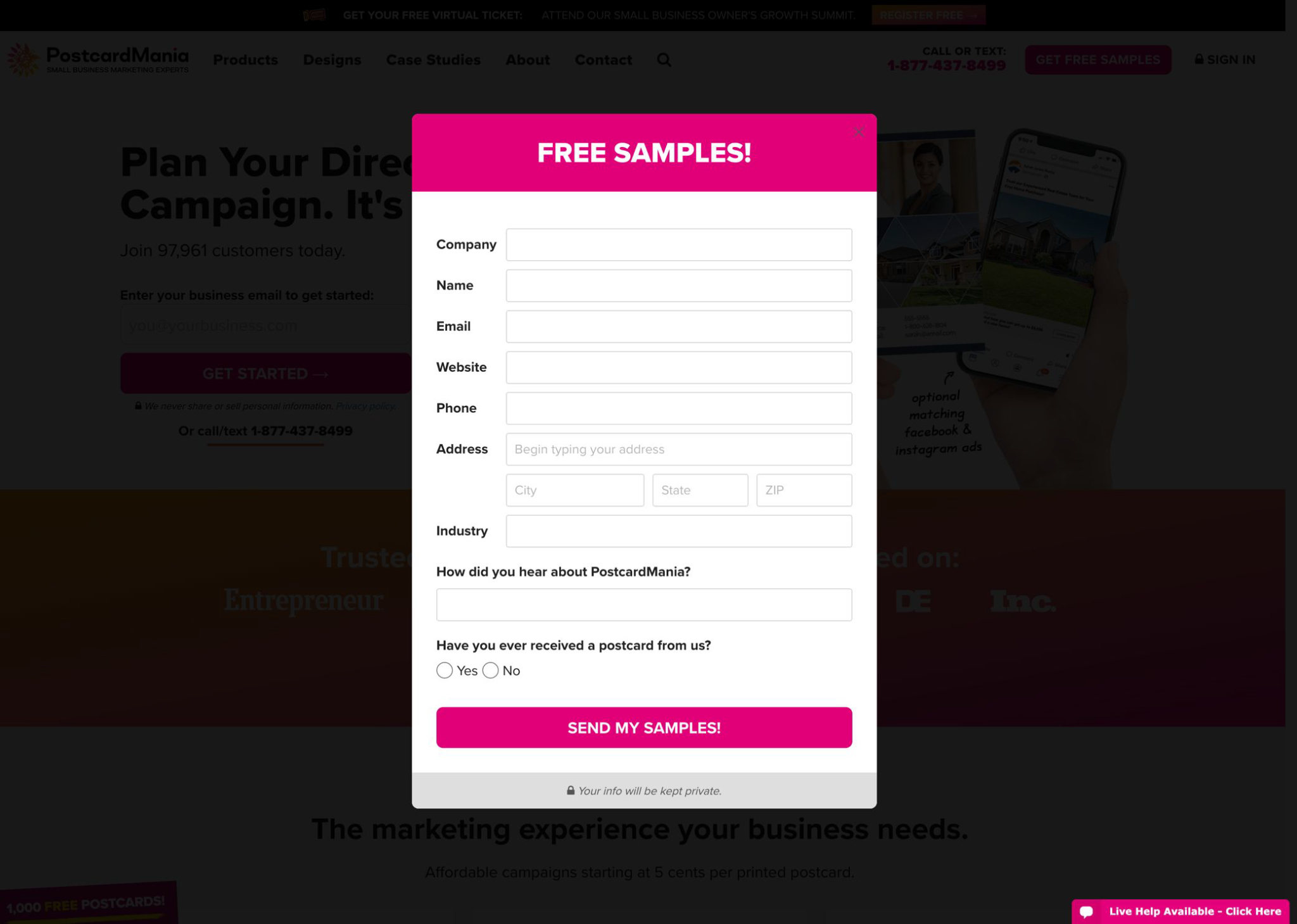
5. Pop-Ups
Pop-ups used to have a bad rep, but I love them — and I’m not alone. More marketers and businesses are turning to them to capture 65% more leads.
You just have to make sure you’re designing them right!
For example, like contact capture forms, have them offer something of value for a tiny bit of contact information. Also, make sure they’re easy to click out of and don’t repeatedly keep popping up, or a visitor will likely become annoyed and leave the website.
There are several ways it can appear on the screen. I prefer this style, where the pop-up appears blocking the content and fades out the background so that the pop-up is the central feature on the screen.
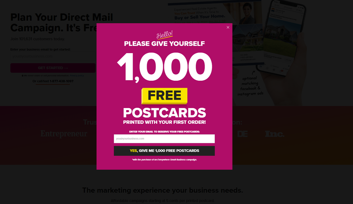
Make sure the “X” to exit the pop-up is visible, or you’ll annoy and likely immediately lose the visitor that refuses to give information.
6. Landing Pages
Landing pages are lead capture devices in web page form. They’re single web pages that focus on a particular product/service, promotion, email offer, or other online advertisement.
Landing pages are built for one purpose – conversions. We’ve found several elements over testing a variety of landing page formats that help increase conversions:
- A Headline that matches the promotion. Otherwise, something will be off and a potential lead will immediately bounce.
- Supporting subheading to provide more information.
- Bullet pointed benefits. Not features – these should answer the question “what will I get out of this? How will this service/product benefit me?”
- A testimonial or other credibility indicators. These can be videos, reviews, or a trust seal. Placing a credibility indicator next to a lead capture form can increase landing page conversion by 9%.
- A compelling reason to convert, such a great offer or other major benefit.
- A lead capture form with as few fields as possible.
- A button that describes exactly what happens next.
- Some “About” information. People want to know about who they’ll be doing business with – think of this as a credibility indicator for your landing page. Give them all the information they need to trust you at the landing page so they don’t feel the need to go to your regular site and abandon the landing page without converting.
- No way out. A landing page should have no additional navigation or other additional pages. This simple layout is meant to control the visitor to take the desired action right there on that page.
If you don’t see the value in optimizing all the website design elements yourself, we offer an extremely affordable landing page design service.
7. Live Chat or Chatbots
If you’re looking for a more interactive way to gather information, try running a chat feature. Live chat is a kind of prospect or customer messaging software that allows website visitors to speak directly with a company’s staff.
Live chat rooms work as a small pop-up window within a company’s website. These chats can either be initiated by the website visitor, or they can appear automatically as a proactive way to engage the visitor.
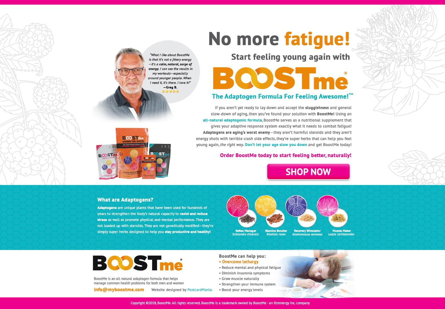
PostcardMania has a manned live chat operator during all business hours! You might’ve noticed it pop out at you while at the homepage of our website.
It accounts for 9% of PostcardMania’s leads and 25% of our incoming calls! The goal of our chat room is to get people on the phone with a marketing consultant since we do all of our business over the phone.
If you’re also a business that needs a client to get on the phone to close, I highly recommend looking into a live chat feature.
However, I understand that you may not have the manpower to stand by a chat room all day; this is where chatbot services come in. Similar to live chat, chatbots offer a more interactive way to engage website visitors with pop-up chat windows. As the name suggests, you’re chatting with a “bot” that conducts conversations via text or text-to-speech.
There are a wide variety of chatbot platforms, each with its own features and price ranges. Check out this list to see which would best fit your business’s needs!
Importance of Split Testing
The Split Test, commonly referred to as A/B testing, allows marketers to compare two different versions of a web page or lead capture device to determine which performs better, with the goal of boosting conversions.
Whatever lead device capturing system you use, make sure that you’re continuously split testing its designs!
To get to the pop-up mentioned above, we continuously split tested our designs and selected the ones that performed best. This led to an 8X conversion rate increase from the first design!
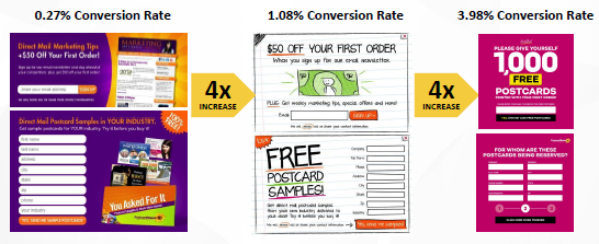
The same goes for landing pages – we increased this landing page’s conversion rate by 4.61% by split testing.
If you don’t want to go through the hassle of doing this yourself, you can use PostcardMania’s Catch-That-Lead Tool. We design two lead-capture forms for your website and continuously split-test them for performance!
And there you have it! All of the most essential information you need to have an amazing website that converts visitors into paying customers.
If you have any questions about anything website conversion-related, feel free to call or text one of PostcardMania’s marketing consultants at 1-800-628-1804. Their advice is always free!
Or you can email me directly at joy.gendusa@postcardmania.com.
Best,
Joy