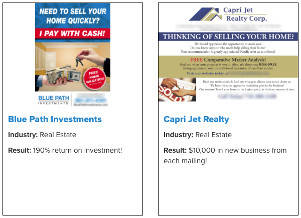
We Bought Postcard Designs from Our Competitors… and WHOA
Updated on July 15, 2021
Knowing your competitors is SO important.
PostcardMania was actually borne out of a bad competitor experience, and there was obviously a market for it — we reached $49 million last year!
Before I started PostcardMania, I had a small graphic design firm offering design services and I brokered printing for my clients.
Needing some more business myself, I decided to send out postcards marketing my graphic design services to businesses in my area.
One particular printer was offering 5,000 postcards for $425. That was a STEAL back in the day!
Everything seemed fine. Until…
I got my proof back from the printer — via FedEx on a CD because the internet wasn’t yet a thing —
And I was SHOCKED.
Actually… I was horrified.
I really couldn’t believe it!
This company had the audacity to print THEIR phone number on MY postcard.
What?!
Here I was, the owner of a graphic design firm that also brokered printing directly servicing businesses, and then this printer put their phone number on my postcard — without my permission — so they could market their services to MY list.
Obviously, this was a HUGE conflict of interest because now my potential leads would see another business’s phone number on MY postcard. I certainly had no intention of spending all that postage money to advertise them.
I called them immediately and demanded they remove their phone number from my postcard.
And after going back and forth with my customer service rep and then the manager, I FINALLY got their phone number OFF my postcard without being charged.
However:
They warned me that next time it would be… a $50 FEE to remove their number!

I hung up the phone, and decided right then and there:
I’m going to start my OWN postcard company, we’re going to call it PostcardMania, and we won’t put our phone number on our clients’ postcards and then make them pay to take it off!
It turned out to be a pretty good idea! I became their competitor and this brings me to the point of this article:
Knowing YOUR competition and staying up to date with them can improve your business!
It can literally change your business and your life.
And the ULTIMATE insight into knowing your competition is…
Drum roll please…
BLIND SHOPPING!
Blind shopping is when you buy from your competition as if you’re just a regular customer.
It’s called “blind” shopping because your competitors don’t know it’s you buying from them.
You buy from your competitors to test their processes and see their products from the viewpoint of a customer.
And honestly…
Many businesses blind shop.
And if they’re not, they should be!
Here’s why:
When you find out what your competition is doing, or not doing…
It helps develop YOUR competitive edge!
AKA: your Unique Selling Proposition (USP).
A USP is what makes your business different from and better than your competitors. Your USP needs to be on your website, your postcards, your signage, etc…
FREE report: How to write a USP that makes your business irresistible
Here’s the thing:
Sometimes in the day-to-day grind of working in your business, you can forget exactly what it is that makes you different from and better than your competitors.
That’s why you HAVE to look at what your competitors are doing…
And blind shopping your competitors allows you to see exactly what they’re producing and how their service is.
Blind shopping allows you to see the following:
- How is their customer service — are you on hold for 0, 3, or 10 minutes?
- How fast their service is (or isn’t)
- Pricing — if it’s not visible on the website
- The quality of the final product
- Did they deliver on their promises
- And all the other nuances you would miss if your competition research is limited to looking at their website and checking their social media
From time to time, we shop our competitors because it helps inform our USP, as well as our product development.
Here’s our USP:
PostcardMania is the ONLY marketing company that creates your campaign based on the results of 76,438 clients.
After all:
The goal of marketing is getting RESULTS for your business.
When we document and track the winning campaigns of our other clients, it helps YOU stack the deck in your favor when it comes to your own campaign.
We share many of these results online and in different trade magazines nationwide, like this:
So with getting results in mind, we blind shopped 3 of our competitors and lived to share the details here.
Our Blind Shopping Rules:
- We gave our competitors — as well as our own graphic design team — the same company to design a postcard for: Lightning Pools & Paving.
- We gave our competitors and our graphic designers the same images and copy to use.
- We didn’t give any design direction. We wanted to see what we would get from a design department that was supposed to be getting us a product that would bring in leads. Plus, we wanted to make sure our graphic design team was on their A game, too!
- We didn’t tell our competitors OR our graphic designers what we were doing. (We were like undercover spies.)
- We used our 10 elements of postcard design to measure the designs we received, because the important part of postcard design is how well it generates new leads!
These 10 elements have been compiled after tracking thousands of successful campaigns. Most of those successful campaigns include these 10 design elements.
Be sure to download that report if you want to understand each of the 10 elements before we jump in…
So start your engines… here we go!
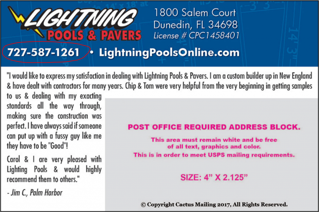
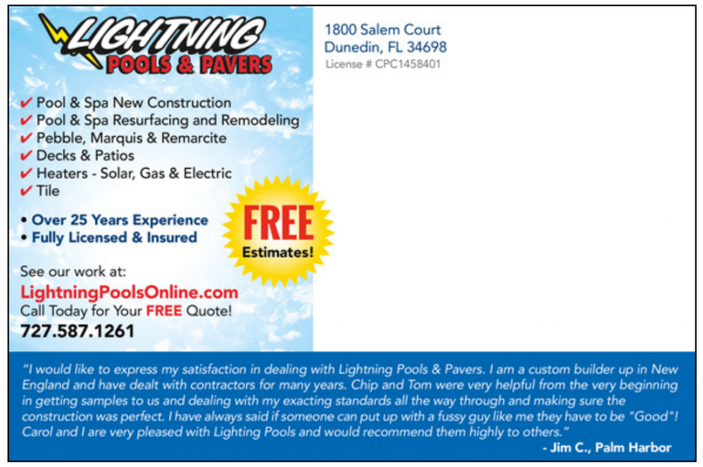
COMPETITOR A
*Design fee= $5
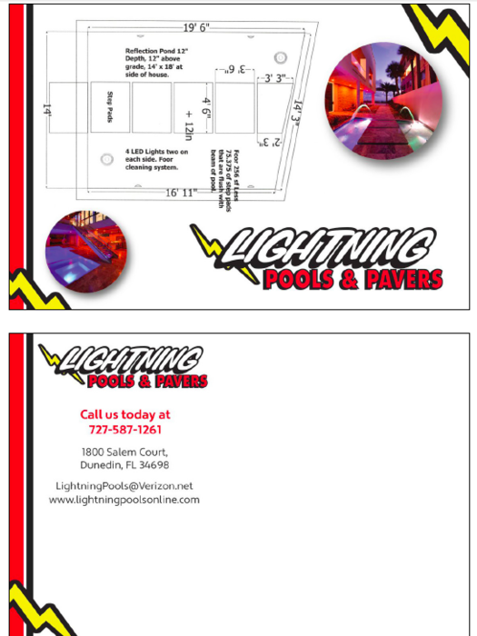
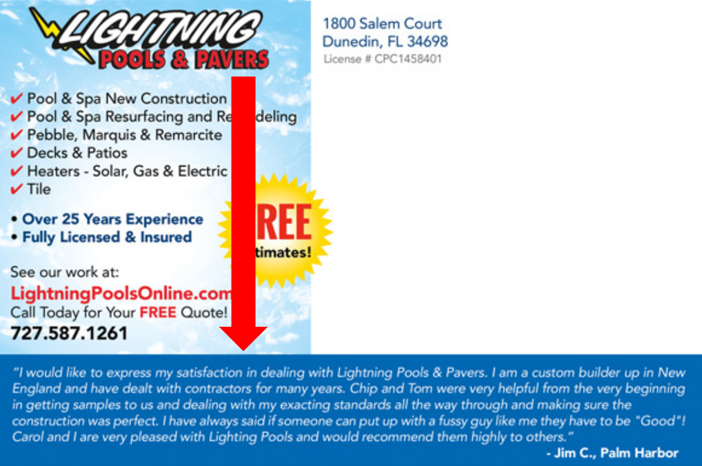
![]() Clear and BOLD headline: There is NO headline on this design at all, which is surprising. Without a headline, there is nothing to tell me what this postcard is about besides the logo. I have no idea what’s being sold. If you have to figure that out when you see an ad, you won’t — you’ll just trash it!
Clear and BOLD headline: There is NO headline on this design at all, which is surprising. Without a headline, there is nothing to tell me what this postcard is about besides the logo. I have no idea what’s being sold. If you have to figure that out when you see an ad, you won’t — you’ll just trash it!
![]() Relevant images– The first image we see of the pool diagram is too abstract and honestly — it’s confusing why it’s even there! After all, the images on your postcard need to clearly and quickly communicate what your business is about.
Relevant images– The first image we see of the pool diagram is too abstract and honestly — it’s confusing why it’s even there! After all, the images on your postcard need to clearly and quickly communicate what your business is about.
You see:
Someone looking to buy a pool isn’t dreaming of blueprints. They’re envisioning how amazing their new backyard will look with a gorgeous, blue sparkling pool. And THAT’S what you want to show them — not boring, bland diagrams!
The two actual images of pools, on the sides, have been reduced down so small, I can hardly tell what they are!
![]() Color that POPS– The colorful bubbles do really pop off the page… but like I said, they’re pretty useless images unless I have a magnifying glass close by.
Color that POPS– The colorful bubbles do really pop off the page… but like I said, they’re pretty useless images unless I have a magnifying glass close by.
![]() Special offer– There is no offer anywhere. Why would I call?
Special offer– There is no offer anywhere. Why would I call?
![]() Back headline (Subhead)– There’s no back headline or text… not much going on there at all. This would’ve been the perfect place to explain why Lightning Pools & Pavers is better/different from the competition (their USP!)… but instead there’s a white background.
Back headline (Subhead)– There’s no back headline or text… not much going on there at all. This would’ve been the perfect place to explain why Lightning Pools & Pavers is better/different from the competition (their USP!)… but instead there’s a white background.
Here’s an example of a subhead on the back of a postcard:
Do you see how it helps lead your eye into the rest of the text?
Very helpful when you want someone to read your entire message!
![]() Benefits– There are no benefits anywhere on this design. However, there is space that could’ve been utilized on the back of the postcard, but instead… it’s just white background.
Benefits– There are no benefits anywhere on this design. However, there is space that could’ve been utilized on the back of the postcard, but instead… it’s just white background.
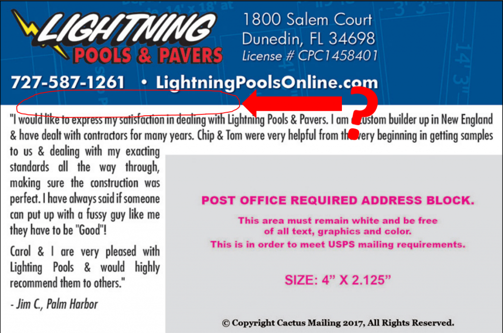
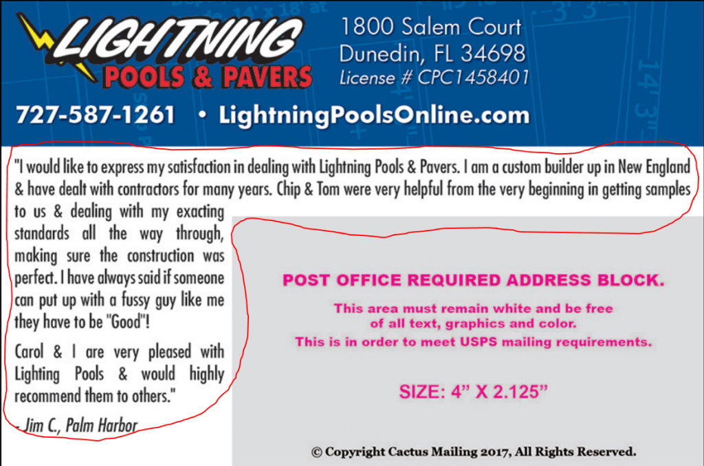
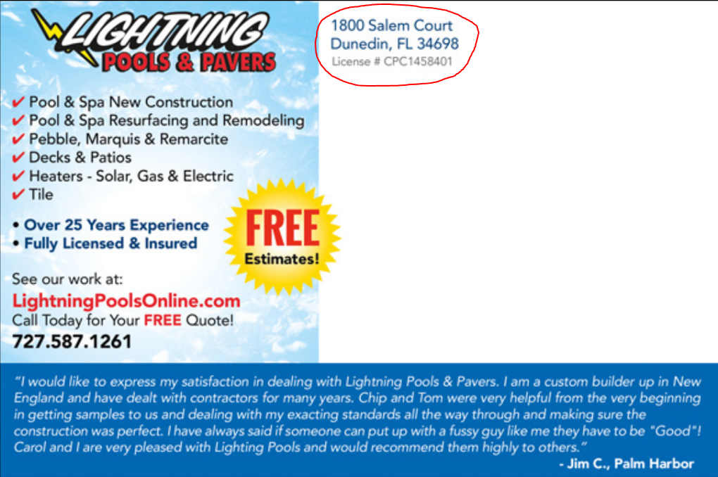
![]() Company name/logo– Lightning Pools & Pavers is on the front and the back, so at least we know who sent the postcard.
Company name/logo– Lightning Pools & Pavers is on the front and the back, so at least we know who sent the postcard.
![]() Call to action– There is a call to action on the back of the postcard — in red, to call the company now. Given how much space is on the back of the postcard, this call to action could’ve been a LOT bigger so it would really stand out to the recipient.
Call to action– There is a call to action on the back of the postcard — in red, to call the company now. Given how much space is on the back of the postcard, this call to action could’ve been a LOT bigger so it would really stand out to the recipient.
![]() Phone number (back only)– On this design, the phone number is only on the back, but it should be on the front too. Make it easy for prospects to call you!
Phone number (back only)– On this design, the phone number is only on the back, but it should be on the front too. Make it easy for prospects to call you!
![]() Website– The website URL is on the back of the postcard, which is good. Given how much space is free on the back of the postcard, the designer could’ve better highlighted the website or directed the reader to visit.
Website– The website URL is on the back of the postcard, which is good. Given how much space is free on the back of the postcard, the designer could’ve better highlighted the website or directed the reader to visit.
![]() Return address– The return address is on the back of the postcard as well. This is good for getting returns on bad addresses and maintaining clean mailing list, which saves money on postage.
Return address– The return address is on the back of the postcard as well. This is good for getting returns on bad addresses and maintaining clean mailing list, which saves money on postage.
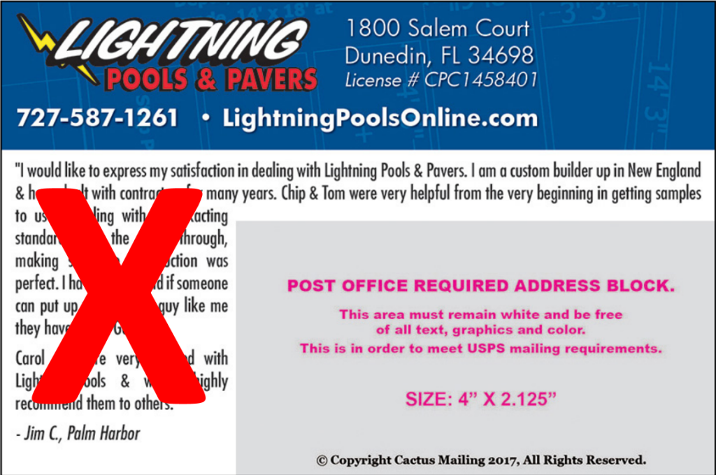
Tip: Don’t use a P.O. Box as your business address. It screams, “I’m a tiny business and work from home!!”
If you do work from home and don’t want to put your home address out there, what I recommend is that you get a UPS store box. That way the return address will be their address and the box number will be your suite number.
This is a tiny nuance but think of it this way:
Your marketing is attempting to take someone from having no feeling about your business one way or the other, and getting them to have good enough feelings to interact with you.
That P.O. Box address can take them from neutral to no thanks.
![]() 5-Star review– This postcard has NO reviews — nowadays people are making buying decisions based on reviews. Add a five star review to all your ads for better response!
5-Star review– This postcard has NO reviews — nowadays people are making buying decisions based on reviews. Add a five star review to all your ads for better response!
![]() Eye trail– Eye trail is how your eye travels across or down a promotion piece, design or webpage — what you see and in what order you see it.
Eye trail– Eye trail is how your eye travels across or down a promotion piece, design or webpage — what you see and in what order you see it.
Ideally, the eye trail will lead the viewer to a call to action. This design lacks good eye trail initially because of the flatness of that boring pool diagram. You don’t even see it at first!
You start at one of the photo bubble graphics, because they’re bright. They really pop out! And from there, you drift to the logo. And then you realize (IF you’re still looking) that there’s a white 2-dimensional diagram there to the left. But you don’t actually get any real communication from the postcard.
Tip: You really don’t want the last thing your postcard recipient looks at to be on the left side of the page.
Here’s why:
In the Western World (Europe and the Americas), our eye travels left to right and up to down in order to read. That is a comfortable and logical eye trail.
This design flips our usual eye trail on its head and takes you backwards.
Is this a HUGE deal that will result in me not EVER doing business with Lightning Pools?
Not really.
It’s just a little uncomfortable. It causes some slight friction, and I might not even understand WHY at first viewing. This is just another nuance that can take the recipient from neutral to no thanks or neutral to hmmm… I’m interested.
BUT:
If the goal of your marketing is to get people to respond, you want to stack the odds in your favor — because it’s an uphill battle to take someone from disinterested to interested to taking action.
This means reducing any small amount of friction between them and your business.
And THAT means having good eye trail and making sure that ALL of these 10 elements are accounted for in your postcard design — and really, all marketing messaging.
KEY TAKEAWAY:
This postcard was just a huge waste of money.
No one could immediately understand what is being advertised, so this postcard isn’t making a clear impression for the business at all.
If your postcard doesn’t immediately communicate to your recipient who you are and what your business offers, it isn’t doing its job, and it’s a total waste of time and money —
And that’s this postcard to a T.
Part 2
Last week, I shared the story of how and why I blind shopped 3 of my competitors. (If you missed it, you can jump to it so you’re caught up. You should DEFINITELY read the first part so you’re familiar with the rules of the game!)
Today I’m sharing the postcard designs of two more competitors I shopped.
AND:
Since I also “shopped” my own graphic design team (in secret) to make sure they were on their game…
You’re going to see how those designs turned out, too!
So here’s the second competitor and how their postcard design fared…
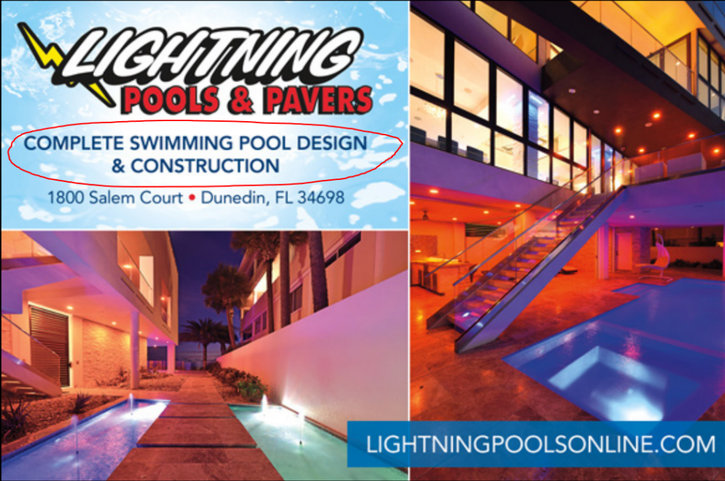
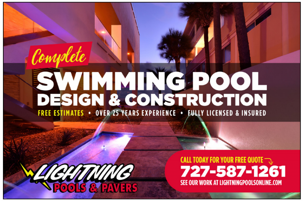
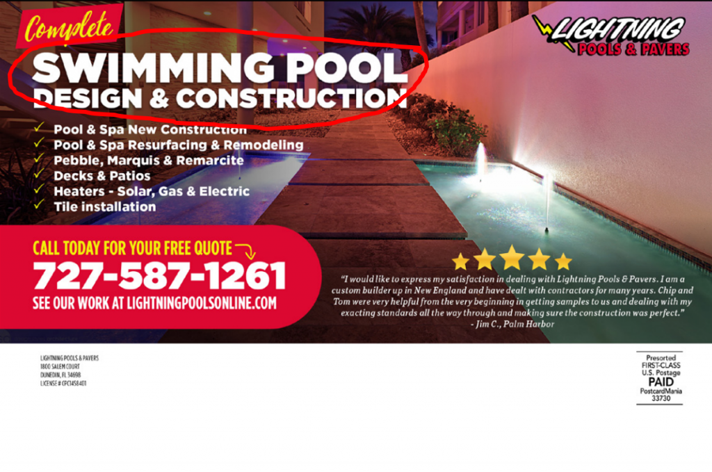
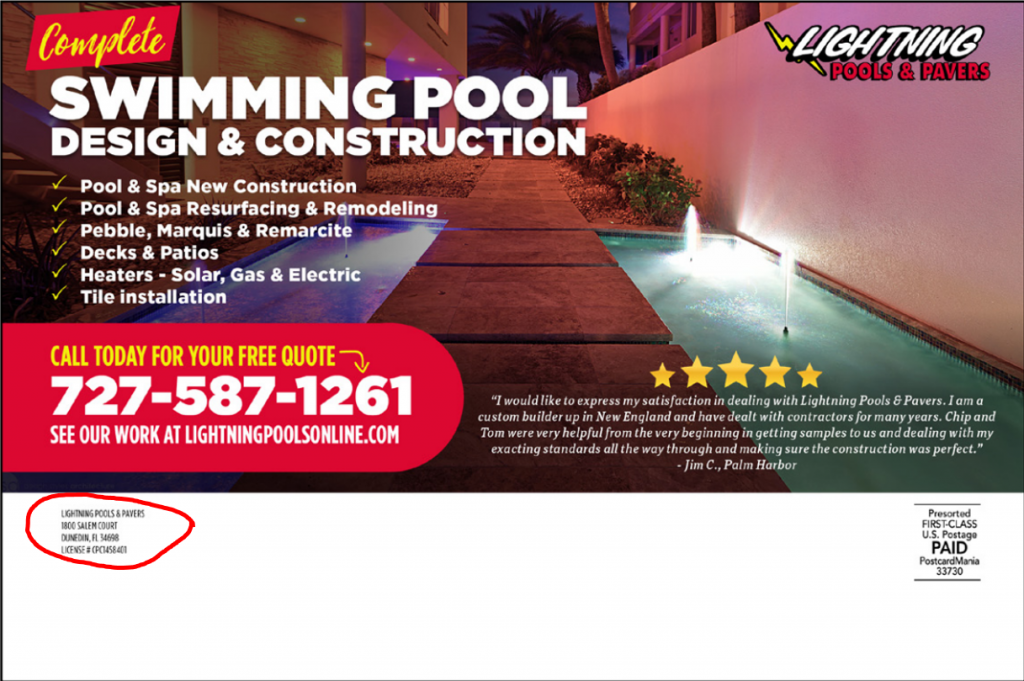
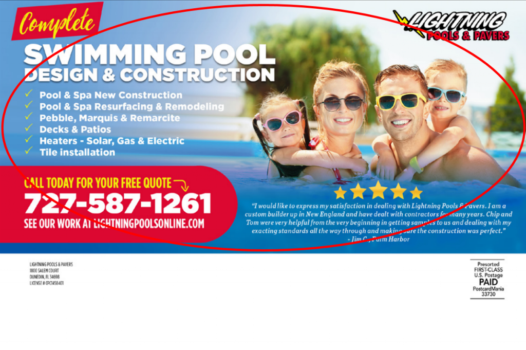
COMPETITOR B
*Design fee= $150
Note: this design fee is $145 MORE than Competitor A’s design.
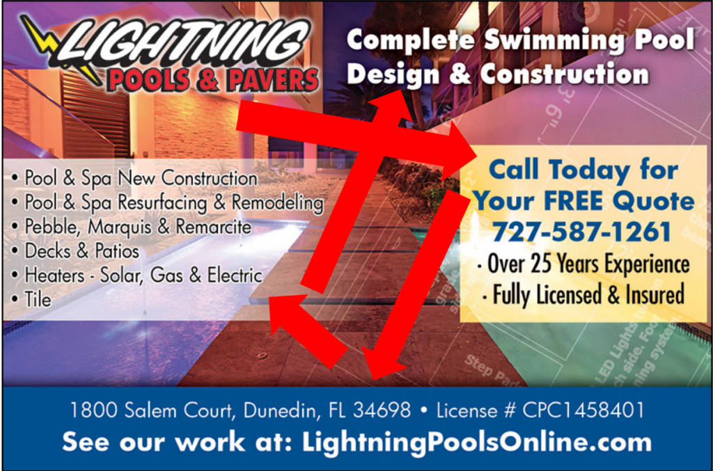
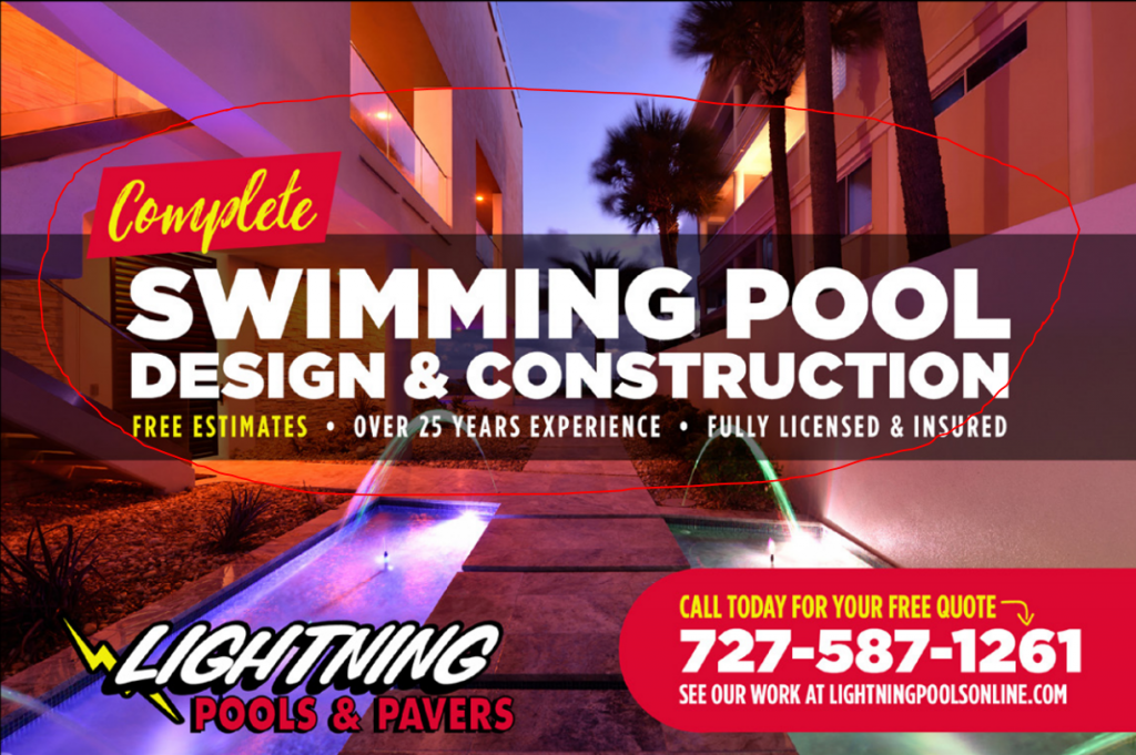
![]() Clear and BOLD headline: On this design, the headline seems to be “Complete Swimming Pool Design & Construction,” but it’s neither compelling nor big enough to immediately attract my interest. In fact, it’s given the same amount of space, so it’s like the logo and the headline are competing for the attention of the recipient, which isn’t what you want.
Clear and BOLD headline: On this design, the headline seems to be “Complete Swimming Pool Design & Construction,” but it’s neither compelling nor big enough to immediately attract my interest. In fact, it’s given the same amount of space, so it’s like the logo and the headline are competing for the attention of the recipient, which isn’t what you want.
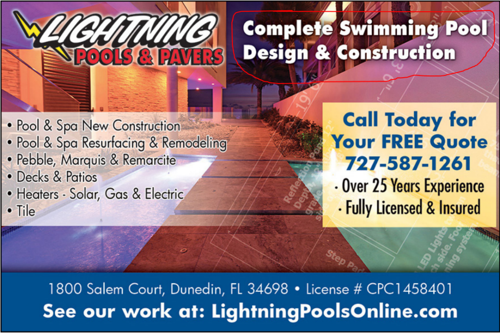
You want your headline to CLEARLY stand out and pull in the attention of your recipient.
That’s not the job of your logo, because your logo communicates the name of your business.
Your headline needs to stand out, because your headline communicates what your business can do for the recipient.
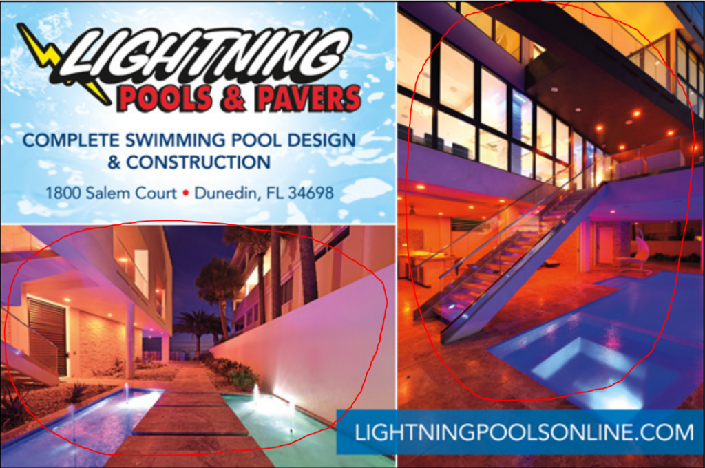
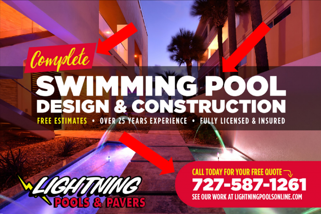
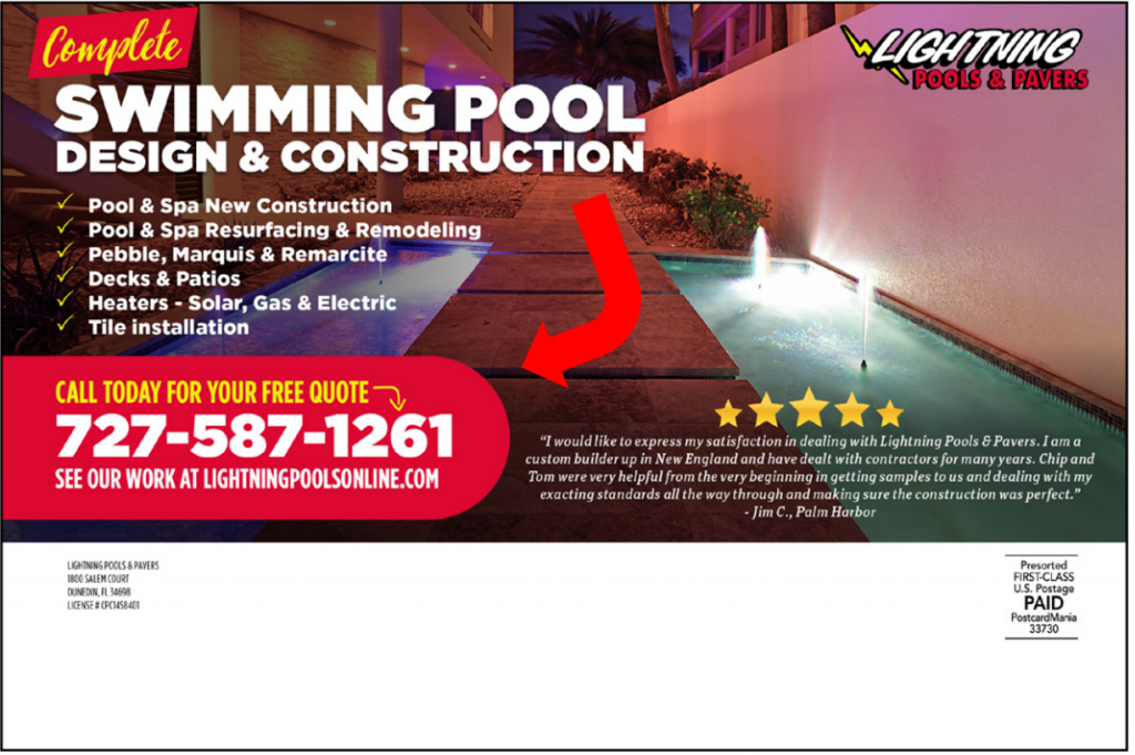
![]() Relevant images: Although the designer used the image I provided, there are too many text and graphic elements on top of the image. So now the image of the pool is way too blocked by these other graphic and text elements, and you can’t even tell the image is supposed to be a pool… it looks more like an elevated sidewalk or something!
Relevant images: Although the designer used the image I provided, there are too many text and graphic elements on top of the image. So now the image of the pool is way too blocked by these other graphic and text elements, and you can’t even tell the image is supposed to be a pool… it looks more like an elevated sidewalk or something!
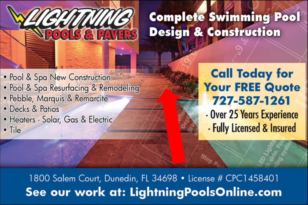
Those graphics also create other problems for this design, which I’ll get to a bit further down…
![]() Color that POPS: On this design, you can immediately see there is a contrast in color, which is what draws the eye (and our attention!) into your message. My eye is drawn to the yellow box first, which is good because it contains their phone number, call to action and an offer — but since I looked there first and the relevant images are covered by graphics, I don’t know what the free quote is for. That moment of indecision might be the different between a call and your card in the trash.
Color that POPS: On this design, you can immediately see there is a contrast in color, which is what draws the eye (and our attention!) into your message. My eye is drawn to the yellow box first, which is good because it contains their phone number, call to action and an offer — but since I looked there first and the relevant images are covered by graphics, I don’t know what the free quote is for. That moment of indecision might be the different between a call and your card in the trash.
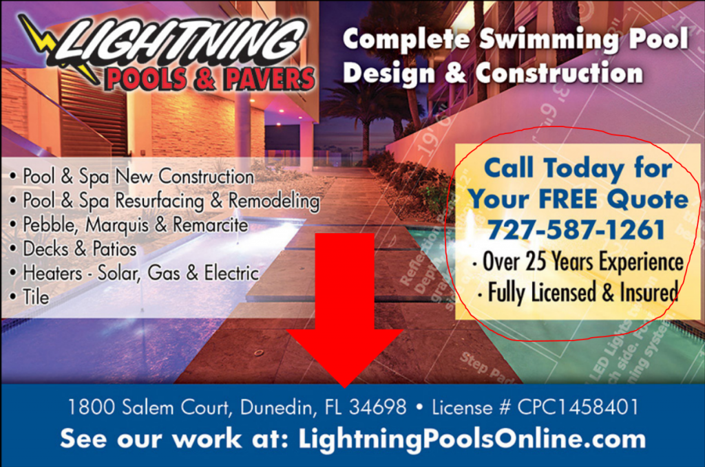
![]() Special offer: You can see the special offer in the yellow box on the front of the postcard — a FREE quote. I like how the designer arranged the special offer inside the yellow box because it draws your attention to it.
Special offer: You can see the special offer in the yellow box on the front of the postcard — a FREE quote. I like how the designer arranged the special offer inside the yellow box because it draws your attention to it.
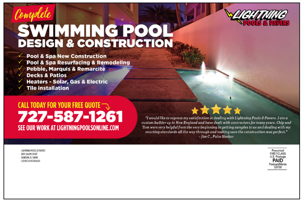
![]() Back headline (Sub-head): On the back of the postcard, I see the logo, and then I see a big block of text… but I don’t see a sub-head. (A sub-head leads the recipient into reading the back of the postcard.) Without a sub-head all that cluttered text is daunting to the recipient, and I really doubt someone would try to read all that tiny, squished text.
Back headline (Sub-head): On the back of the postcard, I see the logo, and then I see a big block of text… but I don’t see a sub-head. (A sub-head leads the recipient into reading the back of the postcard.) Without a sub-head all that cluttered text is daunting to the recipient, and I really doubt someone would try to read all that tiny, squished text.
![]() Benefits: I don’t see any benefits anywhere on this design. On the front of the postcard, I clearly see the list of features… but remember, features are NOT benefits!
Benefits: I don’t see any benefits anywhere on this design. On the front of the postcard, I clearly see the list of features… but remember, features are NOT benefits!
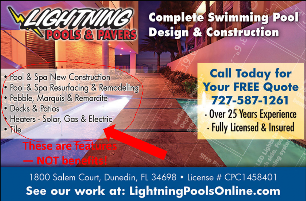
Here’s how to turn those features into benefits:
- Pool & New Spa Construction (Feature) — Turn Your Backyard into an Outdoor Oasis (Benefit)
- Pool & Spa Resurfacing & Remodeling (Feature) — Stop Leaks and Cracking Foundations (Benefit)
- Decks & Patios (Feature) — Be the Go-To Backyard For BBQs (Benefit)
- Heaters- Solar, Gas & Electric (Feature) — Save Money On Heating (Benefit)
- Tile (Feature) — Get the Custom Tiling Design You Want (Benefit)
The difference is subtle but certainly present. Now the recipient doesn’t have to spend that split second understanding how those services can improve their lives — it’s written right there in black and white!
![]() Company name/logo: Lightning Pools & Pavers is on the front and the back. Check!
Company name/logo: Lightning Pools & Pavers is on the front and the back. Check!
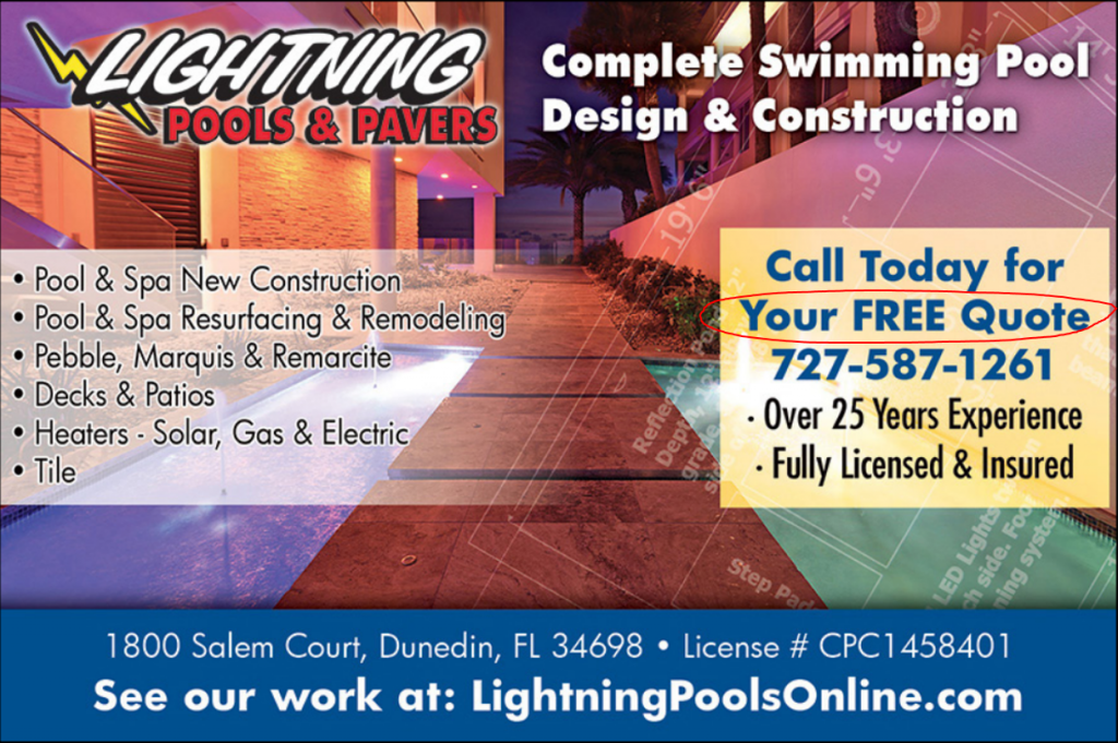
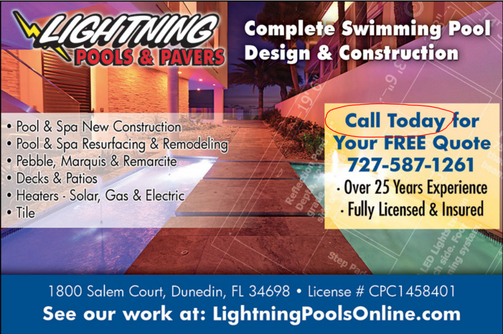
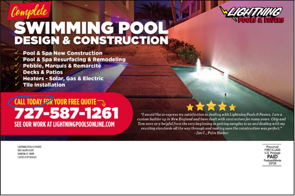
![]() Call to action: I see the call to action in the yellow box on the front… very easy to spot! I really like that designer used that yellow box to highlight both the call to action and the special offer because those 2 design elements impel the recipient to ACT. But there is no call to action on the back of the card.
Call to action: I see the call to action in the yellow box on the front… very easy to spot! I really like that designer used that yellow box to highlight both the call to action and the special offer because those 2 design elements impel the recipient to ACT. But there is no call to action on the back of the card.
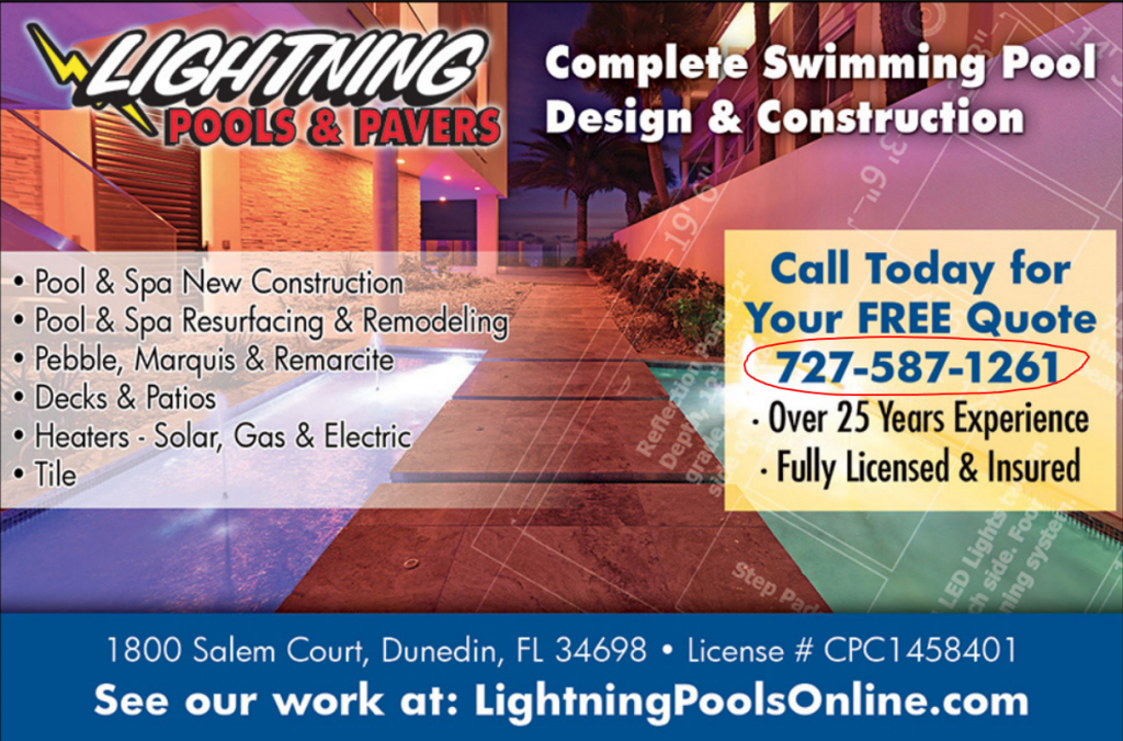
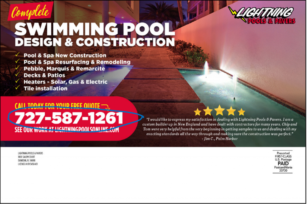
![]() Phone number: The phone number is on both sides on this design. Another check!
Phone number: The phone number is on both sides on this design. Another check!
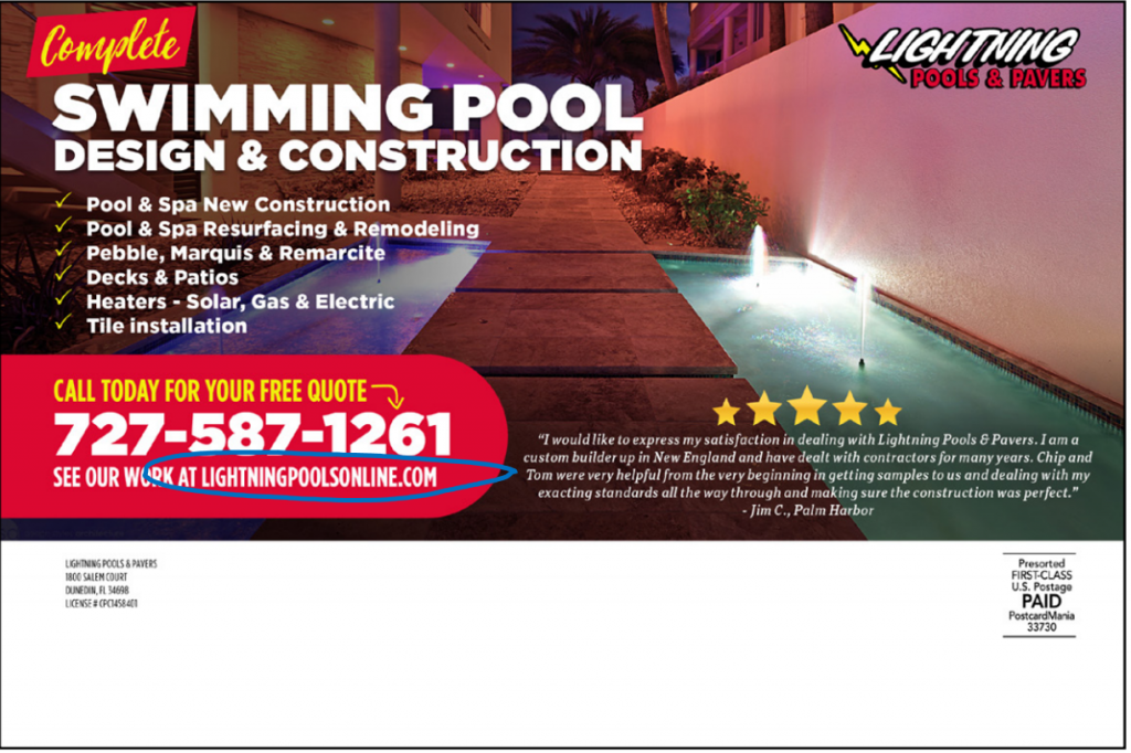
![]() Website: You can see the website URL in white bold text on both the front and the back. The truth is that 95% of interested prospects will visit your website, so you want your URL to be easy to see so they can type it into their smart phones right then and there.
Website: You can see the website URL in white bold text on both the front and the back. The truth is that 95% of interested prospects will visit your website, so you want your URL to be easy to see so they can type it into their smart phones right then and there.
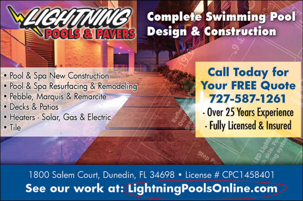
![]() Return address: The designer situated the return address on the back in white text right next to the logo — very easy to see.
Return address: The designer situated the return address on the back in white text right next to the logo — very easy to see.
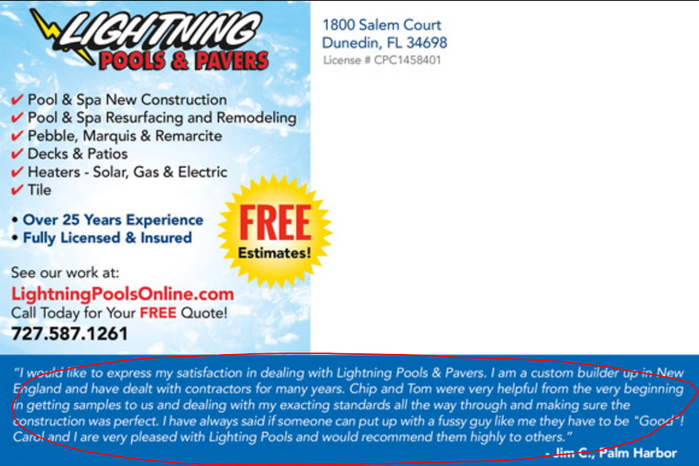
![]() 5-Star review: Although this design does have a review, the problem is it bombards the back of the postcard. Too much text (especially when it’s condensed like that) repels recipients from reading your postcard, because it looks overwhelming. You haven’t made it easy for them to understand your message, so the result is simple: they won’t.
5-Star review: Although this design does have a review, the problem is it bombards the back of the postcard. Too much text (especially when it’s condensed like that) repels recipients from reading your postcard, because it looks overwhelming. You haven’t made it easy for them to understand your message, so the result is simple: they won’t.
The back of this design could benefit from a number of things (like a sub-head or bullet points, which would make the message easier to absorb), but using a review IS a good idea.
That’s why I suggest:
Using a (nice and short!) 5-star review with a gold star graphic (![]() ) that immediately SHOWS your recipient that it is a review and that your business rocks.
) that immediately SHOWS your recipient that it is a review and that your business rocks.
Plus it takes up much less space on your postcard.
![]() Eye trail: When I look at this postcard, I feel my eyes jump around the front of it. Every has been given equal weight (which is a graphic design term meaning everything is about the same size), and this splits your attention.
Eye trail: When I look at this postcard, I feel my eyes jump around the front of it. Every has been given equal weight (which is a graphic design term meaning everything is about the same size), and this splits your attention.
Ideally, your postcard’s eye trail would do the following:
ATTRACT – The images along with the headline have to do this instantly
INTEREST – Attraction is great but once that occurs your copy has to INTEREST the recipient to want the
MESSAGE you are trying to convey.
That eye trail should lead someone to flip your card over and get your entire message.
On this design, I see the logo and yellow box first, and the last thing I do is try to understand what these images are. I’m not sure why I’d flip it over, but even if I did, the postcard falls flat because of all the text dominating the back, and I don’t feel like I want to keep reading it.
KEY TAKEAWAY:
This design was a little better than Competitor A because at least I don’t feel immediately confused by the message. With some study, I do understand that this is a pool construction and remodeling advertisement. But the truth is nobody is going to take the time to do a little study when they get promo in the mail. This postcard would probably get thrown away and never be turned over.
My favorite parts of this design:
The call to action is highlighted in yellow and really pops, and I can find the phone number fast for my free quote.
But:
The front of this postcard remains so overwhelmed with text elements, I can’t imagine someone actually plucking it out of the mail stack to read it.
I certainly wouldn’t and I have an oversized pool that is ready for a makeover — so I am a super qualified and potentially HOT prospect for this business. And yet this is not a postcard I would read.
At the end of the day, your customers don’t want to de-code your communication — instead they want it clearly laid out in front of them.
This postcard design has failed in that aspect.
Let’s see how Competitor C, our final competitor, did:
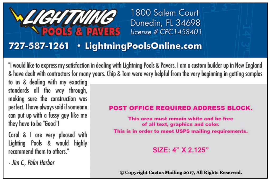
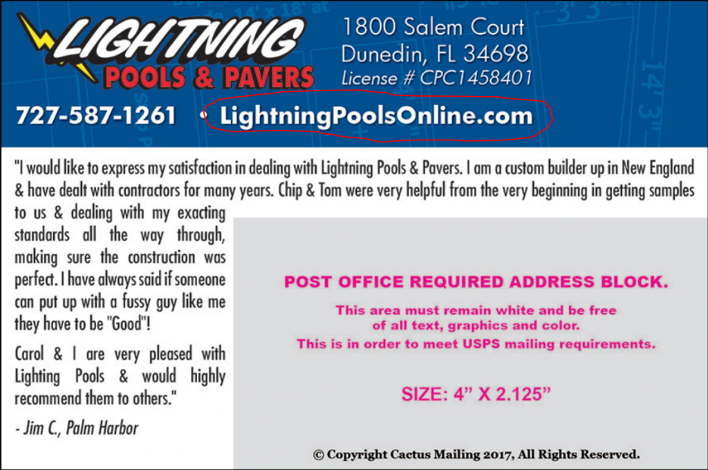
COMPETITOR C
*Design fee= $149 (basically the same price as Competitor B’s design)
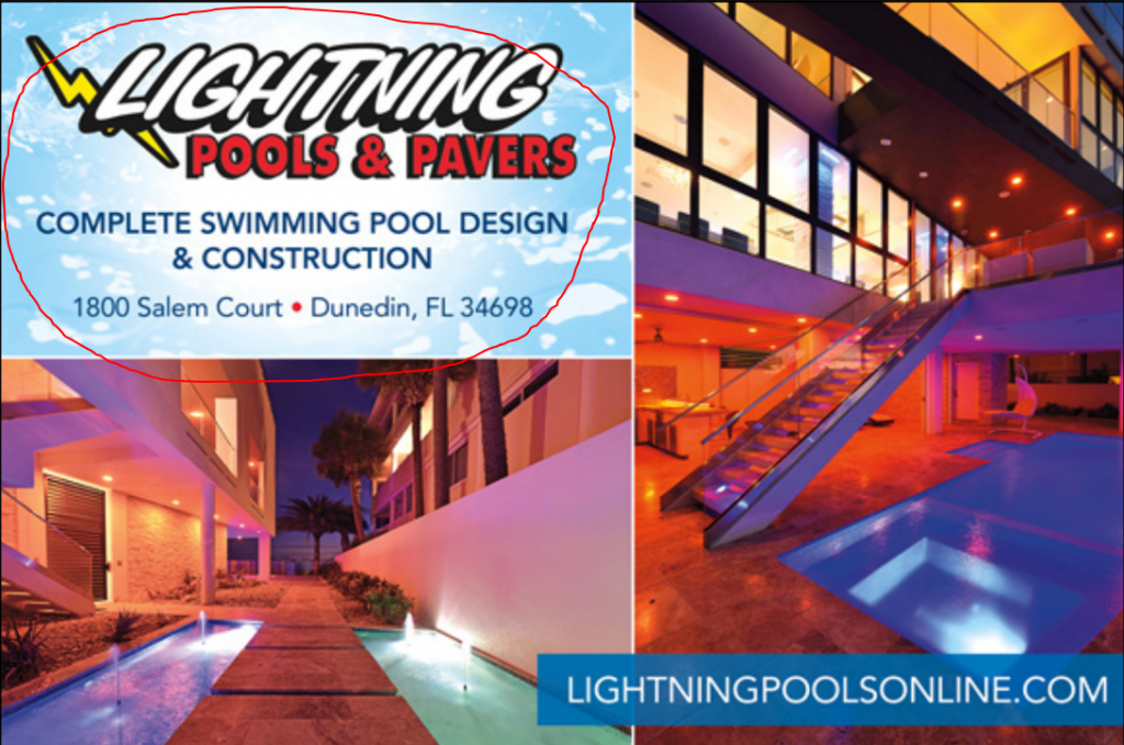
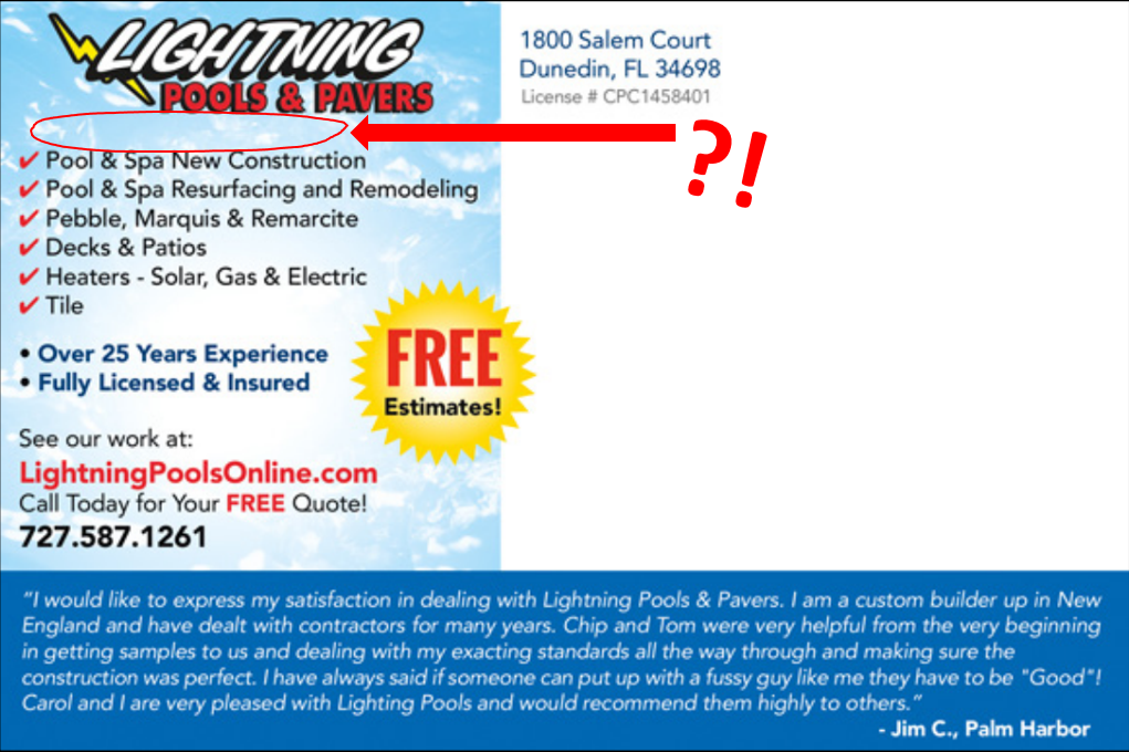
![]() Clear and BOLD headline: For one, the blue “Complete Swimming Pool Design & Construction” doesn’t stand out against the light blue textured background. But more importantly:
Clear and BOLD headline: For one, the blue “Complete Swimming Pool Design & Construction” doesn’t stand out against the light blue textured background. But more importantly:
The logo completely dwarfs the entire headline.
Again, your logo is not the element that reaches out to grab your recipient — that’s your headline’s job. The blue “Complete Swimming Pool Design & Construction” is buried beneath the loud logo, which leaves your recipients unaware of your marketing message — that you can redesign and construct their pool.
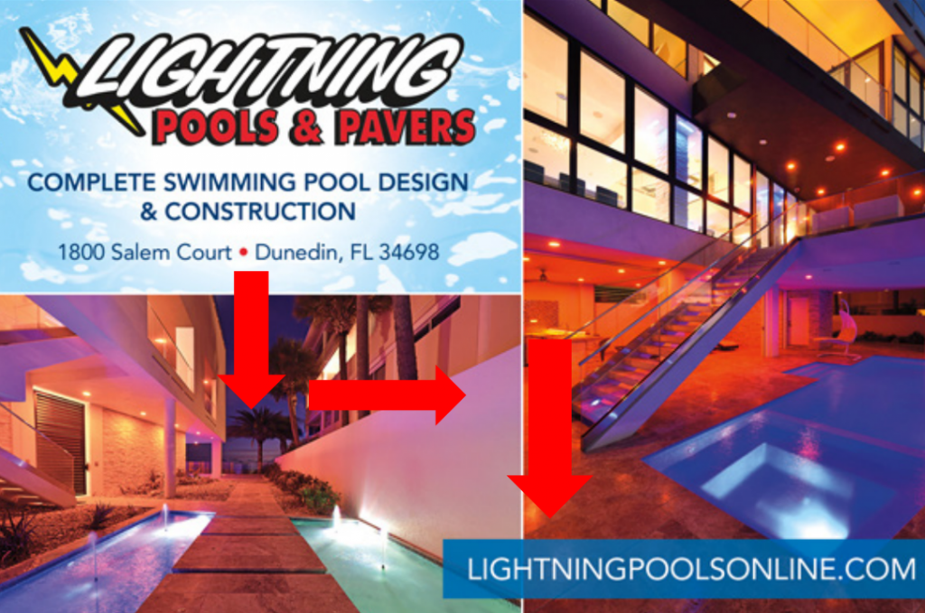
![]() Relevant images: The images are dark, and they don’t communicate that THIS IS A POOL COMPANY. To be honest, I think the business comes off as a lighting company.
Relevant images: The images are dark, and they don’t communicate that THIS IS A POOL COMPANY. To be honest, I think the business comes off as a lighting company.
Yes, we provided these images, but on the postcard… they just don’t work.
![]() Color that POPS: The use of the light blue background on the front and back of the postcard makes the text stand out more visibly, since the photos are so dark. This creates a good contrast.
Color that POPS: The use of the light blue background on the front and back of the postcard makes the text stand out more visibly, since the photos are so dark. This creates a good contrast.
On the back, a bright yellow starburst clearly highlights the special offer — the recipient will surely see this. I love it!
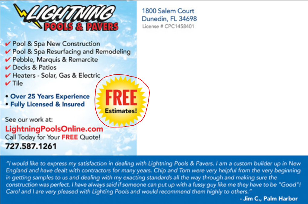
![]() Special offer: I can easily see the special offer on the back in that bright yellow starburst: FREE estimates! Love the use of the bright yellow for the offer. (Apparently I’m a fan of yellow suddenly!)
Special offer: I can easily see the special offer on the back in that bright yellow starburst: FREE estimates! Love the use of the bright yellow for the offer. (Apparently I’m a fan of yellow suddenly!)

People LOVE free offers… but free estimates are a little commonplace.
Instead, you can offer your prospects a coupon to use (and put it in those awesome dotted lines that scream COUPON). This would give them a generous (but viable) amount of money off your product or services, which can help with response.
FREE report: Get 128 proven winning marketing offers from 17 industries
![]() Back headline (Sub-head): I don’t see a sub-head on the back… just the logo.
Back headline (Sub-head): I don’t see a sub-head on the back… just the logo.
I hate to be frank, but your logo probably means just about ZILCH to prospects. They probably don’t know you, so what is gained by making your logo top and center of your advertisements?
Nothing!
It’s just wasted marketing real estate that could have been used for a great headline.
And on the back, your postcard needs to have a sub-head to draw the recipient in to read the back of your postcard. But I do like that they have easy-to-read bulleted items on the back.
![]() Benefits: Not a benefit in sight! The list of features does not illustrate benefits, much like the last one. Though I will say that I much prefer the look and placement of these features/services over the previous design!
Benefits: Not a benefit in sight! The list of features does not illustrate benefits, much like the last one. Though I will say that I much prefer the look and placement of these features/services over the previous design!
Bullet points are:
- Great and…
- Easy to scan!
See?
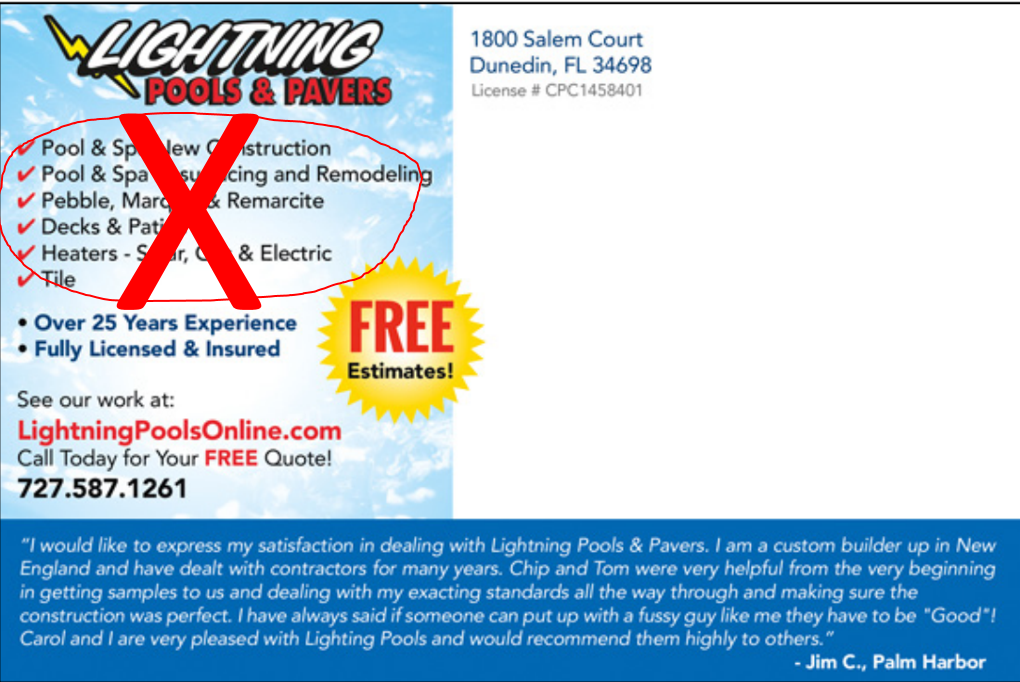
None of the competitors bothered to list benefits, and this is probably because we didn’t purchase copywriting services. (A copywriter composes the words on an advertisement so that someone is likely to respond.)
Here’s the deal:
Unless you list the benefits of doing business with you on your postcard, you can’t assume prospect will understand how you can make their lives better or easier.
List the benefits out clearly (in bullet points!), and your recipient will know WHY your product or service is valuable.
![]() Company name/logo: Lightning Pools & Pavers is on the front and the back. Yep, that’s a check!
Company name/logo: Lightning Pools & Pavers is on the front and the back. Yep, that’s a check!
![]() Call to action: The call to action is on the back on the lower left hand side — though it’s definitely small. Do you see it?
Call to action: The call to action is on the back on the lower left hand side — though it’s definitely small. Do you see it?
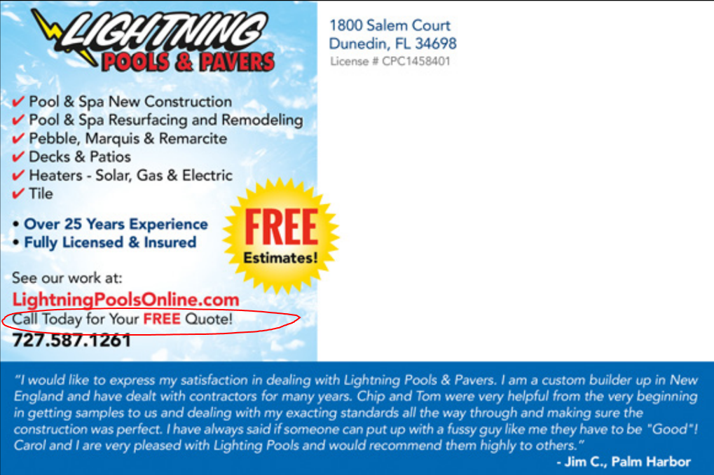
Your call to action should be BIG, so your recipient can’t help but notice it right away. This one’s a little small, but it is there. They get a (somewhat reluctant) check.
![]() Phone number (back only): This postcard only has the phone number on the back… so unless the person reading this postcard flips it over to the back side, they won’t see the phone number.
Phone number (back only): This postcard only has the phone number on the back… so unless the person reading this postcard flips it over to the back side, they won’t see the phone number.

You want it to be EASY for your prospect to know how to reach out to you…
So you get calls (hello, leads!)
![]() Website: The URL is located on the front in the lower right hand blue bar, so not only is it there, it stands out. Enthusiastic check!
Website: The URL is located on the front in the lower right hand blue bar, so not only is it there, it stands out. Enthusiastic check!

![]() Return address: I can see the return address on the back of the postcard, very easy to spot in blue.
Return address: I can see the return address on the back of the postcard, very easy to spot in blue.
![]() 5-Star review: I don’t see a 5-star review on this design, but I do see the review featured in the blue bar on the bottom of the back side.
5-Star review: I don’t see a 5-star review on this design, but I do see the review featured in the blue bar on the bottom of the back side.
Again, the review is too long and small for anyone to actually read, but I do appreciate that this designer didn’t fill up the entire back of the postcard with one review.
Remember: the 5-star review is optimal because it IMMEDIATELY shows your prospects your business is credible even before they’d have to read anything.
![]() Eye trail: This postcard actually has easy-to-follow eye trail, and here’s why:
Eye trail: This postcard actually has easy-to-follow eye trail, and here’s why:
It’s not dominated by too much text/clutter, and the elements are arranged in a clean, linear fashion allowing your eyes to move from top to bottom and from left to right. We in the Western World are used to reading in this way, so recipients will easily read this postcard and follow along with the marketing message.
KEY TAKEAWAY:
Competitor C’s postcard is designed to grab recipients’ attention and encourage them to read the rest of the postcard.
Where this postcard design falls short is in how clearly it communicates to the recipient.
If the postcard had benefits listed with a larger call to action, the recipient would know more of WHY to call in for the free estimate. All in all, it’s not a horrible design, but there is room for it to be stronger so that recipients are impelled to call in.
So there you have it — those are the postcard designs we received when we bought from three competitors.
Sending out postcards from these competitors would likely raise awareness of a business called Lightning Pools & Pavers, but the question is:
Will postcards like these reach the target market and consistently drive good, qualified leads to call in?
Well, in my experience helping over 76,000 small businesses with their marketing since 1998…
Competitor A: Definitely not.
Competitor B: Probably not.
Competitor C: Probably not.
They’re kind of the equivalent of posting a flyer — maybe you’ll get some awareness, and the really, really interested prospects will delve in further.
In order to reliably and consistently bring in new leads, you have to:
- Have a good mailing list of people qualified to buy from you
- Mail postcards consistently (every week or month, depending on how competitive your market is)
- Include ALL 10 of the elements we measured these designs against
Before I offer MY final analysis, I want you to see what my graphic design team did for Lightning Pools & Pavers.
Again, to reiterate —
My team didn’t know I was doing this blind shopping project, and they didn’t know their designs would be featured in this analysis.
So let’s see what they did:
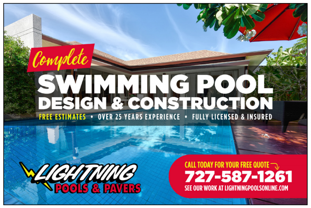
PostcardMania EXAMPLE 1:
*Design fee= $99
(Partial design, using copy and images provided)
Note: this is $50 LESS than both Competitor B and Competitor C’s design fees.
![]() Clear and BOLD headline: I can immediately see the clear and bold headline — it’s VERY easy to know what this company offers: “Complete Swimming Pool Design & Construction.”
Clear and BOLD headline: I can immediately see the clear and bold headline — it’s VERY easy to know what this company offers: “Complete Swimming Pool Design & Construction.”
The headline is large and centered in the middle front of the postcard so it commands your attention immediately!
A headline that commands attention is what you want, and… funny…
Every one of our competitors missed this HUGELY critical element.
![]() Relevant images: The images remain unclear, but if you buy a partial design and provide images, our designers will compose your postcard based on the materials you submit.
Relevant images: The images remain unclear, but if you buy a partial design and provide images, our designers will compose your postcard based on the materials you submit.
BUT!
There is a really exciting aspect to this, which I will get to shortly…
Let’s go over the rest of the elements first.

![]() Color that POPS: You can immediately see that the contrast in color is noticeable in this design.
Color that POPS: You can immediately see that the contrast in color is noticeable in this design.
The white headline visibly pops against the dark transparent bar in the middle of the front of the postcard, as well as the darkness of the original photo. Plus, the call to action and the special offer are located in bright red boxes on both the front and back.
See how “Complete” on the front is in yellow? That’s done on purpose!
Yellow is an effective color at standing out on postcard design, and we use it to highlight important elements. For example, notice that it’s also used in the call to action, too!
![]() Special offer: The special offer is highlighted in yellow text with the bright red box: FREE QUOTE.
Special offer: The special offer is highlighted in yellow text with the bright red box: FREE QUOTE.


Notice we have the special offer on the front AND the back sides because we want to make SURE the recipient sees this and calls in for a free quote!
![]() Back headline (Sub-head): The sub-head on this design grabs the reader’s attention and entices them to keep reading the information on the back.
Back headline (Sub-head): The sub-head on this design grabs the reader’s attention and entices them to keep reading the information on the back.
Do you see it? “Swimming Pool Design & Construction”
Just a reminder that none of our competitors had a sub-head on their designs ☺
![]() Benefits: On this design, my team tweaked the features that were given, but as you can see they still aren’t truly benefits.
Benefits: On this design, my team tweaked the features that were given, but as you can see they still aren’t truly benefits.
If you want to make SURE your postcards include all 10 elements off the bat (and don’t consider yourself a writer), you can pay just $100 for our professional copywriting services. Our copywriters will not only turn those boring features into meaningful benefits, but we’ll ensure that all marketing copy communicates the company’s message perfectly to their target market. And you still get unlimited changes!

![]() Company name/logo: I see the Lightning Pools & Pavers logo on the front and the back. Love it!
Company name/logo: I see the Lightning Pools & Pavers logo on the front and the back. Love it!
![]() Call to action: The call to action is located both on the front AND the back in the red boxes with yellow text. You can’t miss it — and that’s the point!
Call to action: The call to action is located both on the front AND the back in the red boxes with yellow text. You can’t miss it — and that’s the point!

![]() Phone number: The phone number pops out in bold white text on the front and the back — again, in the bright red call-to-action boxes.
Phone number: The phone number pops out in bold white text on the front and the back — again, in the bright red call-to-action boxes.

![]() Website: You can see the white URL in the red boxes with the call to action, special offer, and phone number. We make the URL easy to find because we know 95% of prospects will visit the website before taking action.
Website: You can see the white URL in the red boxes with the call to action, special offer, and phone number. We make the URL easy to find because we know 95% of prospects will visit the website before taking action.

![]() Return address: The return address is on the back of postcard. It’s not large because it doesn’t need to be. Anybody who really needs your address nowadays will simply Google it.
Return address: The return address is on the back of postcard. It’s not large because it doesn’t need to be. Anybody who really needs your address nowadays will simply Google it.
![]() 5-Star review: Hooray! It’s finally there. The 5-star review (with the stars!) shows up in the lower right hand corner on the back.
5-Star review: Hooray! It’s finally there. The 5-star review (with the stars!) shows up in the lower right hand corner on the back.

See how the 5-star review layout makes it very easy to see that Lightning Pools & Pavers is credible? That’s what you want. No longwinded reviews taking up way too much space.
![]() Eye trail: This design has excellent eye trail, and here’s why:
Eye trail: This design has excellent eye trail, and here’s why:
The postcard’s text elements are laid out so your eyes easily flow down the postcard, ending up at the most important part: the red boxes which highlight the call to action and special offer.
There’s no extra clutter, and all design elements are spaced out well enough so your eyes are directed to where they need to go: the call to action!

KEY TAKEAWAY:
This postcard will generate leads, unlike the designs of the 3 competitors.
It grabs attention, and it’s very clear that this is a pool company specializing in design and construction.
More importantly, the call to action and the special offer are in two red boxes, and the phone number pops out at you. Anyone who sees this postcard will notice it and read it, and moreover: they’ll know what they need to do to get the special offer (call today!)
Now I want to show you how my team would fully handle a client’s postcard design from start to finish.
When you get your postcard designed with us, my team takes your images, business information, special offer, logo, and overall marketing goal into mind and designs a postcard.
But… your design does NOT stop there.
Your design is then sent back to you for review. Included with your design is a checklist of each of the 10 elements — which are fully defined — showing you exactly which elements are successfully included on your postcard.
If there are elements missing from your postcard, you’ll see which ones are missing.
This gives you an opportunity to improve your design even more, which in turn improves your chance of getting a good response and even more new business!
You can send your design right back to us with any corrections, and we’ll update it for you.
Throughout this process, my customer service team helps you review your design and make sure that all changes are in the interest of improving response and are speedily done.
Before any printing happens, you must approve the final design of your postcard.
NOTHING gets printed until you love your postcard and you approve it as ready for print.
We not only want you to love your postcard, but it’s important to us that every single element is geared towards getting your business fantastic results — because results are what we live for!
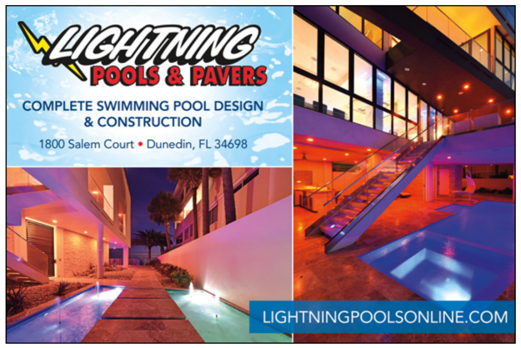
For this last example, my team sent me back my design (the one you just saw above), and they recommended I change the images. I let them choose the images so they’d be relevant to the company’s message, and here’s what they did:
PostcardMania EXAMPLE #2
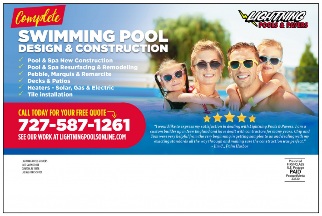
*Design fee= $0 (our changes are unlimited so they’re included in the original $99 design fee)
Just look at those images!
Finally, they’re actually relevant to the fact that this is a pool company.

You can see that these images not only make it very obvious that this is a pool company, but they also portray the #1 biggest benefit of having a new or redesigned pool:
Having fun and enjoying your pool!
Images of happy people swimming in a bright blue pool immediately communicates that as a customer of Lightning Pools & Pavers, I’ll get the benefits of having a gorgeous pool to swim in and enjoy with my family.
Who doesn’t want that!?
So out of all the designs we’ve analyzed, THIS is the design I’d let you take to the bank.
Every single one of the 10 elements of postcard design are on this postcard, and it’s the one design out of everything you’ve seen here that will most likely generate lots and lots of leads!
So there you have it!
If you’ve read this far, you’ve just learned a TON about postcard design, and my hope is that you’ll use this data when you’re planning your direct mail marketing. We use exactly what I shared with you every single day at PostcardMania, and I can tell you that designing postcards with these 10 elements on hand is what gives our clients results.
After all —
We’re not just a postcard printer.
I created PostcardMania to be a marketing company.
We care about your RESULTS. Other guys will print anything you ask them to regardless of whether it will get a response. Of course we will print whatever you want us to as well, but we will show you that it doesn’t tick these 10 boxes and try to get you to do it correctly.
That’s why I hired a full-time Results Manager.
My results department has amassed results from 76,438 (and counting) companies’ marketing campaigns to help YOU create a marketing campaign for your business solely based on what generates leads.
I’m extremely proud of my graphic design team.
And we want to help you!
If you have questions about how postcard marketing can help your business generate more leads and sales, call one of my marketing experts at 800-628-1804. The consultation is absolutely FREE! And of course, you can always email me directly at Joy.Gendusa@PostcardMania.com.
Best,
Joy
16 Comments
Not even close LOL
I’m a HS dropout! School of HK?? Hard Knocks! I appreciate your comment! Thanks so much!This is awesome! Thank you for sharing this.
You’re welcome, Holly!! So glad you enjoyed it.
Joy,
I’m really enJOYing this series.
It’s about time to start a new campaign or two.
Let’s talk.
All the beat,Ken
Ken, absolutely! I’ll have your marketing consultant Sammy reach out to you!
I would like Joy to take a look at my current post card design with PostcardMania to see if it meets the standard discussed above.
Very helpful article. I will contact you when I start my screen printing business.
Roosevelt, we very much look forward to helping you grow your business! Please keep us posted on your progress and let us know when you’re ready to start a campaign. Thank you so much for reading!
Hi Clement!
I’ll be sending you an email shortly with my notes, I’ll look at your postcard design when I get to the office.
-JoyHello Ms. Gendusa
You are a very driven and impressive young lady. I became aware of you from an article in “Fast Company” magazine and have been tuning into you periodically. You make that easy with your aggressive emailing. You walk the talk, which is very important from a consumer perspective. I am a real estate agent and send out a lot of post cards. I have picked up a lot of very good tips from you. Thank you for that.
Glenn
Hello Glenn,
Thank you SO much! I’m so glad you find these tips useful. That’s exactly what we love to hear! If you ever want a second opinion on your postcard marketing, give our marketing consultants a call at 800-628-1804. It’s totally free!Hello Glen,
I saw your webinar in YouTube. It is very informative, specifically for people who are skeptical about Direct mail campaign. I’m about to sign up my campaign with Amy and I’m curious to see how your design team will include those 10 elements that you mentioned. It is a great article, very descriptive. I enjoyed it.
Thanks,
SumanWe’re excited to work with you, Suman! Thanks for choosing PostcardMania!
I think what you do here is so wonderful that I applied to work here and had an interview last week. I’m on pins and needles awaiting to hear back. I have a few ideas of my own that I feel would contribute another 20-30% growth for the company in the coming year. You’re article is inspirational and dead on great advice. Maybe I’ll have the honor to be working side by side with you soon.
David, I’m so happy to hear that you find these posts helpful! Let us know if there’s any way we can assist you in the future!


Hi Joy!
Do you have an MBA?! I am currently enrolled as an MBA student and it’s crazy how much what you have been telling us aligns with my Marketing Strategy course – especially about positioning our business to be distinguished from the competition. We just talked about that last night.
Keep it coming!