Grocery Website Design Analysis — Boulder, CO
Updated on July 15, 2021As always, these small business website design analyses are here so you can see examples of website designs that incorporate all of the 5 essentials of business website design. I’m your host Shannon Johnson (PostcardMania’s Web Design Specialist), and my next analysis comes from the grocery industry. The business, Mile High Organics, is located in Boulder, CO.
See the site in action: www.milehighorganics.com
Design:
First impression: I love the visual appeal of this site. It contrasts orange and green. It uses subtle diagonal stripes at the top to give it some texture, and uses a white background to give it a really clean look. This is the website of an organic grocery, so a look that is bright, crisp and clean is a perfect match for their marketing message. They also have a great image that fills up most of the homepage. It’s a clean countertop occupied by lots of fresh veggies, breads, eggs, and cheeses. I swear; this site was making me hungry! It pulls you in right away.

Marketing:
Simplicity and Engagement— This site makes a fairly complicated process very simple. It breaks everything down into 3 pages, and as a visitor you really don’t have any questions that those 3 pages don’t answer. It gives you everything you need quickly and efficiently. That is perfect for the skimming and browsing modern consumer. They also use great images and design elements to keep you engaged on every page.
Benefits on the homepage— At the bottom of the homepage image, they list three benefits for prospects to see, like the fact that their groceries are delivered, and you don’t have to be home for the delivery. It gives prospects a sense of how easy it can be for them to have great organic groceries in their house all the time. They start thinking they can turn over that leaf and make their home completely organic.
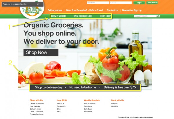
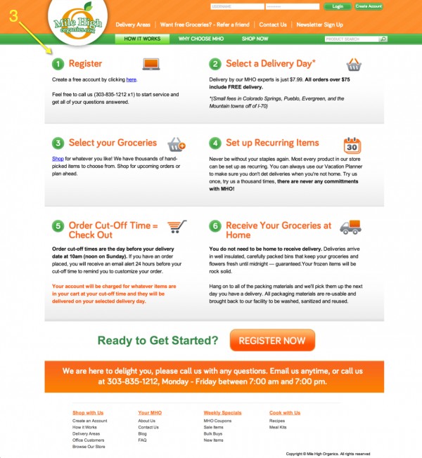
How It Works Page— This is a great move. How does it work? That’s exactly what consumers are wondering when they come to this site. “How can you deliver fresh produce to all your customers reliably?” “I don’t even have to be home? Won’t the groceries go bad?” Mile High gets in front of these hesitations and answers them with an engaging, easy-to-follow, step-by-step guide to the whole process.
SEO (Search Engine Optimization):
SEO is the practice of optimizing the copy on your website so that search engines can understand what your website is about and how they should rank it for particular keywords. This website is optimized for keywords like “organic groceries” and “Denver.” This is what most quality prospects of Mile High Organics will be typing into Google to find the type of groceries they offer, so using these keywords on their site will help those prospects find them.
Copywriting:
There isn’t a lot of copy on this site AT ALL. It really uses images well to communicate everything you need to know. The How It Works page has copy that clearly explains the purchasing and shipping process. Their About Us page has some warm, personable copy to build a connection with prospects. That’s all you really need for a business like this one.
Programming:
Programming is always a tough one to spot. If you can’t spot it, it means it’s all working correctly. I didn’t notice any issues on this site. It ran smoothly. Navigation was easy and intuitive. All the images were placed well. Overall, its programming looks top notch.
Does your site master all 5 of the small business web design essentials? Find out by downloading our Ultimate Small Business Web Design Checklist.
Best,
Shannon