The Gold Medal for Postcard Marketing Goes to…
Updated on July 15, 2021
I don’t know about you guys, but I am very excited for the Olympics!
It’s so inspiring to watch the athletes, who have worked hard to be the BEST at their sport, achieve their dream of becoming an Olympian.
In honor of the Summer Games, I thought it would be fun to award some medals to a few of our clients who are postcard-marketing champions — and give the rest of you some ideas for your marketing!
Read on to see what makes a direct mail postcard worthy of gold, silver or bronze…
My creative team pumps out well over 300 new postcard designs every week, and I have to say: When I look at them, I’m super impressed!
So many of my clients are following my advice and using the 10 essential elements of postcard design!
Let’s look at some award-worthy designs that have recently come off the press…
The gold medal goes to:
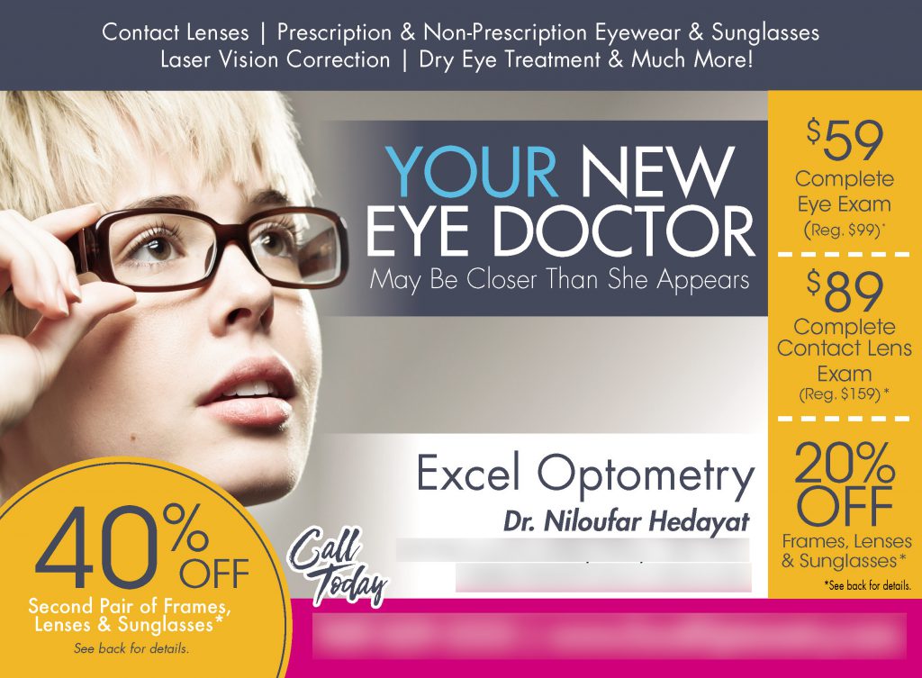
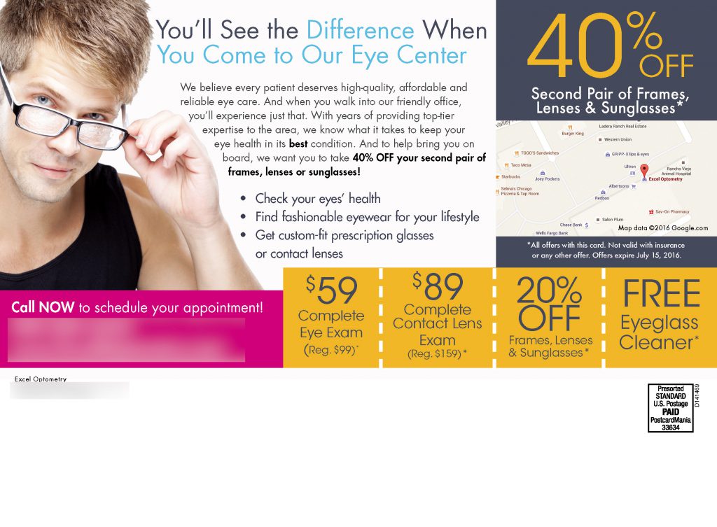
I absolutely love the bright colors on this card! In fact, it has a LOT of good stuff going on:
- A strong call to action (CTA) that stands out
- Several great offers (with an expiration date!)
- The dotted lines between the offers scream “COUPON!”
- A sub headline that leads into text
- Bullet points that are…
- Benefits (Rather than just stating their features!)
- A map showing their location (this saves prospects the step of looking them up on Google maps!)
But I think my favorite thing about this card is the eye trail. A good eye trail makes people want to keep reading — which is obviously super important if you want your message to be read!
Notice how on the front and the back of this card, the people in the photos are facing the copy (the text)? If they were facing away, your eyes would be drawn off the card rather than into the text. (I’m a designer by trade — I notice these things!)
Great postcard, guys. A-plus!
The silver medal goes to:
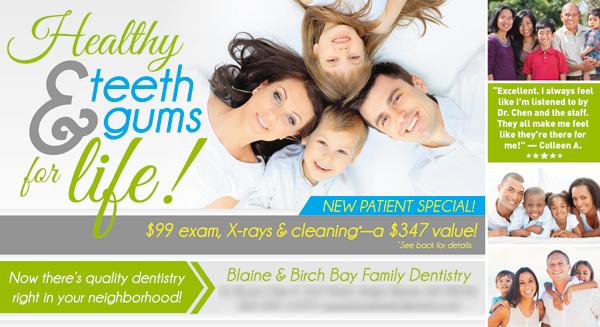
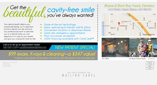
Here’s what I like about this dental postcard:
- The clear, bold headline
- The supporting image of a smiling family
- Bright, attractive colors
- The sub headline on the back (that’s a benefit!)
- Photos of the doctor and the office (this increases prospects’ affinity for the practice)
- A map to help prospects locate their office
- Contact information is easily seen on both sides
- The testimonial helps establish trust
The only improvements I would suggest are making the bullet points benefits instead of features and making the call to action a bit bigger and a completely different color so it stands out more — minor quibbles, considering how much they got right. It would also serve them well to add any five star review they got online — just the five stars, a portion of the review and the name of the person that posted it.
Well done!
The bronze medal goes to:
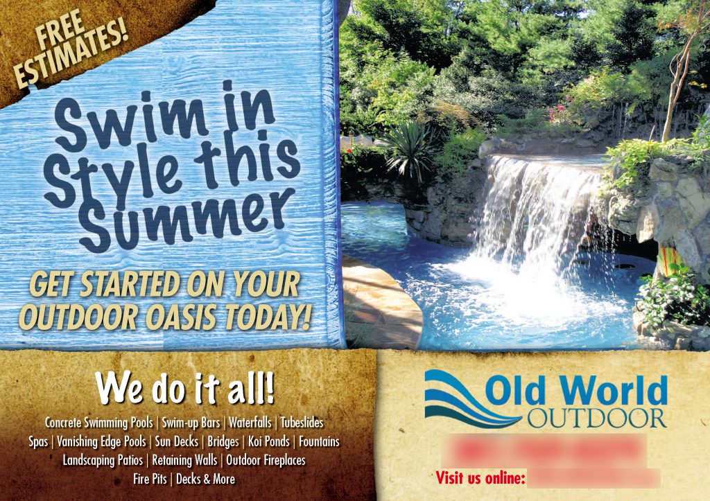
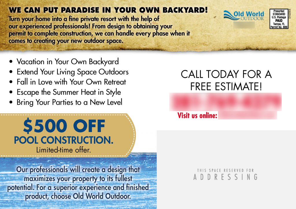
The aesthetics aren’t my favorite, but this postcard is so PACKED with benefits, I had to give it a medal!
Using benefits on your postcard tells your prospect what YOU will do for THEM — how you will solve their problems or improve their life. Many businesses only include their features — that is, what they offer — on their marketing materials.
When you use benefits, you’re thinking about your prospect’s needs and point of view!
But benefits can be tough to nail down — so it always makes me happy to see companies using them!
Here’s what else I like about this card:
- The bold headline and supporting graphic
- TWO offers (free estimates and $500 off)
- A strong call to action (in a completely different color from the rest of the card)
- A sub headline leading into text, plus bullet points
The only problem I have with this card is that it lacks trust elements — most importantly, a return address!
Including a return address not only helps you keep your postage costs down (undeliverable postcards come back to you, so you know which addresses on your mailing list need to be updated), but it tells prospects that you’re a REAL business with a physical location.
Plus:
When I went to this company’s website, I saw a Better Business Bureau seal — I’d love to see that on their postcard, too!
Honorable mention:
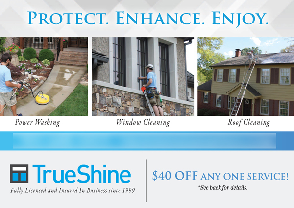
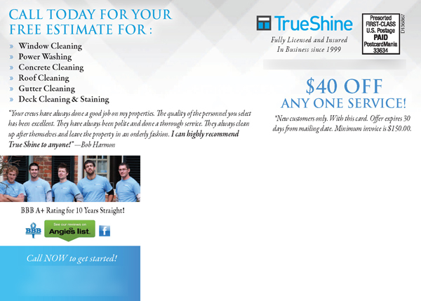
This postcard does a lot of things right:
- A clear headline (PLUS it’s a benefit!)
- Supporting graphics — you know IMMEDIATELY what they’re offering
- Trust elements (testimonial, staff photo and trust seals)
- Sub headline and bullet points
- An attractive offer
If I lived in these guys’ service area, I would definitely call them!
Honorable mention:
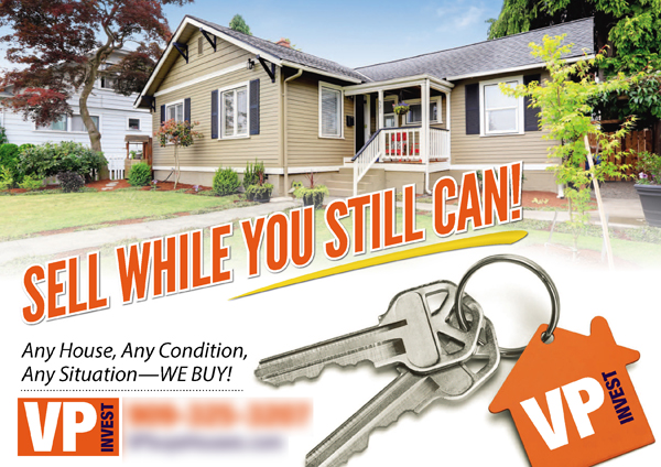

I really like this real estate investor postcard. The eye trail is amazing — I love how the keys point right to “Any House, Any Condition!”
It also has:
- A great headline
- Excellent supporting graphics
- Contact info on the front and back
- Sub headline and bullet points that are…
- (You guessed it) Benefits!
Are you inspired? I hope so! These guys are bringing it — they really know what they’re doing! Our marketing experts can help you craft a medal-worthy postcard (or website, or pay per click campaign) for your small business, too. Call 800-628-1804 — the consultation is free! Want me to critique your postcard? Email it to me at Joy.Gendusa@PostcardMania.com!
And if you really want to be a champion marketer, register for the Small Business Owners Growth Summit here at PostcardMania headquarters September 28-30 — it’s only $97 for clients!
Best,
Joy
6 Comments
Haha, we already know your postcards are successful, Nick! Sometimes we like to shine a little limelight on other people too. 😉


So sad. I didn’t even get an honorable mention.