Direct Mail Postcard Design: Music Studio in Haverhill, MA
Updated on July 15, 2021More customers and revenue. That’s what you get from a well-designed postcard, yes?
Yes.
But in order to get a well-designed postcard, you have to know the 10 critical elements every postcard needs. It took me 15 painstaking years to discover them, but you master them much quicker than that with my help!
Now, I could just tell you what those elements are (and you can read about them here). But if you are a hands-on, visual learner (like me), you’ll want examples. So every week, I’ll pull a winning postcard design from PostcardMania’s files and show you why it works.
This week’s postcard design comes from DeAngelis Studio of Music and Arts in Haverhill, Massachusetts. Let’s do this thing.
NOTE: The more you familiarize yourself with good marketing principles, the easier it is to implement them in your own marketing! I encourage you to check back regularly for the latest postcard design analysis (or better yet, sign up for email alerts!).

1. Headline
The headline is a pivotal element of your postcard, because people use it to decide whether or not they’re going to read the rest of the card. If your headline is boring, too long or they have to think for more than five seconds about what it says, the postcard goes in the trash. If it’s quick, engaging and intriguing, prospects keep reading to learn more.
The headline on this card is “A Fresh, Fun Approach to Music and Arts Education.” Boom. Plus, the largest element – which you read first is simply “MUSIC & ARTS EDUCATION. Right there it tells you what this studio is offering you. They offer a fun, creative environment for developing their child’s musical or artistic talents. This headline is crystal clear and, in the right hands, highly desirable. The only possible improvement to the headline would be to incorporate something about it being for kids if that is who they are targeting with the piece.
2. Images
The images you choose for your postcard reinforce the message. They help prospects visualize benefits, and also set the overall tone for the postcard.
This studio chose a picture of a young child jamming on a huge adult-sized electric guitar with a huge smile on his face. The background is a rocking concert crowd. We love the image that they chose and feel like it goes perfectly with the card!
3. Colors
Color choices matter because they help set the tone of your card, get prospects’ attention and reinforce your marketing message. You don’t always have to go with bright colors to create an engaging visual appeal, although that is often very effective. You just need to choose colors that are consistent with your brand and your marketing message.
For this business, they wanted to use bright colors. They’re artsy and creative, and their message is about “a fresh, fun approach to music and arts education.” They really needed colors that popped off the card! They went with yellow and orange contrasted by black background accents. This pumps up the energy and excitement – a perfect match for the card’s tone. I really do love this card so far!
4. Sub-Headings
The sub-heading is the headline on the back of the card. It continues the message that the front of the card started. Think of your postcard like the opposite of a mullet: party in the front, business in the back. Once the prospect is sufficiently intrigued by the front of the card, you need to give them another engaging headline on the back to ease them into the body copy (where you reveal all the benefits you offer them).
DeAngelis chose the sub-heading “Nurture your child’s talents.” This is quick and to-the-point. Parents want their children to maximize their potential, and they know that requires developing the talents that come naturally to them. So this sub-headline works, but it could benefit even more by mirroring the sentiment of the main headline. Something like, “You child will learn, improve, and have a blast!” incorporates the “fun” aspect from the front of the card.
5. Benefits
The benefits your services provide to prospects and clients are the main event of your marketing postcard. This is the big selling point that shows prospects why they should choose your company over your competitors.
The DeAngelis Studio promotes benefits like one-on-one lessons, fun lessons, flexible scheduling and exciting performance opportunities to showcase the children’s new abilities.
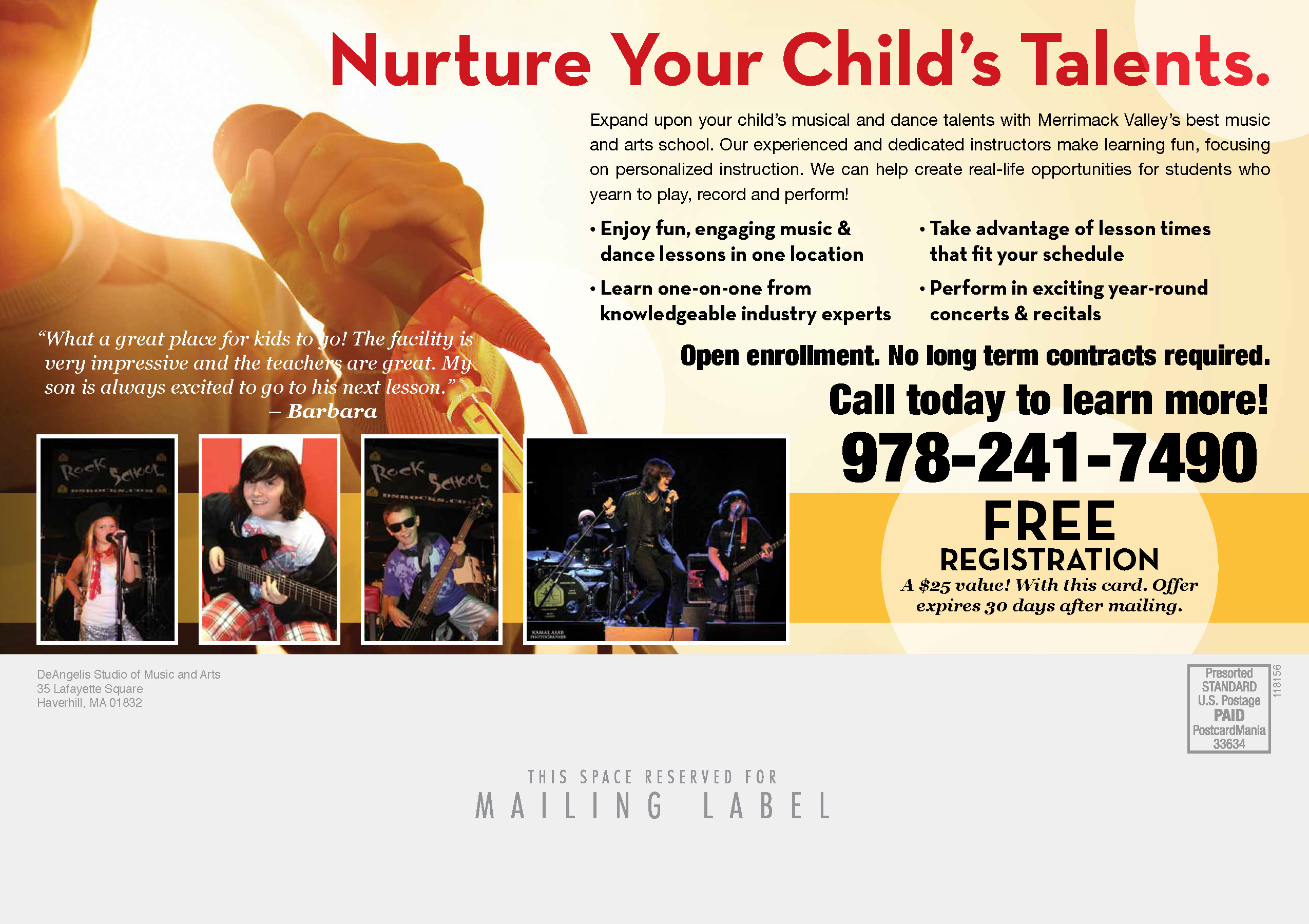
6. Offer
The offer can make or break response. After reading through all the great ways your company can make their lives (or their children’s lives) better, the prospect is thinking about taking action. The offer gives them that final push.
This card features an offer for Free Registration. Hmmm.. that’s pretty blah. A better offer would be to allow the child one free class. It would cost nothing to get started. That way they can try it out and see for themselves how the quality of the studio’s offerings stacks up to what they read on the postcard. At that point, they have nothing to lose and everything to gain by taking the next step: calling the studio to schedule a lesson. The Free Resgistration is an okay offer but nothing that will force me to respond. While my offer would cost the school something to provide, the cost would most likely be outweighed by the increase in response and new students that the mailing generated. The offer could also be included in a coupon layout with dotted edges to make it immediately clear that it was a special offer.
7. Call to Action (CTA)
This is a very small part of your card, but it is incredibly important. People need you to tell them exactly what to do. If you don’t, they will most likely do nothing. All it takes is something like “Call Now!” or “Visit Our Website to Learn More.” We’re not talking about Shakespeare here. This card has a mixture of those two examples: “Call today to learn more!” and the phone number. That will get the job done.
8. Logo
9. Contact Information
10. Return Address
Your logo, contact information, and return address always need to be featured on your postcard design. You would be amazed how many designs we receive from clients without these elements included! As you can see, all are accounted for on this postcard.
What do YOU think? Would this design make you call?
Best,
Joy