A Marketer’s Guide to Fonts
Updated on August 11, 2022
Do you want your prospects to have a good first impression of your business or a poor one? The outcome could determine whether you land the sale or not!
Most businesses make their first impression via advertising — a postcard, an ad on Facebook, etc. — which means you have to pay particular attention to how your ads come across.
If your ad is a person on the sidewalk shouting for the attention of prospects as they pass, fonts are the clothes your bellower wears.
Do you want them to wear a clown get-up? Or a three-piece suit?
Fonts speak to your audience without speaking, and you definitely want to say the right thing!
Before I started PostcardMania, I was a designer. So I know what you might be thinking right now:
- “I’m a busy business owner running a business. I don’t care about fonts or design.”
- “This is what designers are for and why we pay them. I don’t need to know this stuff.”
- “I wouldn’t even know the difference between fonts if it hit me over the head.”
But no one — I repeat: NO ONE — is going to look out for your business like YOU will look out for your business. You owe it to everything you’ve built to step out of your comfort zone momentarily and learn a little something about fonts. It will go a long way, trust me.
And it won’t take long at all, nor will it be painful. I’ve included a lot of visuals and good/bad examples to help even the most design-averse among us.
Let’s get started:
1. Choose appropriate fonts to evoke the right mood.
Each font has a personality and creates an effect on your audience. It can be casual, playful, serious, elegant, quirky…the list goes on!
Let’s look at a number of fonts lined up next to each other so you can see and feel for yourself the effect that each one has on you:
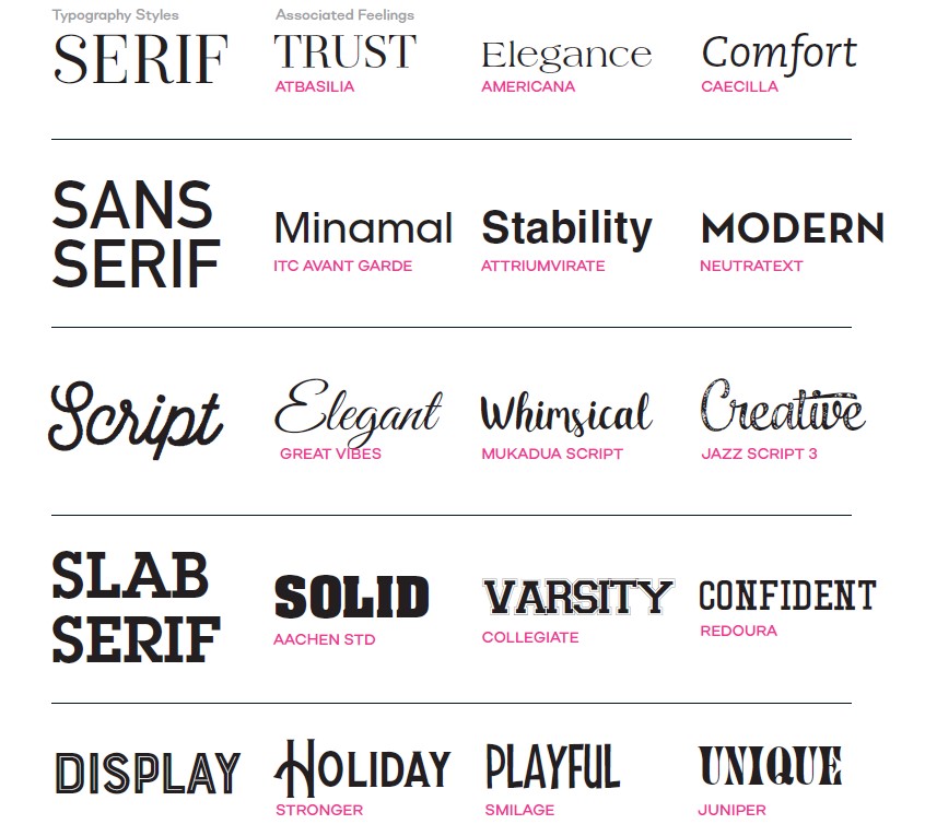
Would you agree with the three words on the right describing how each font makes you feel? My guess is yes.
Also, take note of the difference between serif and sans serif fonts. A “serif” is a design term that describes the little marks at the end of each letter. Serif fonts are best for blocks of text — like a paragraph — that are printed because the serif helps move our eyes along the page. That’s why newspapers always used Times New Roman — it has the serifs, which made it super easy for folks to read the paper.
“Sans” is French for “without,” so sans serif fonts don’t have these little marks. Sans serif fonts are best for making blocks of digital text more readable. The fonts on this page are sans serif. I can’t say why on a screen serifs are hard on the eyes, but so it is.
Serif, Sans Serif, Script, Slab Serif, and Display are different font styles, and are a good starting point for choosing a font.
Now that you know a little more about the mood and effect that each typeface can cause, you’re probably wondering:
“Joy, how the heck do I apply this to MY marketing??”
All you have to remember is that the effect of your font must match the purpose of your design.
So ask yourself:
What is the purpose of this ad? What do I want people to instantly feel about my business?
Then, find the right fonts to portray that purpose.
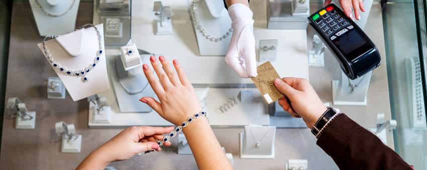
Here is a perfect example of a poor font choice:
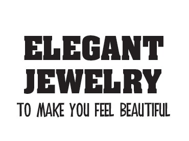
If you saw an ad from a jewelry store with this headline, what would you think about that store?
You might think their idea of “elegant” and “beautiful” differs greatly from yours. Not ideal if you want to sell expensive rings and necklaces. The slab serif font (the top one) elicits strength, and the display font below shows playfulness. These aren’t appropriate fonts for selling jewelry.
Here is a better choice:
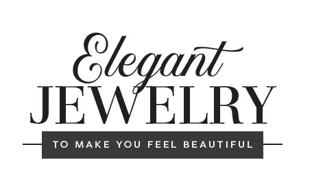
The combination of serif and script fonts communicates elegance and trust, while the sans serif text on the bottom has a modern feel.
Let’s look at them side by side.
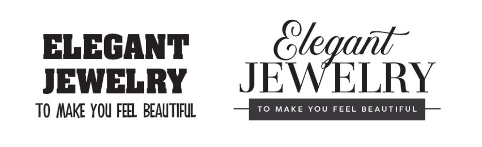
Which business would you choose?
You may be wondering now:
Are there specific fonts that work best for different industries? There are!
After 20 years, we have narrowed down the best fonts for each one. Want to know which ones would work best for your business? Email me at: joy.gendusa@postcardmania.com.
2. Get comfortable with the vocabulary.
Let’s go over two design terms: typeface and font. Knowing the definitions of these terms will help you better understand design and speak about it intelligently.
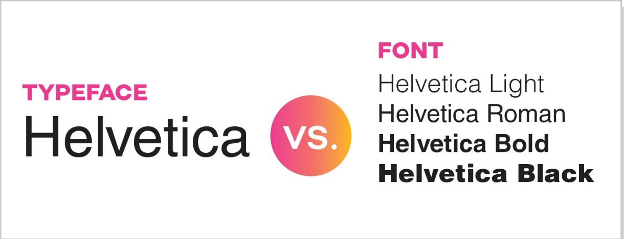
A typeface is a particular set of glyphs that share a common design. A glyph is literally just the shape that a letter, number or punctuation mark makes.
A font is a set of glyphs within a typeface, meaning they share the same shape but are slightly different. Even different sizes are fonts. So, 12-point Arial is a font, and 10-point Arial is a separate font. The same goes for different weights — a 14-point Arial Black is a different font from 14-point Arial Narrow. They are different fonts but the same typeface. And a ‘point’ is a measurement — it’s teeny.
Think of it this way, if typefaces wore a mood ring, the different feelings would be the fonts!
As you get to know the different typefaces and fonts better, you’ll be able to make design decisions faster and communicate more effectively about them with your colleagues and staff.
3. Use fonts to draw the recipient’s eye right to your most important message.
Once you know how you want your business and its ads to affect prospects, and you’ve chosen your fonts accordingly, it’s time for your next lesson:
Use fonts in a way to attract the most attention to the parts of your message that matter most.
The human eye is naturally drawn to large or dominant elements. You can use this information to your advantage!
Look at these two designs for a minute…
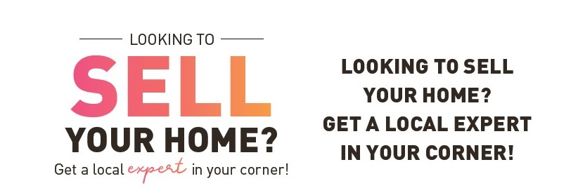
Which word does your eye focus on first?
The first word that stands out to people is “SELL” on the left. It’s the largest font between the two, and your eye is naturally drawn to the biggest element on the page.
Both designs are saying the exact same message, but they give you completely different impressions because of the way the words are stacked.
Also:
Did you notice how it is actually more difficult to read the message on the right??
The design on the left is more enticing to look at, and it’s also easier for the eye and brain to absorb. The one on the right actually takes a little bit of concentration to read.
If your ads require that extra bit of attention for people to absorb your message, you’re losing prospective buyers — and that means you’re losing sales.
Ever heard the line, “You’re easy on the eyes”? It means your eyes have a more positive and relaxed reaction to things that look nice, and the same is true of the text on your marketing piece.
Your eyes also like categories — an order of reading.
In a way, good design is about making your eyes happy.
So the next time you are evaluating a design, ask yourself, “Are my eyes naturally drawn to looking at this? Do I read this quickly, or do I ignore the message completely?”
If your answer is no, focus on creating that hierarchy. And remember, we have 17 experienced designers ready to create a fantastic postcard for you who will incorporate these elements.
4. Mix different fonts together to create interest, impressions and hopefully sales.
Why not pick just one font? Because multiple fonts work together to create visual interest, attract attention and define your brand.
It’s kind of like the icing on a cake; would you leave it plain or put frosting and decoration on it?
One caveat:
Don’t use more than 3 different fonts.
Using too many will have the opposite reaction from your prospects. They will feel lost, confused and overwhelmed.
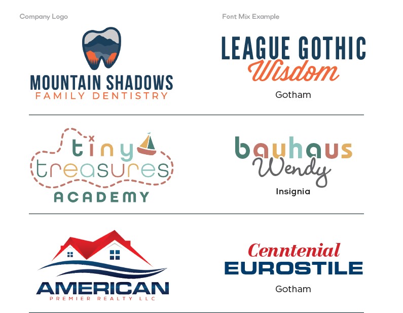
Here are some examples of quality logos that mix different fonts together to create an image that not only shows off the company’s characteristics, but also pleases the eye:
After all…it’s not just what you say, but how you say it!
One more tip: just like relationships, opposites attract each other. Mix tall and narrow fonts with short and stubby ones; mix plain sans serif fonts with fancy scripts; mix bold fonts with super skinny fonts.
Play with it till the contrasts work together to form a branding message people enjoy looking at.
5. Make sure you can read it.
You might be thinking, “Okay, Captain Obvious, why do you even have to say this?”
Believe it or not, I’ve seen my fair share of un-readable postcards in my mailbox. It may seem like common sense, but it has to be said anyway — your audience must be able to read it.
One reason so many businesses make this mistake is because they get caught up having fun using unique fonts throughout their mail piece and forget about practicality.
They figure, “Hey, it looks pretty, let’s use it!”
Big mistake.
Take a look at this example:
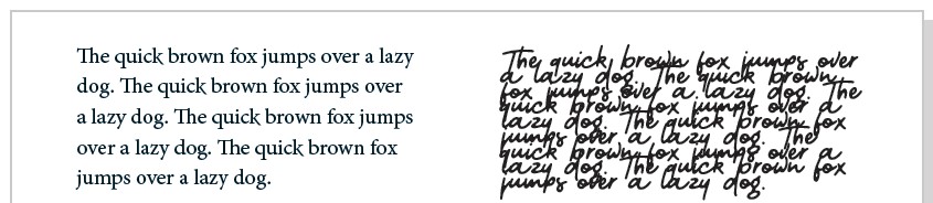
Which one is easier to read?
The paragraph on the right is too tight, making it very difficult to read. The reader will likely get annoyed and opt to not even bother reading your mailer altogether.
On the other hand, typefaces with serifs that are too pronounced have the opposite effect. Sans serif fonts tend to be more readable than their serif counterparts in smaller point sizes.
6. Create legibility with contrast to make your most important messages pop.
Once you know which fonts are best for your business, it’s time to add color.
Color is another way to direct and influence the eye. It’s a powerful tool, so you’ll want to use it intelligently.
Take a look at how color impacts the exact same font and message:
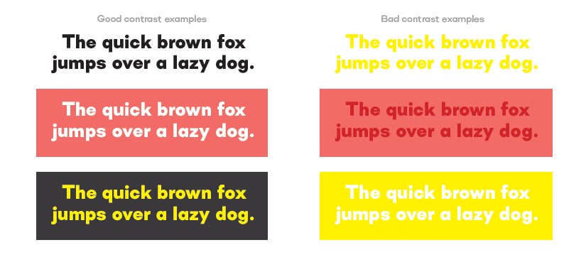
Which blocks of text stand out to you more?
It’s the blocks on the left, no contest. The examples on the right are too similar to read easily. Your eyes have a difficult time seeing the message quickly.
The key is contrast. The examples on the left have it, and those on the right don’t.
High-contrast combinations will make the words jump off the postcard, which means they can make your most important messages stand out.
For example, make a call to action like “Call Now!” a bright color like orange for the background and white for the letters. Or another trick I like: using colors that aren’t featured anywhere else on your postcard for your call to action. It really helps it stand out. That will draw the eye of the reader involuntarily to that call to action and hopefully get them to take that action!!
It’s all these little nuances that make up the successful design — and what is success but a new lead from it!
You can also use this strategy for offers, like “50% off!” or contact information — anything you want the recipients’ eyes to dwell on.
Keep in mind, when you order a design from PostcardMania, our design team is trained to incorporate this key principle into your postcard. Highlighting a call to action is on the list of all our top must-have design elements.
Also remember that since the advent of design software some 25 years ago, many business owners decide to ‘save money’ by being their own designer. Don’t be that business owner. Design is an art that follows very specific rules to solve a problem, and if you don’t know the rules, you’ll waste a lot of money on your campaign to save $199 on design. (Well, that’s what we charge; it can be way more expensive than that elsewhere.)
For more tips on how to design the perfect postcard, read this:
The End-All, Be-All Direct Mail Design Checklist for Maximizing Results
You’ll find the 16 must-have design elements for postcard marketing and lots of industry research to back it up!
Want to get started on a direct mail campaign today? Call 800-628-1804 to talk to one of our marketing consultants who can get you started choosing a design template or can craft a design tailored to your business from scratch.
6 Comments
I’m happy to hear you found it helpful, Steven! Thanks for reading!
Excellent tutorials and very educational. Thank you.
Thanks, Sue! Glad you found it helpful!
Great advice . A good business owner/mgr will want font mixtures that make the business products and/or services Ad stand out and interest the prospects to respond .
Exactly, Jack! Thanks for commenting!


Wow, thank you for the information. I had no idea about mixing fonts and how impressive it makes a logo or message pop!