6 Ways To Guarantee Your Postcard NEVER Gets Trashed
Updated on July 15, 2021
Not sure if you know this, but here at PostcardMania we design around 400 postcards each and every week.
That’s 400.
Yup, my creative team is like the NASA of postcard marketing design.
With that kind of weekly volume, it’s clear why we call ourselves the postcard marketing experts.

Over the past 19 years I’ve done a LOT of work curating the most easy-to-use marketing advice ever. I can’t tell you how awesome it is seeing business owners using postcard marketing more and more in their companies. They see it works!
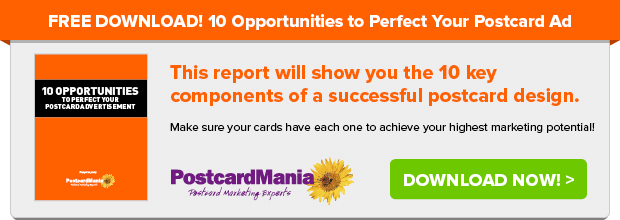
FREE report: Literally SEE the Best Postcard Designs That 76,438 of Our Clients Use
But with so many new business owners catching onto the postcard marketing buzz, I still see some postcards cross my desk that need help…
So here are the best ways you can immediately make your postcards POP like confetti to customers.
These 6 simple design tips are SO effective, I wager they’ll be the difference between a call to your business, and the dusty trashcan.
1. CUT OUT ANY CONFUSING COPY
If there’s anything you’ll hear me saying over and over again at our office it’s this:
NEVER EVER sacrifice clarity for cleverness.
Your postcard is NOT the place to emulate abstract Shakespearean poetry.
Customers today are outright overwhelmed with about 5,000 marketing messages per day between billboard ads, smartphones, social media ads, newspapers… and more.

Customers WILL NOT take the time to de-code any riddles or confusing copy on your postcard.
If they don’t know who you are and what problem you solve for them right away, they’ll trash your postcard.
KEEP IT SIMPLE. Communicate directly, clearly, and quick.
2. TOO. MUCH. TEXT.
With video on the rise, people just don’t have the time to read condensed blocks of text. Too much text just turns people off.
Keep your copy quick and snappy!
You want to GRAB ATTENTION, give your offer, and call that customer to ACT.
Do this:
BOLD headline
Sub headline
Bullet points
Any little extras that are vital
AVOID THESE on your postcards:
- The backstory of your business
- Every award/recognition you’ve ever received
- Every single product and service your business offers
See those bullet points? Easy to read, right? Use them, love them! I tell you, it works!
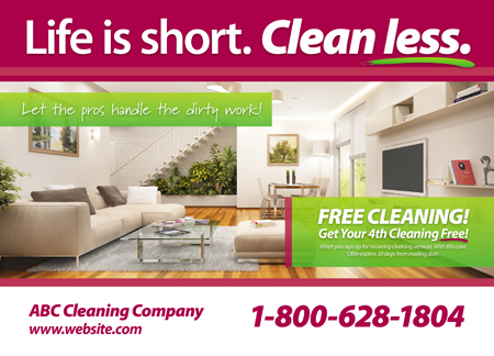
3. USE PHOTOS THAT ARE CRYSTAL CLEAR
In our Instagram world, photos are king!
Recall how I said earlier that too much text turns people off? Well, that’s because photos really DO speak 10,000 words, so you need to make sure they look amazing.
No matter what your postcard says, if it LOOKS like it’s stuck in 1962, I guarantee you it’ll be trash.
Lucky for you, it’s easy to take high resolution photos with any smartphone today. You DON’T have to be a professional photographer to take a high resolution picture that will work on any postcard. Just make sure the photo is clear, bright, and in focus.

However… if your product relies on exceptional photography, such as with jewelers and interior designers, you should absolutely hire a professional photographer for your photos! When you’re selling high quality, you can’t expect others to invest in you if you’re unwilling to invest in yourself. High quality photography DOES pay off.
4. ELIMINATE UNNECESSARY GRAPHIC DESIGN ELEMENTS
Your postcard is a not a collage project. Too much clutter overwhelms people.
The purpose of your postcard is FUNCTION. You are paying to send it out so it does something— not so it becomes a fancy trash piece that no one remembers…
Therefore, simplicity, my friend.
People want to SEE right away what you are offering, what your business is, what you’re about. And they want to digest this information fast and effectively so they can make a decision in about 2 seconds.
Only use the BEST graphic design elements, and this includes your photography. Use simple, clear elements that are on-brand which communicate directly to your customer and the CALL TO ACTION they need to take.
5. KEEP YOUR OFFER CLEAR
See a pattern in these tips? (Hint: keep your marketing succinct and direct.)
Your postcard is not the place to showcase every minute detail of your company. So DON’T boast too many offers on your postcard.
Too many offers confuses your customer.
When a customer is asked to decide on something that’s not immediately clear to them, their decision is usually NOTHING, meaning the trash can.

If your business does have more than one offer going on at one time (not uncommon, by the way), we can help you split your marketing lists and target the RIGHT message to the right public.
In other words, SEND TWO DIFFERENT POSTCARDS. One to prospects, one to your current customers!
(Aren’t we genius?)
Send a postcard for a free introductory service to your prospects with its own design. And then send another postcard offering a “come back in” special for your current customer list.
When you send the appropriate message to the appropriate customer, they feel like you really ARE speaking directly to them, and they’re more likely to respond! And that’s the point of marketing, right? Getting response!
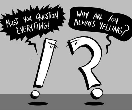
6. GET YOUR GRAMMAR & PUNCTUATION RIGHT
If I see one more person spell dining as “dinning,” I’ll eat my hat!
Ok maybe I won’t, but when customers see spelling errors, you automatically lose credibility.
If you can’t do grammar and punctuation correctly, how will a customer know that you will take care of them and their needs carefully?
Unless it’s on-brand for you to spell something wrong, like “luv” instead of love, make sure somebody who hugs dictionaries proofreads your copy.
This goes the same for punctuation.
Too many punctuation points!!!!!!!!!!!!! results in customers wondering if you’re manic or just plain unprofessional.
Also, “overuse” of “quotation marks” makes people “wonder” if they’re missing out on some “insider joke.”
And Capitalizing Every Letter In A Sentence Makes You Look Like An Amateur Who’s Trying Too Hard.
Too many punctuation marks just clutter your copy unnecessarily.
So keep your punctuation correct and simple.
So there you have it! Now you know what you should and shouldn’t use on your postcard.
Click here if you want to see FREE samples of what’s working in your industry right now!
Or you can always call my marketing consultants at 1-800-628-1804, or email me at Joy.Gendusa@PostcardMania.com.
Best,
Joy
6 Comments
Very nice breakdown of the six steps to success in keeping my money spent out of the trash can.
We are new to this type of mass marketing and look forward to working with your staff immediately.
We do!! I’m cc-ing Susan Tibbs – one of my best Marketing Consultants.. she has a lot of experience with this industry. She will send them to you right away!
Peter, we can’t wait to work with you! Please don’t hesitate to reach out if you ever have any questions regarding your marketing.
We need all the help we can get. Our business of employee benefits brokerage has gotten 20x harder to prospect than 10 years ago.
Chris, we can absolutely help you create a successful campaign for your specific business needs. Give our marketing consultants a call at 800-628-1804 for a FREE marketing analysis!


Do you have success with marketing doctor supervised weight loss programs?