Physical Therapy Innovations
"Marketing is judged by the growth it generates and its return on investment. Postcard marketing is king of both."
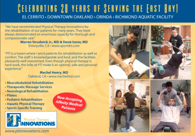 Mailer Design
 The postcard uses muted gold and blue colors, which match the colors of their logo. This is an example of why you don’t always need bright colors for your postcards. The colors just need to serve a purpose, and those particular colors help brand their physical therapy practice in the community. They chose to feature a few testimonials as well as the services they offer on the front of the card. These are two pieces of highly effective marketing information. Prospective patients want to 1) see what you can do for them, and 2) know that you are trustworthy. Those two sections take care of those two desires for them.
The Situation
Allen Ling is a Physical Therapist with a practice in the Berkeley/El Cerrito Area. He was specifically looking to increase the number of new patient referrals to all three of his locations.
The Solution
Since Physical Therapy Innovations is a consistent mailer, we suggested they continue this action by reaching out to additional areas around their locations. To build credibility, Allen has partnered with a few physicians who refer patients to him and uses their testimonials on the backs of his cards. He says this is a great way to reward the physicians who help him by promoting their website. This is effective “double-marketing” for his practice and theirs.
The Results
Marketing is judged by the growth it generates and its return on investment. Postcard marketing is king of both.
Allen saw a consistent inflow of new patient referrals from his campaigns. When targeting new areas around his practices, he had a huge jump of 20 new patients. The most important thing according to him, though, was the return on investment his postcard marketing yielded.
Get a Free Physical Therapy Marketing Kit
Get real samples from the Physical Therapy industry shipped right to your door, for free!
Call or text us at 1-800-628-1804 to get started even faster!

