McDonald’s for Cats? Great Ad, Great Landing Page by Blue Buffalo
Updated on July 15, 2021As a marketer, I am always looking at emails, direct mail pieces, magazine ads, billboards and TV commercials and noting whether or not they are doing a good job of getting my attention. I keep a file of any ads that I think are great, and refer to it when I am coming up with new ad ideas for PostcardMania.
I thought I’d share some of them with you so that you too can get new ideas for your own marketing.
This is a recent ad by Blue Buffalo Co. that I saw in Martha Stewart Living magazine. It has many great marketing aspects about it that I just had to share a few points!

Here is what they are doing RIGHT:
- Great Headline – it definitely got my attention and made me think that my cat food may not be made out of real meat. I thought, “Eeww! Am I feeding my cats the equivalent of McDonald’s for humans?”
- Comparison Chart – the chart does a great job of quickly showing you the benefits of their cat food, and since they don’t know what kind of cat food you are using now, I thought it was really clever of them to just put question marks there rather than trying to list a bunch of other cat foods and all of their features. I’m definitely going to use this idea for comparison charts that we do in the future!
- Landing Page – once they have your attention, they do a perfect job of including a large call to action to visit the landing page www.comparebluecat.com. The landing page design is very well done, letting you choose the cat food you currently use and generating a comparison chart for you.
Here’s how I think the ad could have been ever better:
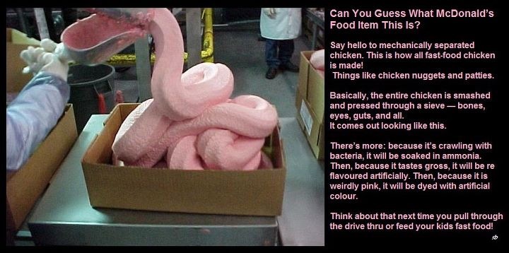
- Include an image of what kinds of gross ingredients could be in your current cat food. That would have helped grab my attention even more. (Have you seen this picture of McDonald’s mechanically separated chicken? Whether or not it is real, it sure got my attention and grossed me out!)

- Call to Action – I would have also included a brief list of a few major retailers who carry the brand in case the person reading the ad was already convinced and ready to buy. A coupon right there in the ad would be great too.
- Landing Page – I would have asked for at least an email address to do the comparison. They asked for all of my contact information after the comparison on a pretty busy looking webpage to mail me the coupon, but I didn’t fill it out. I would have given my email address only in order to run the comparison and then they could have marketed to me until I was convinced to give them all of my contact info to get the coupon.
Overall, they did an excellent job! Nice work!
Have you seen any good ads lately? Tell me about them!
– Sarah


