Marketing Article
Postcard Format Tips: 13 Elements Every Marketing Postcard Should Have
Don't want your direct mail to end up in the trash with the rest of the unread mail? These 13 tips will help you get the results you want:
Hover over a pink number, or tap it on your phone, to explore each element.
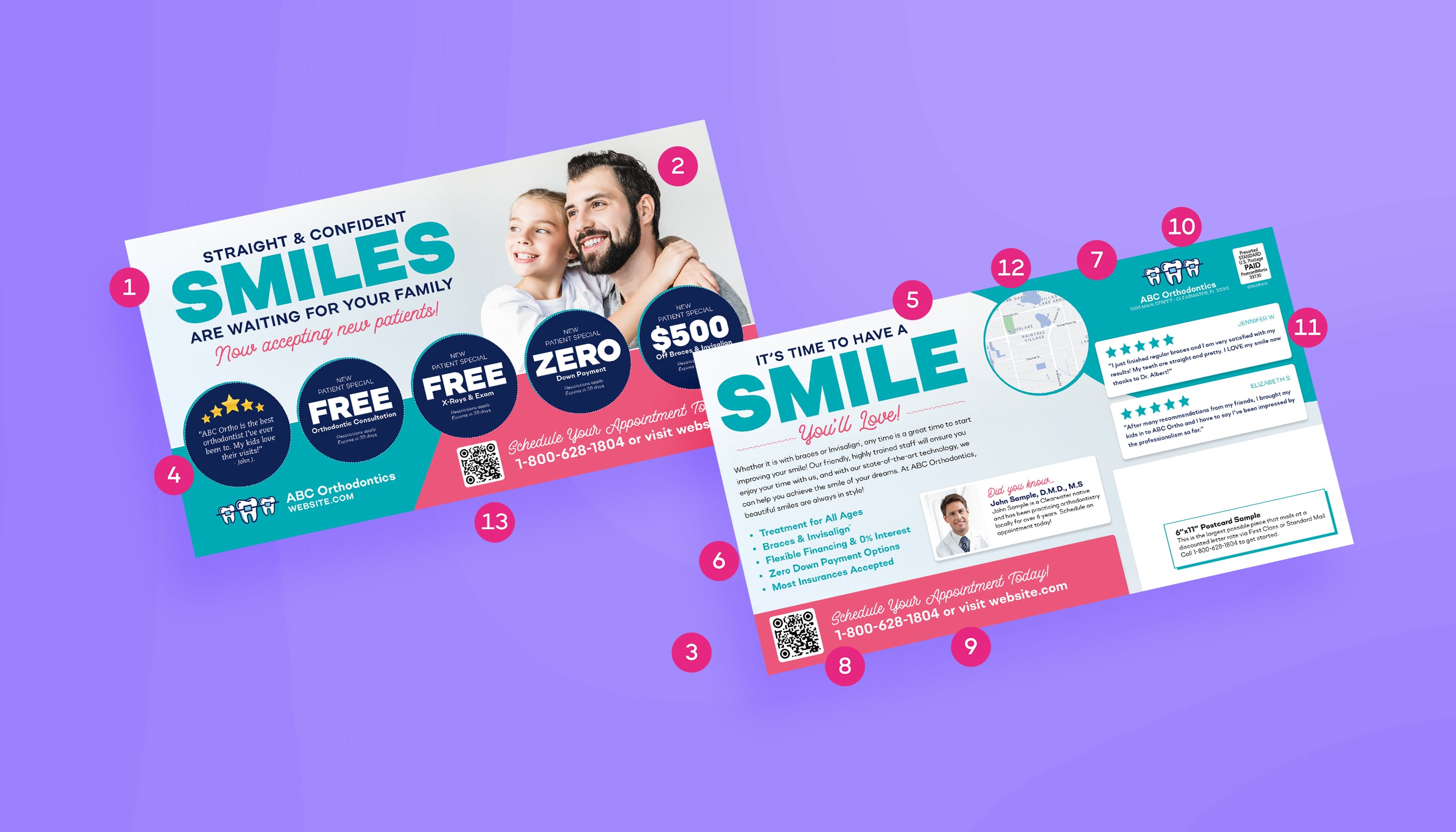
1. A Clear & Bold Headline
On the envelope or front of the mailer there should be one central message. The best way to achieve that is with a bold, clear headline that's not cluttered up with other text. A good guideline is to have the headline fill up at least 15% of the front of the mailer.
2. Relevant Images
The graphic should be easy to understand and add to the message the headline is trying to convey. For instance, if you are trying to get people to list their home you would want to show a home with a SOLD sign clearly visible out front. That graphic reinforces the message more than a simple picture of a home.
3. Color that POPS
Make the headline and other text stand out by using a color that stands out from the background color. When you look at the card, ask yourself, “What do I see first?” If your answer isn't the headline, you might want to tweak the colors.
4. Special Offer(s)
An offer is always a good idea and should represent a specific reason to call now, such as “Limited supply” or “Interest rates are climbing.”
5. Subheadline on Back
If you have a couple of paragraphs of text with no lead in, there's nothing to entice people to actually read the copy. A subhead will give people a place to start reading. If you have only a 100 words or so you may be able to get away with it, but if the text gets any longer than that the average reader will want to have some guideposts along the way.
6. Benefits, not just Features!
One of the biggest errors people make in advertising is stating features, rather than benefits. For example, never assume recipients know what benefit can be derived from a lower interest rate on their mortgage. Let them know how their monthly payments will go down.
7. Company Name and Logo
Although this needs to be on the mailer, it shouldn't overshadow the offer. Customers care most about what you can do for them.
8. Call-to-action in a Non-Matching Color
Tell prospects exactly what you want them to do. “Call today for more information” or “See us online” are two of the most common desired actions.
9. Contact Info & Web Address
Provide your name, phone number, and Web address directly following the call to action. Whatever you ask prospects to do, give them the means to do it easily.
10. Return Address
A return address ensures you'll get returned mail from the post office and sends a message that you're an established professional. People feel better knowing the company they're dealing with has an actual location.
11. 5-Star Review
Builds trust by showing real customer satisfaction and positive experience.
12. Map of your Location
Helps nearby recipients visualize exactly where to find you – boosting foot traffic.
13. QR Code
Make it easy for prospects to contact your business—one quick scan connects them directly from your ad.