Four Ways Good Design Drives Real Marketing Results
Posted on September 4, 2026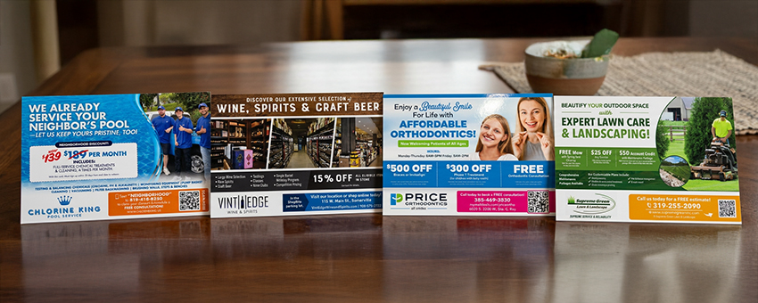
Crafting a postcard design that turns leads into customers can feel a little like magic.
As a busy business owner, you may not know exactly why one design works and another falls flat — but you can usually feel the difference when you see it.
That’s what I want to teach you in this guide:
Why some images things work better than others, and how to spot it.
Take it from a former graphic designer who knows. Before I started PostcardMania, I designed all the postcards myself. I learned very quickly that there’s a big difference between a design that looks nice and a design that actually gets response.
In this guide, I’m going to help you spot the difference between a design that’s bad, a design that’s serviceable, and a design that’s great enough to make a real difference in your results.
And because design is much easier to understand when you can actually see it, I’ve included plenty of visual examples along the way.
With this information, you’ll become be a better-informed business owner. You’ll be able to spot mistakes and correct them in your own marketing.
We’ll focus on one of the largest elements of any design: the imagery.
The photos and images you select for your postcard design can make or break your campaign. So let’s get into how to ensure you make smart choices that will drive response and increase revenue…
Postcard Design Image Must-Have #1: The Image Must Speak to Your Target Audience
Before you can choose images that truly resonate, you need to know exactly who you’re designing for.
Because here’s the truth:
The best images don’t just catch the eye… They feel familiar. They feel relevant. They feel like they were made for the person holding that postcard.
So how do you get there?
It starts with this:
Understanding who you’re mailing to.
In this section, we’ll break down how demographics — and the specific people in your audience — should guide every image you choose. Because once you really understand your recipient, everything gets easier. Your visuals connect faster. Your message lands stronger. And your postcard starts working the way it’s supposed to.
Postcard Design Demographics
First things first, you’ve got to know the makeup of your mailing area.
That means researching the demographics — who lives there, their backgrounds, their culture, their community.
Why does this matter?
Because people notice when something feels off. And they definitely notice when something feels right.
For example…
Let’s say you’re promoting a daycare in a neighborhood that’s primarily African American and Hispanic. If your postcard only shows stock photos of White children, something will feel disconnected to them.
Now flip that.
When your images reflect the actual families in that community, everything changes.
Now the postcard feels familiar. It feels thoughtful. It feels like it belongs. And that builds trust fast.
Here’s the key takeaway:
Even small image choices send big signals.
They tell your audience one of two things: “This was made for me.” Or… “This wasn’t really meant for me.”
And in direct mail, that split-second feeling can make or break your response.
Let’s see how this works in action:
VERSION A: Image Reflects the Demographic

- This image reflects the neighborhood’s cultural and racial demographics, helping the design feel more relevant to the audience.
VERSION B: Image Ignores Demographic

- This image does not reflect the dominant local identities, which can make the design feel off-target to the recipient and impact campaign performance.
Postcard Design Mailing Lists
Knowing the general demographics is a great start for choosing the right images, but it’s not the whole picture.
You also need to know the answer to this question:
“What type of people will you be mailing to?”
Key mailing list demographics include:
- Age
- Gender
- Income level
- Interests
- Location
And every one of those details should shape your image choices.
Now let’s make it practical…
Say you’re designing a postcard for a gym.
If the target is women in their 30s with higher household incomes, you’re not just picking any fitness photo. You’re looking for something specific:
- Modern workout spaces
- Confident, active women
- An environment that feels aspirational — but still attainable.
Because that’s what they relate to.
But here’s where a lot of people go wrong…
They use the same kind of imagery — no matter the audience.
Because if that same gym is targeting seniors, those exact images suddenly feel out of touch.
Too intense. Too young. Too disconnected.
So what do you do instead?
You shift the story.
Now you’re choosing images of older adults staying active in a comfortable, low-pressure setting. Now it feels welcoming, not intimidating.
And just like that, the postcard starts speaking their language.
When your imagery matches your audience, people don’t have to work to “get it.” They see themselves in it.
And when that happens, you’ve already won half the battle.
Let’s compare how different audiences impact image choice on the same design:
VERSION A: Image Reflects 30+ Women
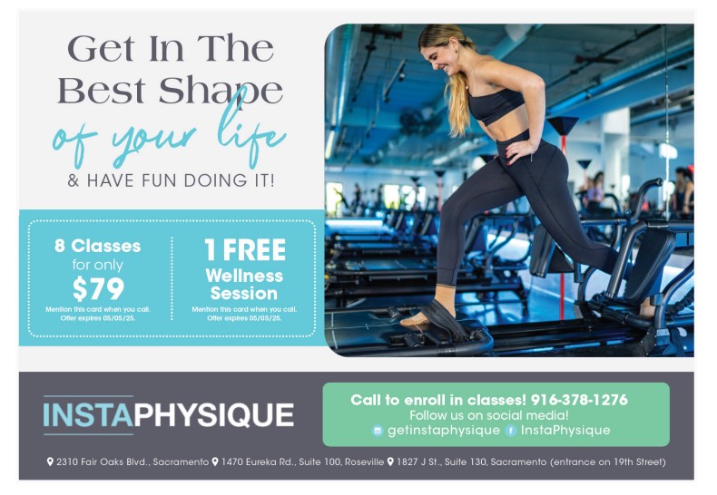
- This image is perfect for targeting younger, active women in their 30s, but it’s not a good fit for older adults.
VERSION B: Image Reflects Seniors
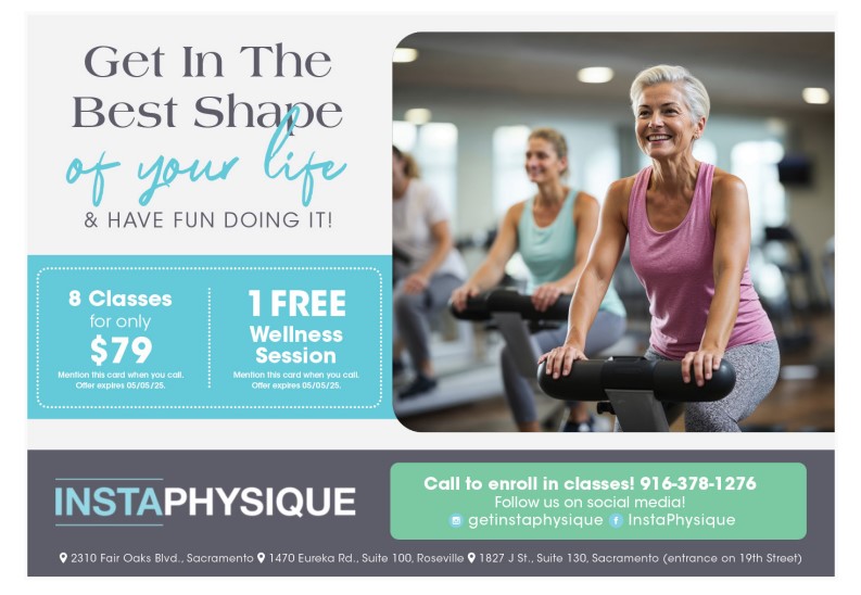
- This image works well for targeting seniors, but it would not connect with a younger audience.
Test Your Knowledge
Below, you’ll see two versions of the same postcard design. The only difference is the image used. Based on the info provided, choose which version’s image feels like the strongest fit.
Info:
Demographics: 55% African American, 35% White, 10% Other; mid- to high-income, Atlanta, Georgia.
Who We’re Mailing To: Women ages 30-60, working professionals and busy women interested in skincare, anti-aging, and self-care.
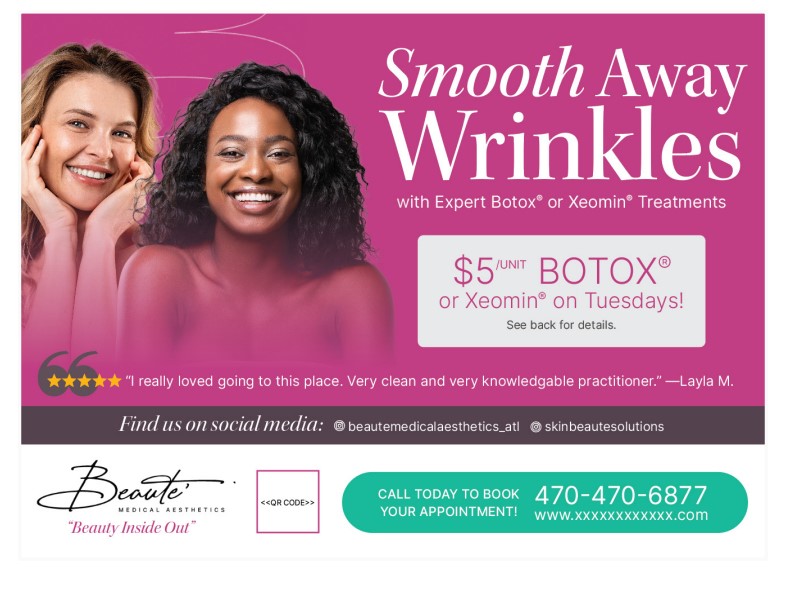
POSTCARD A:
POSTCARD B:
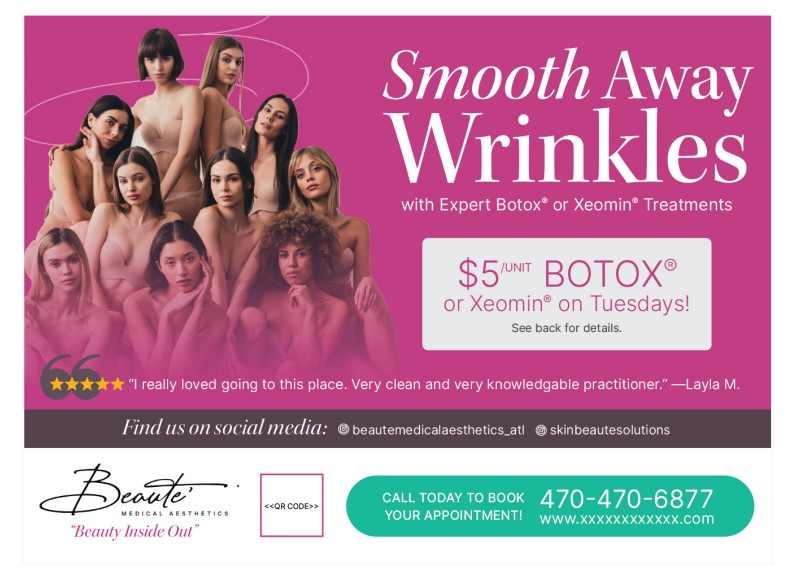
Based on the info above, which image is a better fit for this audience?
Postcard A is the better choice because the image selected reflects the demographics of the area. Postcard B’s image depicts much younger women, and the image is so zoomed out that it no longer looks like a skin care ad — it looks like a shapewear ad.
Let’s do another one.
Here’s the scenario:
Demographics: 48% Hispanic, 36% White, 16% Other; mid- to high-income, Albuquerque, New Mexico
Who We’re Mailing To: Women ages 35+ with children between the ages of 7-18, mothers of the household who are looking for dental care for themselves, and their family
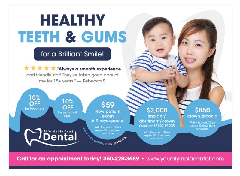
POSTCARD A:
POSTCARD B:
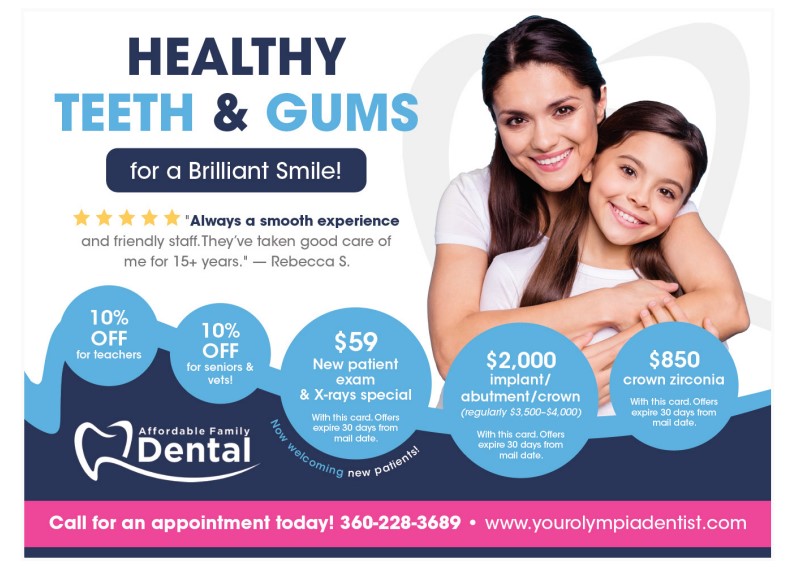
Postcard B is the best choice because it shows Hispanic mother and daughter. The daughter looks about 11 years old, whereas Postcard A shows an Asian mother and baby.
Postcard Design Must-Have #2: The Image Must Support Your Marketing Campaign Type
Now that you’ve got your audience clearly in focus, it’s time for the next piece of the puzzle:
What exactly are you advertising?
Sounds simple, but this is where a lot of campaigns fall short.
Every direct mail piece typically advertises one of these things:
- A product
- A service
- An event
Sometimes it’s a mix of all three.
But here’s the key…
You have to be crystal clear on which one it is.
Why?
Because your image isn’t just attracting attention; it’s setting expectations.
In other words, your image doesn’t just determine who responds. It also determines what they think they’re getting.
A business uses a generic image — like a smiling person — thinking it’s “friendly” or “inviting.”
But here’s the problem: it doesn’t actually show what’s being offered. If your audience has to guess, you’ve already lost momentum.
Instead…
Your image should do two jobs at once:
- Call in your ideal customer
- Clearly represent the product, service, or event you are promoting
Here are some examples of all 3 of these categories:
Service-Based Campaign Design Example:

- Show the type of person it’s meant for (when it makes sense) → Instead of choosing a photo of a home, you could show a happy family with a sold sign.
- Highlight the person delivering the service → Show a picture of a realtor in front of the home with the sold sign.
- Capture the results or experience the service provides → Show a happy family inside the home enjoying it.
- Reflect regional characteristics (when it makes sense) → Use an image of a home that reflects the style of the local community and geographical setting. In California, you could show a home by the ocean, or in Arizona like the one below the house looks like it sits in the desert.
Product-Focused Campaign Design Example:

- Highlight the product itself → In the photo above the skincare products are featured front and center.
- Show the type of person it’s meant for (when it makes sense) → This photo shows a young woman with healthy-looking skin.
- Capture the results or experience the product provides → You could also use a photo of a woman using the product or a before and after photo of the results she achieved using the products.
Event-Based Campaign Design Example:
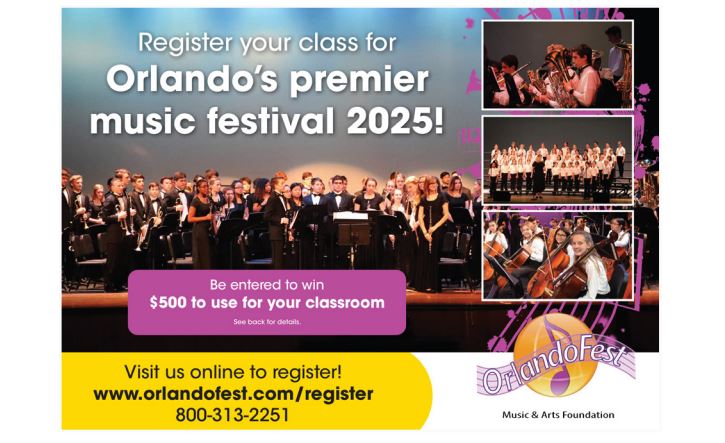
- Highlight the experience and atmosphere → At an event you want to show the atmosphere and setting. In this photo, there is a lively orchestra on a professional stage, which gives the recipient an insider view of the event.
- Show the type of people who would attend (when it makes sense) → At the event, you could show the attendees having fun, or the audience feeling the experience.
- Reflect any location-specific details → The image could feature the building, the surrounding area, or any other local details that give the person an idea of where they’ll be when attending the event.
What if these campaign types overlap?
Some campaigns won’t fit into a single category, and that’s totally normal. Many mailers combine elements from multiple campaign types to tell a fuller story. Your imagery should reflect that.
Here are a few common overlaps:
- Product + Service: A medspa might showcase both the skincare treatments they offer (service) and the products they sell to maintain results at home (product).
- Service + Event: A Medicare specialist might promote their guidance (service) through a free dinner seminar (event).
- Product + Event: A furniture store might promote their latest collection (product) through a limited-time sale or in-store event (event).
- Product + Service + Event: A salon might host a one-day beauty event (event) where attendees can try out new treatments (service), and purchase haircare products (product).
Whichever mix is yours, the images need to clearly reflect that.
Postcard Design Must-Have #3: The Image Must Visually Support the Headline
You know who you’re designing for and what you’re promoting.
Here’s what comes next:
Your images need to work with your message.
Because your headline and your images are a team. If your images don’t reinforce what your text is saying, the recipient gets confused.
And in direct mail, even a small disconnect is a big problem, because your prospect isn’t studying your postcard — they’re scanning it.
After a long day, most people are just flipping through their mail. Your image has to do the heavy lifting. Our brains process images 60,000 times faster than text.
So before they even read your headline, they’ve felt your message through the image.
That’s why alignment is everything.
Your image should echo your headline, support your key points, and make the concept obvious without effort.
These things do the opposite of that:
- Vague images
- Generic visuals
- Nice-looking, but unclear, photos
They force your recipient to use extra thought processing to connect the dots, and most won’t bother.
Here is a great example:
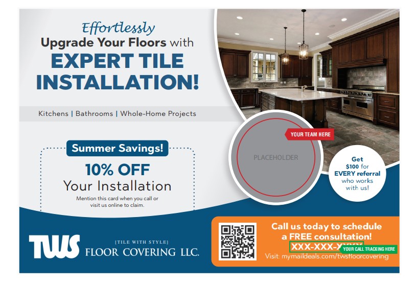
This postcard says, “Expert Tile Installation!” but the image is of a kitchen. Less than 10% of the photo includes tile.
POSTCARD A:
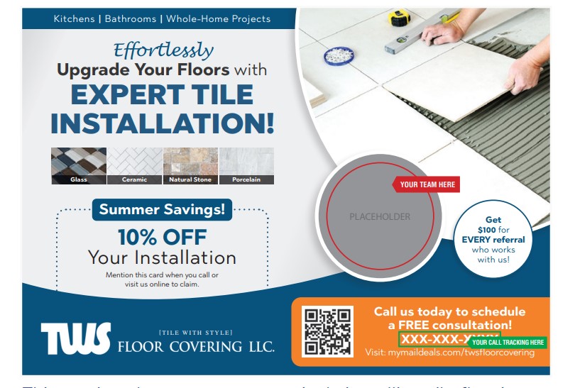
This postcard, however, does have a photo of a person laying tile, so the message matches the image perfectly.
POSTCARD B:
Test Your Knowledge
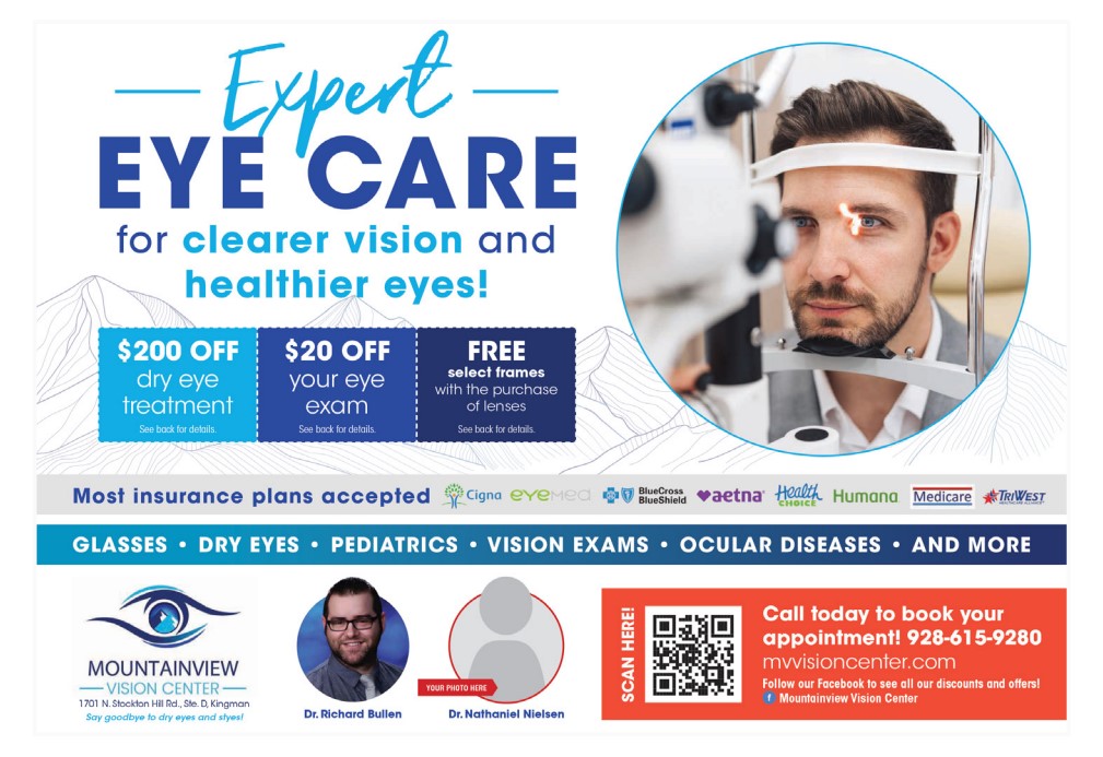
Does this postcard’s message match the corresponding image next to it?
This postcard shows a man receiving an eye exam, and the card’s text also mentions eye exams as part of their services. This works, but you could also add photos of glasses, dry eye treatment products or other things mentioned on the card to give the reader a clearer picture of everything this office offers.
Now look at this one:
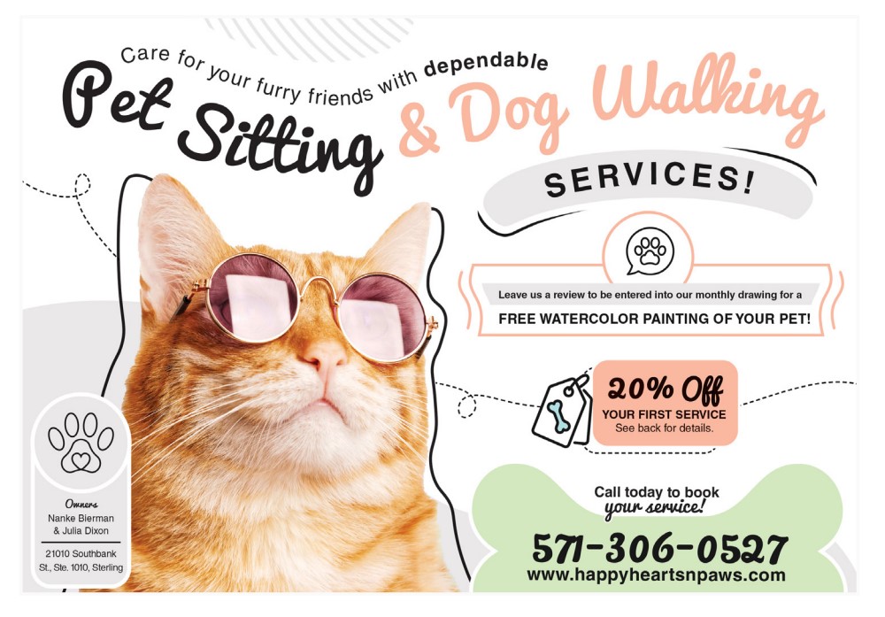
This postcard’s headline says, “Pet Sitting & Dog Walking,” but there is an image of a cat in glasses on the card. A better image on this postcard would be a dog, or a man walking a dog.
Postcard Design Must-Have #4: The Image Must Evoke Emotion
Images are powerful and have the ability to bring out the emotions of the person who sees them.
This is a powerful marketing tactic because emotions drive decision. When advertising connects with a person on an emotional level, they are more likely to respond.
One way to do this is using real images instead of stock photos. Here are some ideas:
Use Photos of Your Product or Service
This helps readers know exactly what to expect, giving them a clear and honest visual of what’s being promoted.
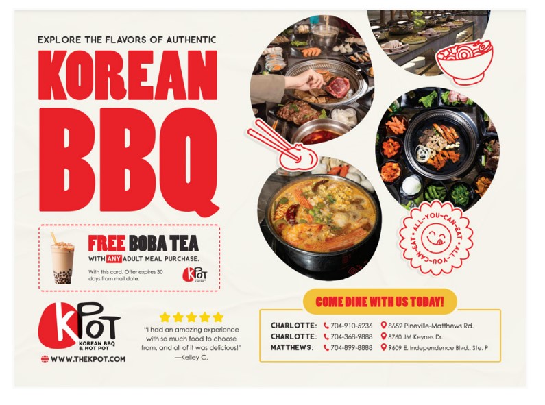
Use Action Shots
Capturing real moments of people engaging with the product, service, or environment helps readers visualize the experience.
Whether it’s a service being performed or people actively participating in something, these images create a sense of authenticity and connection.
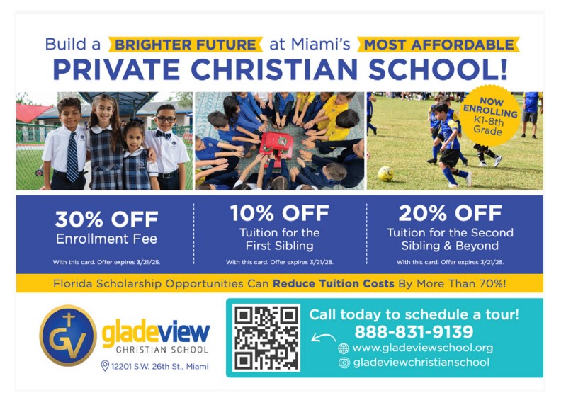
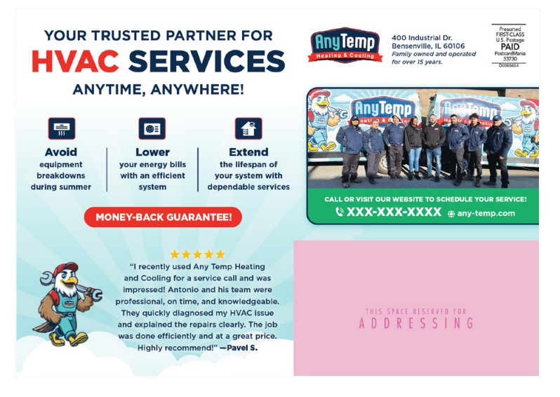
Use Team Photos
These showcase the friendly, welcoming staff, giving readers a sense of the customer service they can expect.
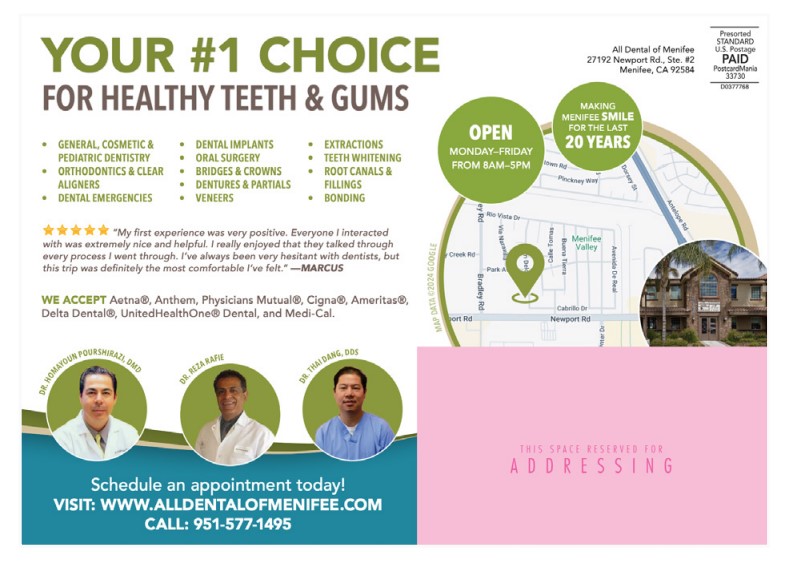
Use Headshots (Professional or Not)
Featuring real team members or key figures in the business humanizes your business and goes a long way in helping recipients feel like they like you and can trust you.
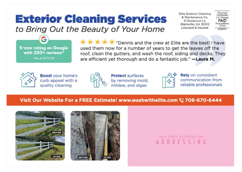
Use Before and After Comparisons
These images visually demonstrate the effectiveness of the product or service, providing real, relatable proof of its impact.
If you don’t want to use real images from your business, select stock photos that still reveal emotions. These are some great options:
- Pets: Cats and dogs evoke warmth, comfort, and humor, often bringing a sense of joy and companionship.

- Kids: Images of kids laughing, playing, or sharing a sweet moment convey innocence, happiness, and energy.
- Family: Photos of families enjoying time together evoke warmth, connection, and a sense of togetherness.

- Seniors: Grandparents with grandkids or enjoying quiet moments convey love, nostalgia, and peacefulness.
- Struggle or Need (use sparingly): Tired parents, cluttered homes, or overwhelmed faces convey stress.
Test Your Knowledge
Compare these two photos and determine which one would move you more to action:
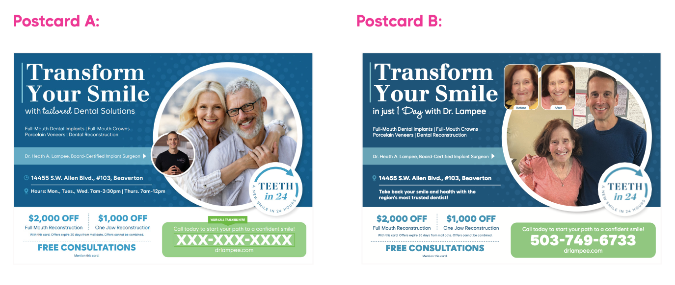
Postcard A uses stock photos while Postcard B uses real-life photos from the dental office. Both make sense for the message and purpose of the campaign, but which one feels more genuine and evokes a stronger emotional response?
Postcard B would have more pull because it not only builds trust with the prospect, but it also gives the person a feel-good feeling about the woman getting a new smile.
Here’s another one. Let’s keep it dental.
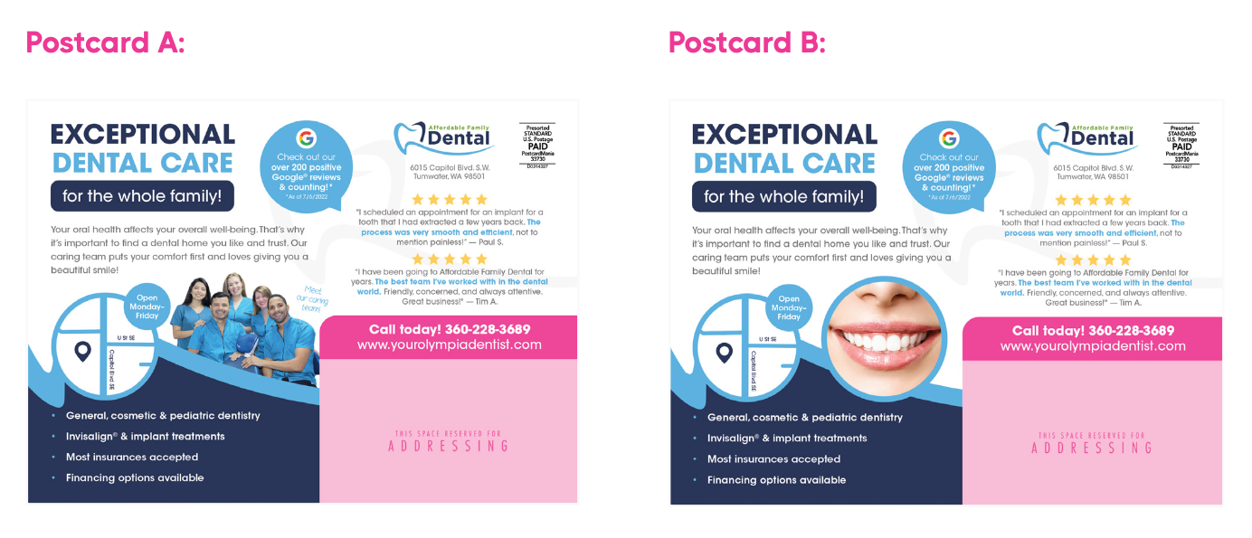
Postcard A should be your winner. It uses real photos that feel more geniune and reinforce the headline: Exceptional Dental Care for the Whole Family.
A single smiling stock photo does not feel very familial. That photo would be better suited to a cosmetic dental practice than a family one.
Choosing Images for Campaign Success
Choosing the right images is key to making your design truly connect. A strong image doesn’t just fill space, it reflects the audience and setting, reinforces the campaign’s purpose and message, and evokes emotion.
When images are thoughtfully chosen, they tell a stronger story and leave a lasting impression.
Remember, people process images faster than words, so the clearer and more intentional your choices, the more impact your design will have!
This postcard below is a perfect example of how it combines all of the 4 principles of: reflecting the audience and setting; supporting the campaign type; visually supporting the headline; and evoking emotion.
Take a look:
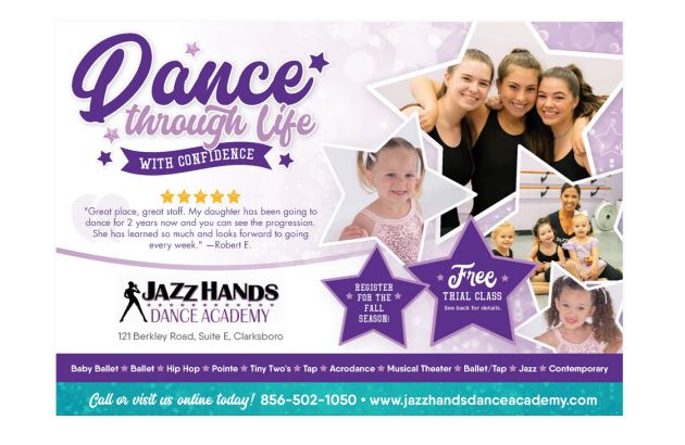
- It targets the right demographic of girls in a specific age range who would want to take dance classes.
- The photos are of real people who have taken the classes before and bring out feelings of happiness since the kids are smiling and lighthearted.
- The photo also supports the headline of “Dancing through life” in order to portray the message that this business offers dance classes for young women.
If you need help with your postcard design, let us know!
Our graphic designers are ready to get a unique postcard design started for you to bring in more leads and annual revenue.