Why a Pretty Postcard Might Be the WORST Postcard
Updated on July 15, 2021
I’ve been talking a lot lately about mailing lists. Today I want to switch gears and talk about another important aspect of postcard marketing:
Many people think:
PRETTY POSTCARD = EFFECTIVE POSTCARD
Not so.
I mean, pretty is nice, but when it comes to your postcard, only one thing matters…
How well does it pull?
By “pull” I mean: Does it elicit a response? Does it get customers in your door?
Seriously…
You could design the most beautiful ad the world has ever seen, but if it doesn’t make the phone ring, it’s A WASTE OF MONEY.
So let’s talk about how to design a postcard that will accomplish what it was meant to do:
Generate leads!
Different people respond differently to marketing messages, so you need to figure out what your target market wants to hear. Otherwise, you’ll never get their attention and they’ll never read your postcard.
So…
How do you know what to say?
You have to BE your target market.
How?
You have to step into their shoes, learn what makes them tick — and what problems they need solved.
To do that, sometimes you have to play a little pretend! To get the hang of it, here are a couple of examples.
Scenario 1: You sell wrinkle-reducing eye cream.
Who is your target market? Mostly women over 40, right?
So pretend you are a woman over 40, with crow’s feet (those wrinkles around the eyes, for you young guys out there!) that are getting worse, it seems, by the day.
Are you pretending? Good.
Now think about how much advertising you (as a woman over 40) are bombarded with.
Now:
How are you (the business owner) going to break through the noise?
By addressing HER concerns.
Your headline could say something like “Crow’s Feet Getting Worse as You Age?” Maybe even show a before-and-after photo.
Now you’ve got her attention!
Scenario 2: You sell golf balls that go farther and straighter than the competition’s.
Let’s say your target demographic is senior golf enthusiasts. You need to figure out the biggest benefit your product offers to them.
To do that, you can draw on:
- Reasoning: Think about the attributes of senior citizens.
- Experience: Do you know any seniors who enjoy golfing?
- Research: Find out what seniors have to say about their golf game as they age.
I know two things about this market:
- Practice makes perfect, so people who have been golfing for a long time have a pretty good aim, so they can shoot the ball straight.
- But as people age, they lose strength, so they start to lose distance on their shot.
So the biggest benefit of your golf ball is going to be the distance factor. THAT’s what you should focus your ad on!
You could take a direct approach and show your golf ball in a cup with the words “You are Here!”
But what if you have NO IDEA what approach to take with your postcard or ad?
It’s time to do some research.
Ask yourself questions like:
- What do your top five customers’ orders have in common? Do they all buy a certain add-on? Is there something they never buy? This will help you understand who your “good customers” are.
- What is the most-often-stated benefit of your service? It’s helpful to try to BE your target market, yes — but there is nothing better than hearing it straight from the horse’s mouth! Ask 20 of your customers, “What is the biggest benefit (your product or service) has provided you?”
For example, say you sell window treatments, and you notice that a certain (fairly expensive) blind sells really well and that most of the people who buy them live on the water or in high-end homes.
You know this blind really helps keep rooms cool, and you might assume that people are buying it for that reason. But upon surveying your customers, you learn that most of them chose it simply because it went with their home décor.
Or you might find that most of them bought it because your sales rep Tom is so handsome and charming and that’s what he recommended.
You don’t know unless you ask!
The point is:
If you advertise this blind with the features YOU thought were most valuable, you may not be getting your target market’s attention at all.
Okay…
Now that you’ve got their attention, what do you want them to do?
What, exactly, are you trying to accomplish? Do you want them to visit your website? Do you want them to call you? Whatever it is, spell it out for them!
This is called a call to action (CTA).
Don’t mince words, just tell them what to do. And DON’T sacrifice clarity for cleverness! (How many times have you heard me say that? About ten thousand!)
For example, if you want them to call and talk to a salesperson, your card should say: “Call today for details!”
Believe it or not, when it comes to advertising, people like to be told exactly what to do. The more they have to think, the less likely they are to ACT.
Think about this:
How many times have you seen a clever commercial on TV — and you have no idea who they are or what they are selling, let alone how you would go about buying it?
It kind of makes you go, “Huh?”
People love cleverness, whimsy and fun — but NOT at the expense of clarity.
And make sure your CTA (ESPECIALLY your phone number or the URL you want prospects to visit) is bold and easy to read.
When in doubt:
Err on the side of being more simplistic and less artistic.
Now…
What should your postcard look like?
As I mentioned earlier, the prettiest postcard is not necessarily the most effective.
After overseeing tens of thousands of marketing campaigns (71,229, to be exact), I KNOW this to be true!
I’ll give you a perfect example:
My client, Measurable Solutions, knows how to market. (They even made Entrepreneur magazine’s “Hot 100 List” of fastest-growing companies in the country.)
You see, I am a graphic designer — so my background dictates that their card should be aesthetically pleasing.
These guys proved me wrong!
Here’s the deal:
Measurable Solutions does business management consulting for doctors (specifically physical therapists) who own their own practice. Sounds pretty conservative/boring/high-brow, right?
You might think their postcard should also be conservative/boring/high-brow.
Nope.
They really drove home the concept of “BE the recipient.”
Think about it:
A physical therapist (PT) is just a person. A man or a woman with a personality, with problems just like the rest of us. What is going to get this person’s attention?
Well…
Jeff Lee and Shaun Kirk, the owners of Measurable Solutions, surveyed their clients (PTs) to find out.
And then they presented us with their postcard design.
I cringed, then smiled and said, “Are you sure this is what you want?”
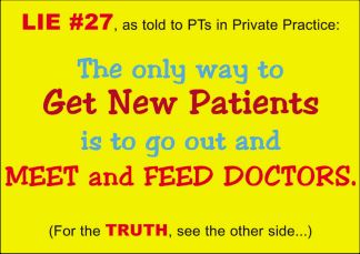
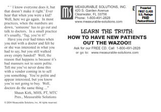
The color pops, I imagine it makes the recipient smile — but more importantly, it solves the most common problem among them: not enough patients.
After more surveying, they found another problem PTs had to deal with: their patients have to be referred by an MD.
So PTs all over the country lure MDs into referring them patients by buying them meals! (Isn’t that interesting? I had no idea!) And what’s more, the PTs HATE DOING THIS!
So even though the postcard is not what you would exactly call aesthetically pleasing, its design is impeccable. It speaks to those problems in a way PTs find comforting and Measurable Solutions finds profitable.
And THAT’s the true test of effective design.
I know that was a lot of information to digest. If you have questions, shoot me an email at Joy.Gendusa@PostcardMania.com or call one of my marketing consultants at 800-628-1804 — it’s FREE!
Best,
Joy
*This article was adapted from my book, Postcard Marketing in an Online World. Click here to read it.

4 Comments
Of course! Thanks so much for reading! Give us a call at 800-628-1804 if you need any help with your marketing!
This has to be one of the most informative marketing articles I have read. Great information ideas and info. Smart! Thank you! Kathryn
So glad you liked it, Kathryn! Thanks for reading!


Helpful- thank you for clear examples!