The End-All, Be-All Direct Mail Design Checklist for Maximizing Results
Updated on July 15, 2021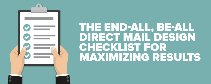
If you’re going to invest in postcard marketing (and you probably should)…
You’ll want to make sure you get the best possible return on that investment — obviously!
What’s not so obvious is HOW to do that.
For many business owners, marketing always feels like a roll of the dice: All you can do is hope for a good outcome.
But…
You can greatly increase your odds of success. You just need to reach high-quality prospects with a mail piece that they will actually look at, read, and then take ACTION!
To that end, I’m going to share the granddaddy of all postcard design checklists with you! Read on!
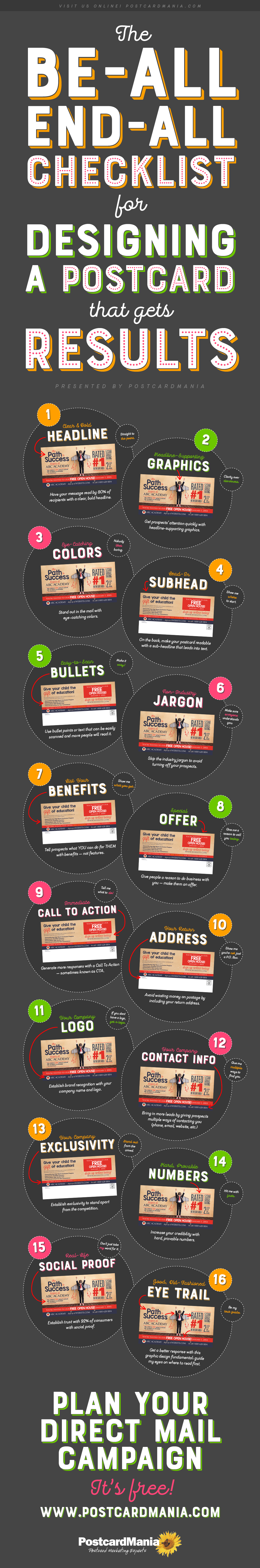
(Click infographic to enlarge)
Share this infographic on your site:
<p><a href='http://www.postcardmania.com/products-services/design-services'><img src='http://www.postcardmania.com/blog/wp-content/uploads/2017/04/POSTCARD-DESIGN-CHECKLIST-INFOGRAPHIC_v2.jpg' alt='POSTCARD DESIGN CHECKLIST INFOGRAPHIC' width='600px' border='0' /></a></p>If you’re a PostcardMania client — or even a regular reader of my newsletter — you are probably familiar with the checklist our designers use when creating postcards for our clients.
A bit about that:
In our 19 years, we have helped more than 73,792 small businesses across hundreds of industries with their marketing. We track our clients’ results, so we can see what designs and mailing lists work the best for each industry, and we share that data with our clients and prospects so they can experience the same success!
I’m very proud of that, actually. It’s probably the single biggest thing that sets us apart from our competition.
Anyway…
Over the years of tracking our clients’ results as well as our own, we’ve been able to identify 10 elements that the most successful postcards have in common.
Download our FREE report on the 10 essential elements of successful postcard design!
I’m going to list them here, along with even more advanced tips for generating the best possible results with your campaign!
Ready to take notes? Here we go…
The End-All, Be-All Checklist for Designing a Postcard that Gets Results:
1. Have your message read by 80% of recipients with a clear, bold headline.
You have just a fraction of a second to get the attention of your recipient, so it should be immediately clear what you’re offering.
Not only should the headline be big — we recommend it take up as much as 25% of the front of your postcard — but it should also be easy to understand.
This is a clear, bold headline:

Whatever you do…
Don’t sacrifice clarity for cleverness! If people have to guess what you’re selling, they won’t bother to find out.
Remember this:
8 out of 10 people read ONLY the headline — the other two will read the rest of your postcard. Give them a compelling reason to keep reading!
2. Get prospects’ attention quickly with headline-supporting graphics.
This goes hand in hand with #1. You want your prospects to know on first glance what your product or service is!
For example:
If you’re a lawn service company, your main graphic should include some landscaping! I know it sounds obvious, but I am sometimes surprised by the “clever” photos advertisers choose!
For example:

I have NO IDEA what they are advertising. Do you?
Are you even interested to find out?
Probably not.
So while to you it may be clever…
But to your prospects, it’s confusing.
Your recipient may be in need of a new lawn service company, but if they can’t tell right away you’re advertising something related to their yard, they are likely to toss your postcard without even reading.
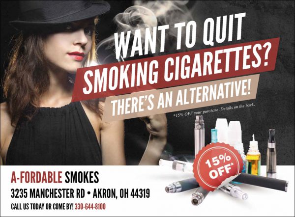
3. Stand out in the mail with eye-catching colors.
Your postcard should stand out in your recipient’s mail pile with bright, contrasting colors. Like this:

But perhaps even MORE importantly…
The colors should help draw attention to the most important information: the headline and call to action (more about this under #9)!
Having said that:
Don’t go crazy — too many colors scatter attention.
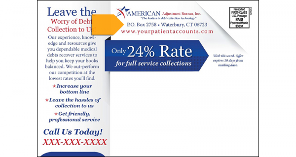
4. On the back, make your postcard readable with a sub-headline that leads into text.
If you want your prospects to READ your postcard (and you do, of course!)…
You need to help them out with your design.
It’s just a fact:
People are not going to commit to reading a long paragraph if they don’t know what it’s about.
A smaller, secondary headline (or sub-headline) on the back of your card that continues the message that the front started gives their eyes a point of entry and pulls them into reading the rest.
5. Use bullet points or text that can be easily scanned and more people will read it.
Make your postcard as easy to read as possible and you’ll get more eyes on your message…
Period!
I know it’s tempting to fill up every last inch of space with all there is to know about your business.
But…
That defeats the purpose of your postcard!
Your card’s job is to generate interest about your business and encourage prospects to call you or visit your website to learn more.
Please believe me when I say:
If it’s too text-heavy, no one will read it, which means it is a WASTE.
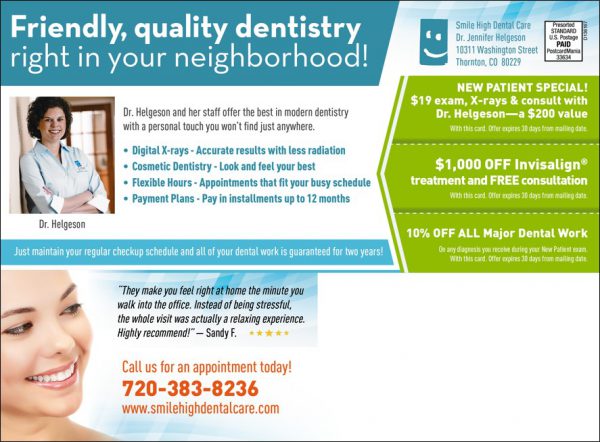
Here’s a postcard with a sub-headline and bullet points:
See how readable that is?
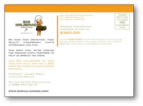
Here’s one without a sub-headline or bullets:
See how uninviting it is to the eye?
These small, subtle differences can make a BIG impact!
6. Skip the industry jargon to avoid turning off your prospects.
Put yourself in your prospect’s shoes.
You know your industry lingo, but they don’t!
When choosing what text to include on your postcard, keep your audience in mind. Use words that everyone will understand.
7. Tell prospects what YOU can do for THEM with benefits — not features.
Again look at things from your recipient’s perspective:
What problem does your product or service solve for them?
Use benefits (literally tell them how they will benefit from doing business with you) instead of just features (good things about your business).
For example:
“Low interest rates” is a feature — it’s what you offer.
“Save money on your mortgage payments” is a benefit — it’s how what you offer helps them!
Here’s a good example:

“Build greater confidence,” “Enjoy more energy & better sleep,” “Increase strength & learn self-defense,” and “Decrease daily stress” are ALL BENEFITS!
8. Give people a reason to do business with you — make them an offer.
I know it can be painful to give away discounts when you’re struggling to pay the bills, but the revenue generated by a lifelong customer is WELL worth it!
Your postcard should include an offer that is of high perceived value, but low cost to you.
Need ideas?
Download this free report that includes 128 PROVEN offers from 17 different industries.
Make sure you include an expiration date or some other wording (like “Limited supply — call now!”) to create a sense of urgency.
9. Generate more responses with a Call To Action — sometimes known as CTA.
Come right out and ask for what you want!
Tell prospects what step to take next to redeem your offer — don’t assume they know what to do. And, actually prospects prefer to be told exactly what to do.
For example:
“Call today to schedule your free consultation!”
If you can draw attention to it using a contrasting color, even better! Like this:

I like to use a color that isn’t featured ANYWHERE else on the card for the call to action, but it is seriously hard to get your designer (any designer!) to do this. They want everything to be match-y, match-y!
Just keep pressing them and they’ll do it, and more people will look at your call to action that way.
10. Avoid wasting money on postage by including your return address.
Including your return address on your postcard accomplishes two things:
First:
It helps returned postcards get back to you from the Postal Service, so you can delete those addresses from your mailing list or have them updated.
Second:
It tells prospects you are an established company that is accountable and accessible. So use a real street address as opposed to a PO Box!
A return address is such a simple thing, but when I see a postcard without one, I wonder WHY they didn’t include it. Don’t you?
11. Establish brand recognition with your company name and logo.
Tell prospects who you are, but don’t make yourself the focus of the card. (Remember, your PROSPECT is the focus of your postcard!)
Place your company name and logo somewhere visible yet unobtrusive.
Here’s a card that smartly combines the business logo and return address:
12. Bring in more leads by including ALL of your contact information.
Give people every opportunity to interact with your company. Include your phone number, website, email address, social media URLs… as many ways as possible for them to communicate with you.
Because:
A prospect may not be quite ready to call you, but be interested enough to like your Facebook page…
And you can “warm them up” into a sale from there!
13. Establish exclusivity to stand apart from the competition.
Is there something you can claim that none of your competitors can? Have you won any awards? Are you the ONLY business in your industry and area that offers a 100% money-back guarantee? Were you the first in your industry to do something? That’s exclusivity.
This is not exclusivity:
“We have the best customer service.”
“Our products are the best in town.”
Everybody says that!
Here’s one example:

Figuring out what sets you apart is no easy feat. In fact, I had my team create a worksheet exclusively for this purpose to help small businesses find their unique selling proposition (USP). And you can download this USP worksheet for free!
14. Increase your credibility with hard, provable numbers.
A number that is impressive and verifiable helps prospects trust you.
For example:
When I say my company has helped 73,792 small businesses with their marketing, THAT’s a hard, provable number!
Here’s another example:

15. Establish trust with 92% of consumers with social proof.
Of course you are going to tell your prospects that you’re great.
But…
It means a LOT more when people who have done business with you say it!
Did you know that 92% of consumers read online reviews and 68% say that positive reviews make them trust a business more? (2015 BrightLocal Survey)
Put reviews and testimonials on your postcard — like this:

16. Get a better response with this graphic design secret: Good eye trail.
This is something I learned about from the Hubbard Management System…
A postcard that has good eye trail leads the recipient effortlessly through the text on your postcard, ideally landing on your call to action.
It’s all about placement of the copy and images. (For example, if there are people in the photo, they should be facing the copy, not away from it!)
Good or bad eye trail isn’t always obvious to the untrained eye.
But…
It can mean the difference between a prospect reading your postcard or throwing it away.
See if you notice the difference between these two cards:

The second one has much better eye trail!
My graphic designers are trained to consider eye trail — that’s why you should always let a professional design your postcard!
I go over all of these elements in detail — and MUCH, MUCH more — at our Small Business Owners Growth Summit, which is coming up in September! It’s two full days of intensive marketing training and a LOT of fun! Join us! See the agenda and register at http://www.postcardmania.com/growthsummit.
Have questions about the summit or anything I’ve talked about here? Call one of my marketing consultants at 800-628-1804 — they’re happy to help you for FREE! Or you can always email me directly at Joy.Gendusa@PostcardMania.com.
Best,
Joy


